

Imbue - Washday Campaign
Taking washday from a dreaded chore to a highly-anticipated ritual
The Project
Washday was a global campaign developed to support Imbue’s launch into the US and its wider 2022 growth plans.
The campaign reframed wash day from a long, frustrating routine into something more positive: a moment of self care, confidence and seeing your curls at their best.
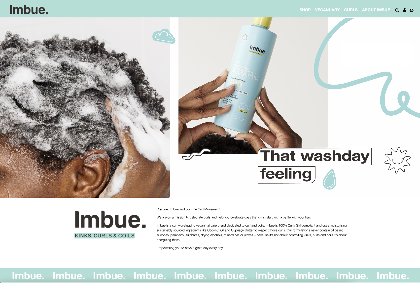
The visual direction brought that idea to life through joyful model photography, real application imagery and a bright product world, showing both the process and the feeling of a successful wash day.
-
Senior Designer
Visual direction · Model & product shoot direction · Campaign design · Video direction & editing
-
Brand Lead · PR & Marketing · Midweight Designer · US Marketing Team · Photography, video, styling and production partners

Model Photography
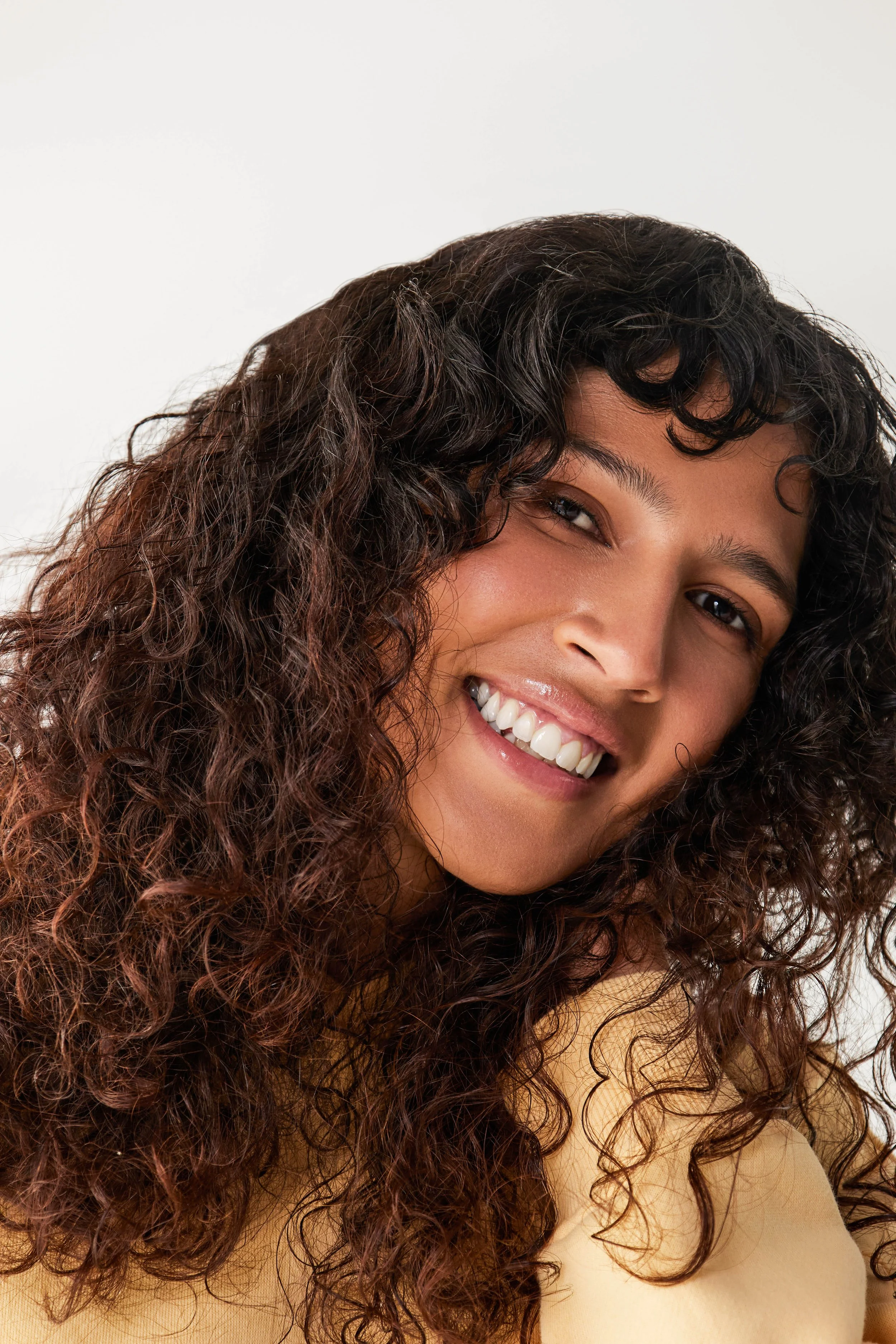
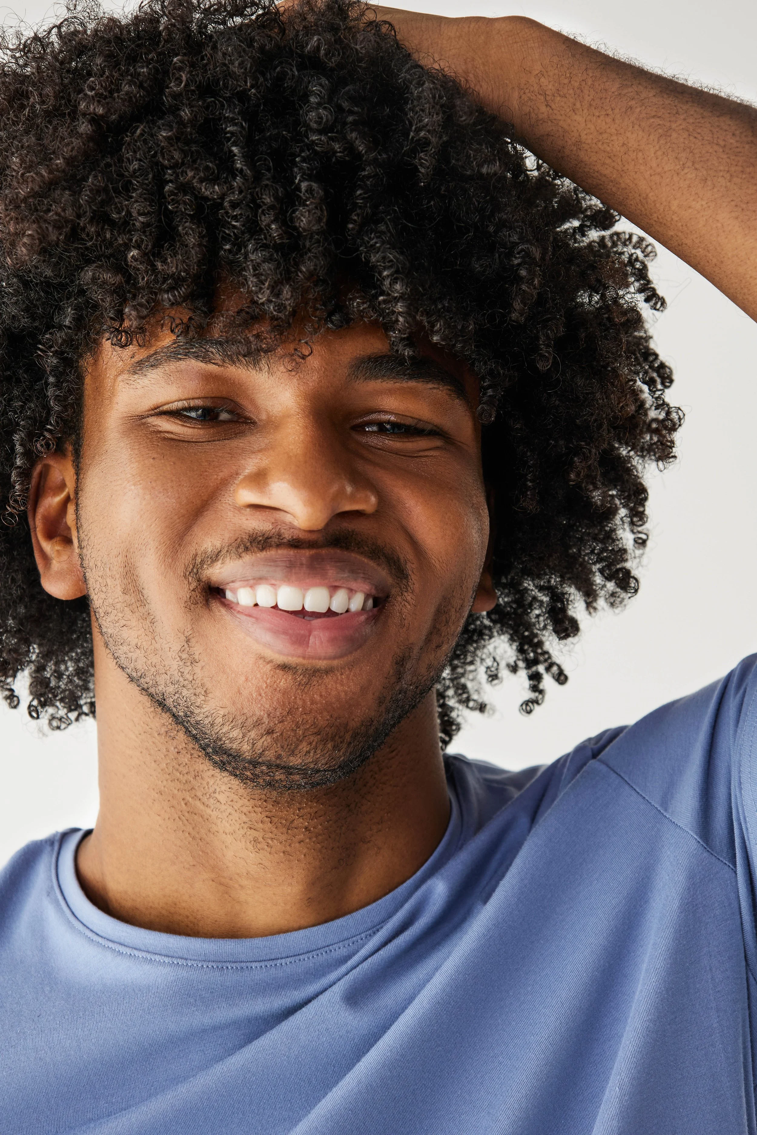
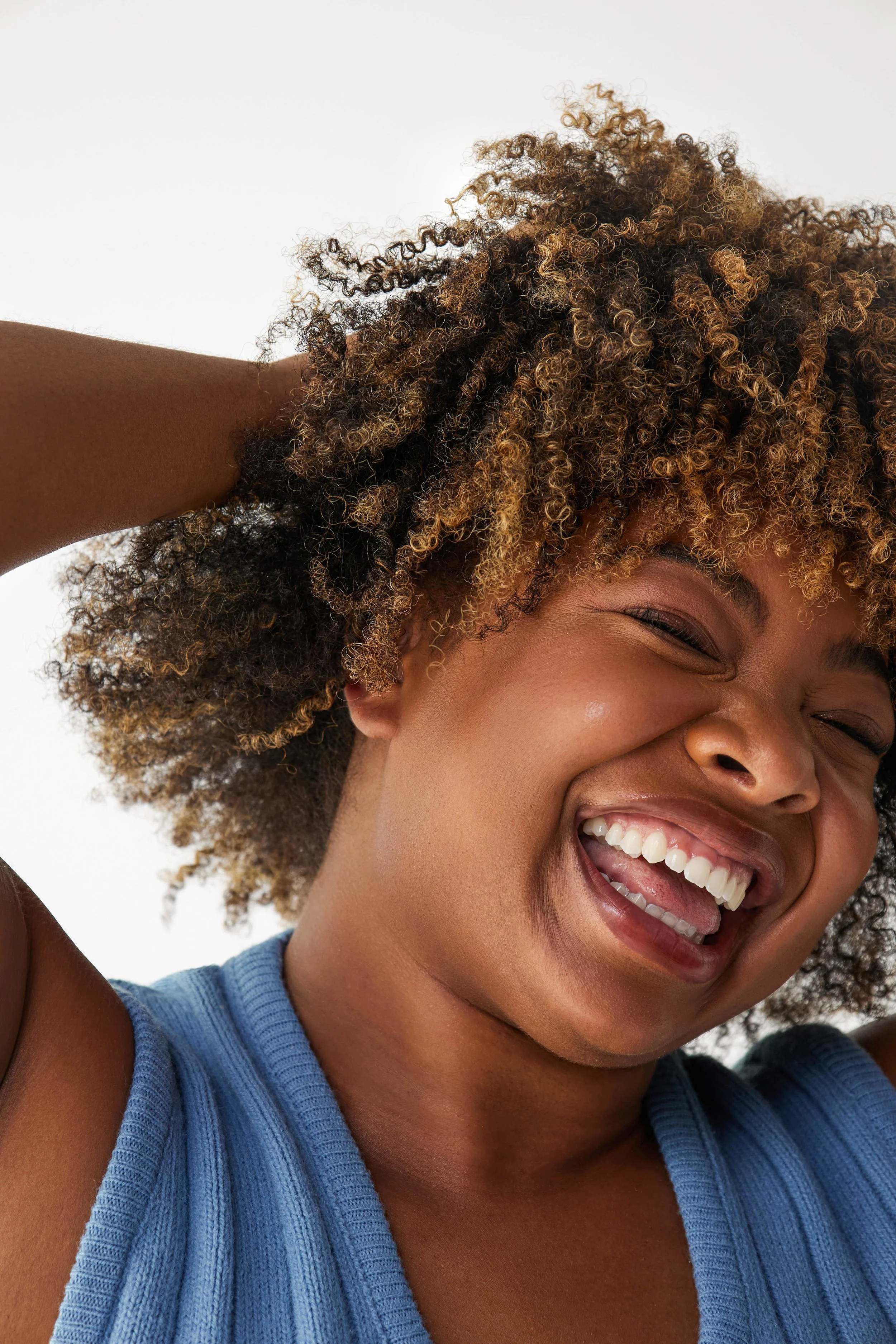
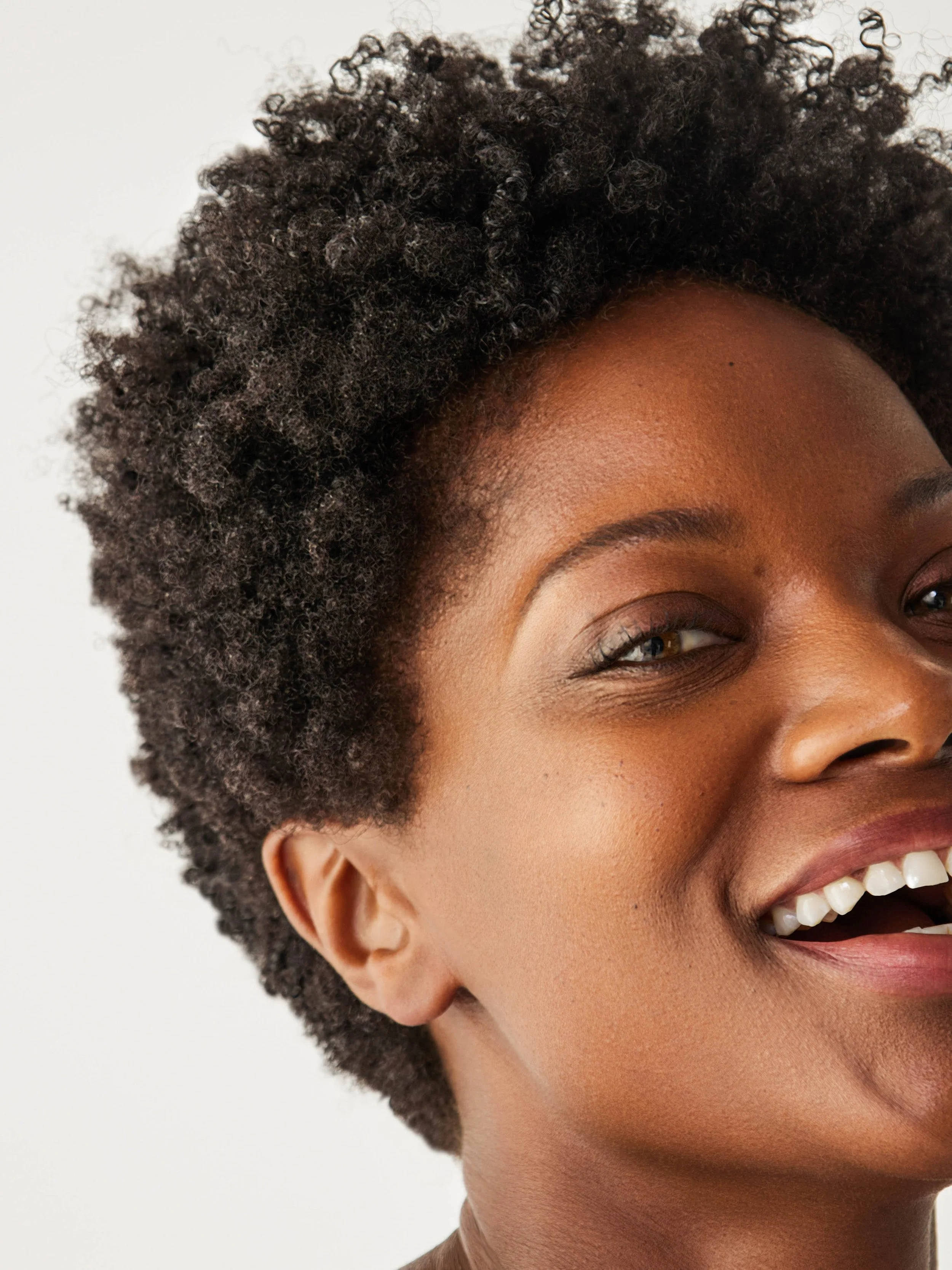
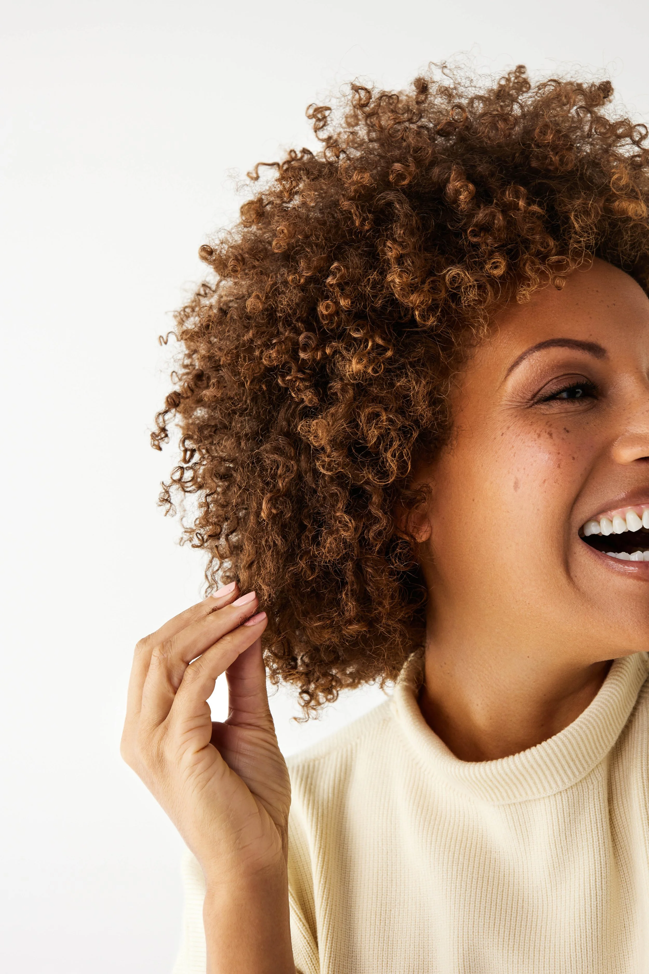
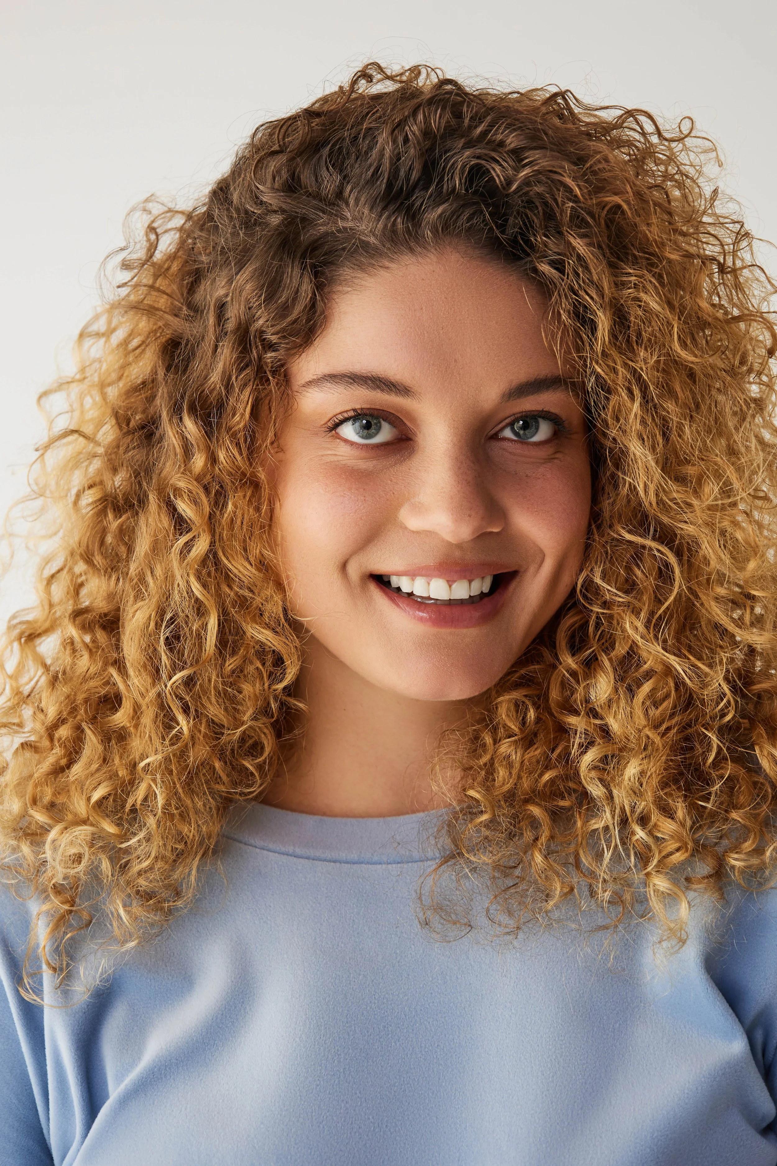
The model photography centred on the feeling of a great wash day, not just the final hair result.
Tight crops bring curls and expression into the same frame, while bright, clean lighting keeps the hair itself clear and detailed. The result links the performance of the products with the confidence and joy they are intended to create.
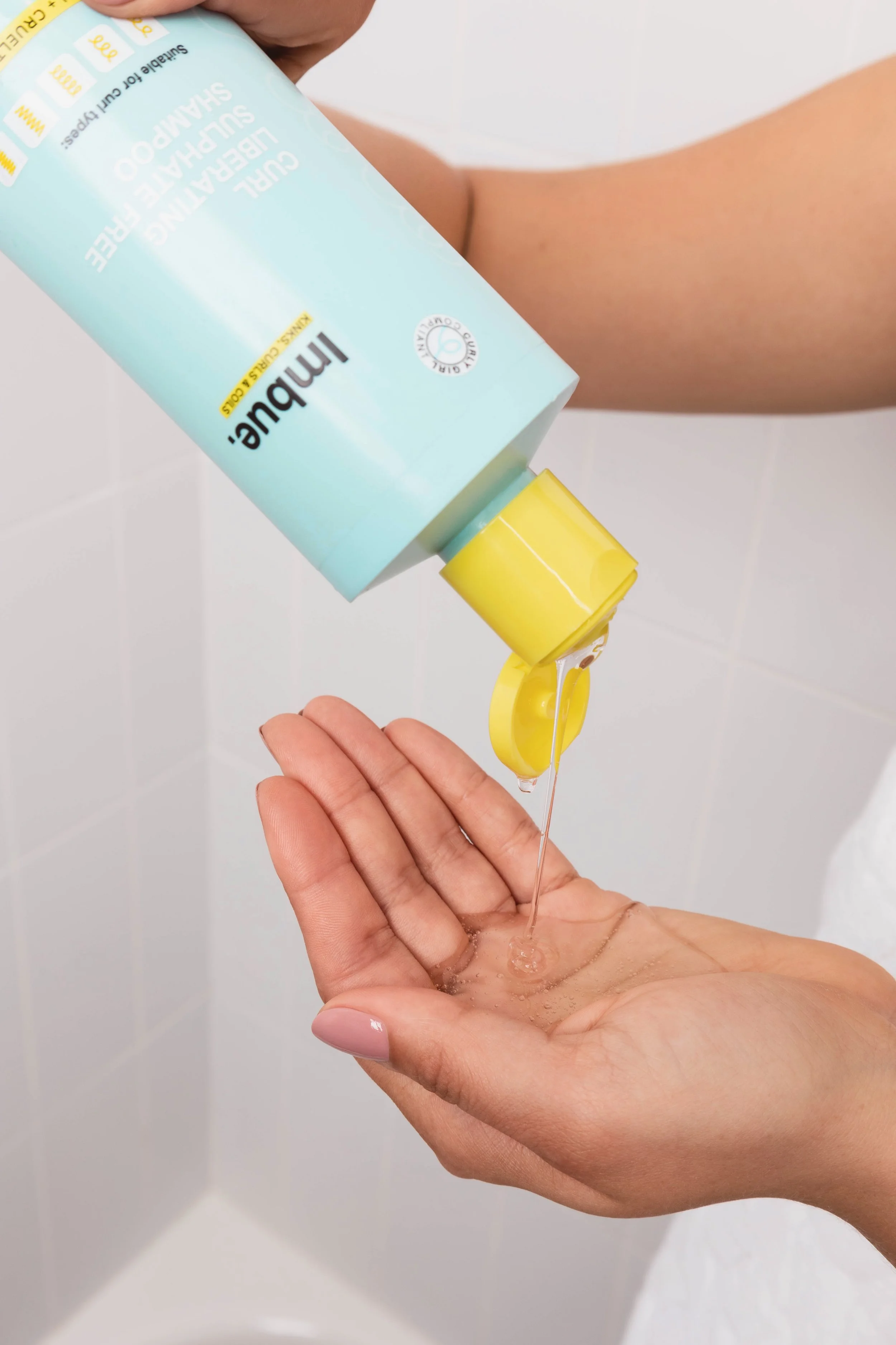
Application Photography
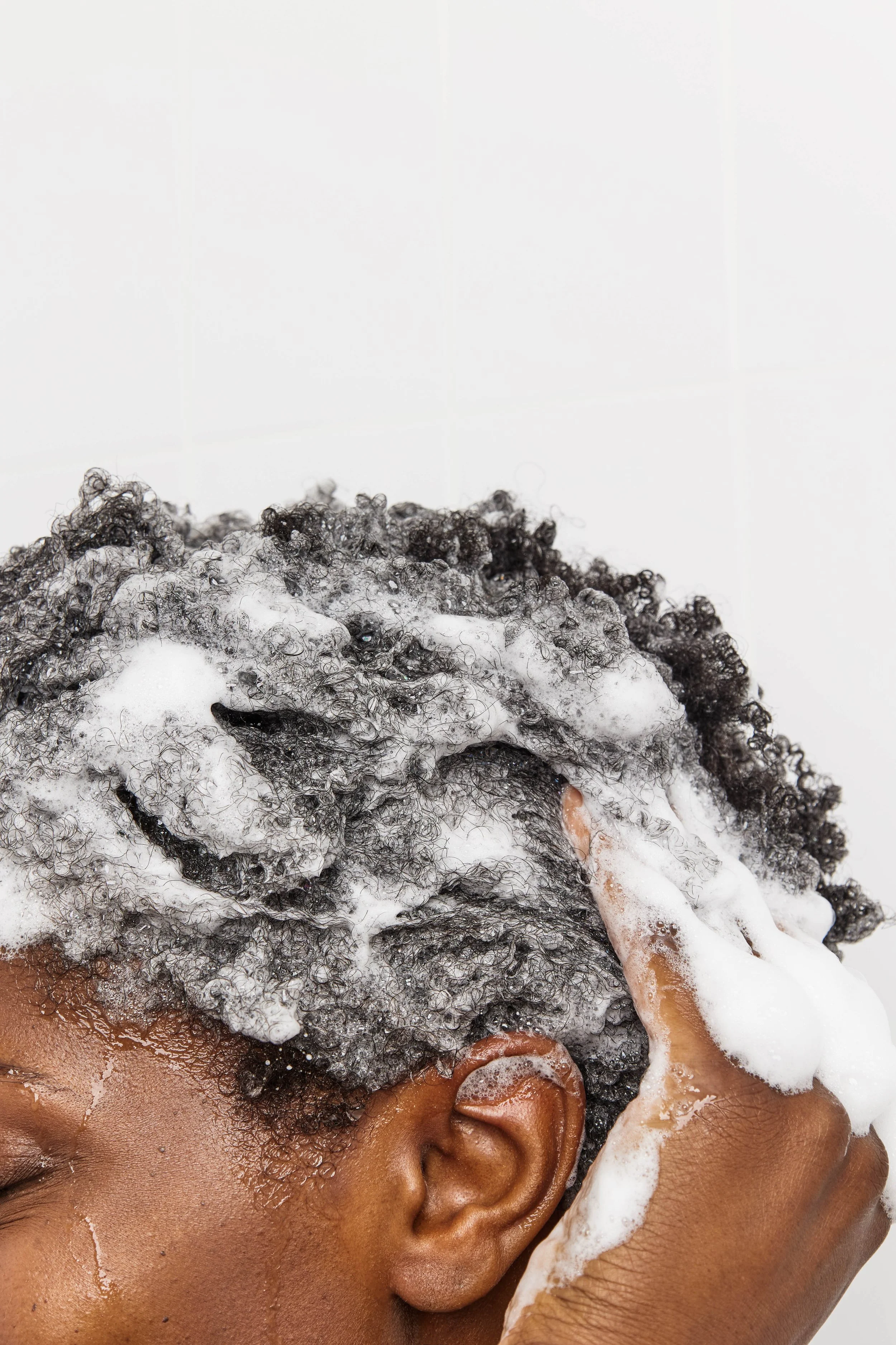
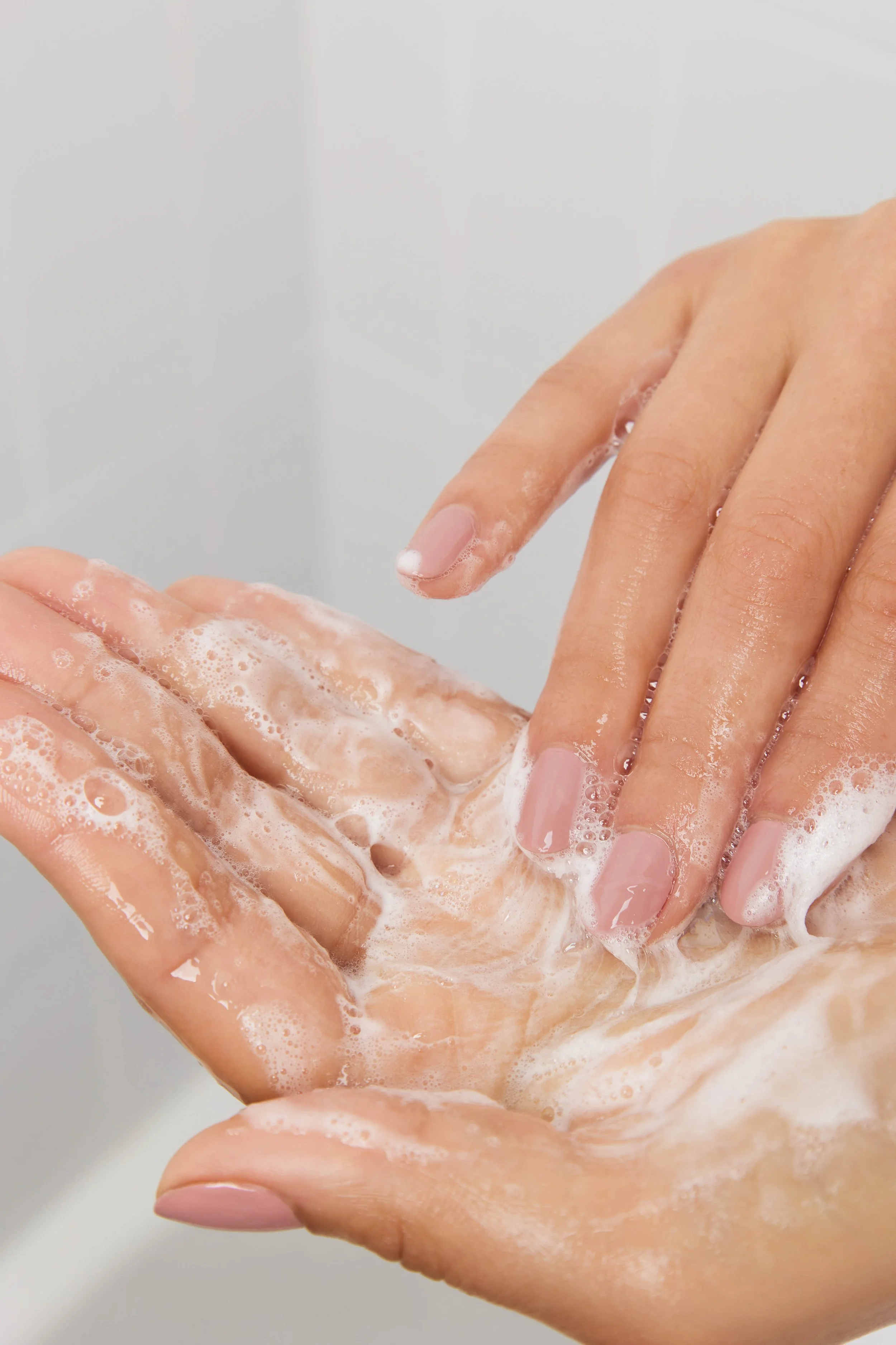
Application photography filled in the other half of the story, showing products being used rather than only the finished result.
Shot in a more natural setting, the imagery adds useful context around the routine and gives the campaign an educational side alongside the more polished hero photography.
Capturing the joy of an empowering washday
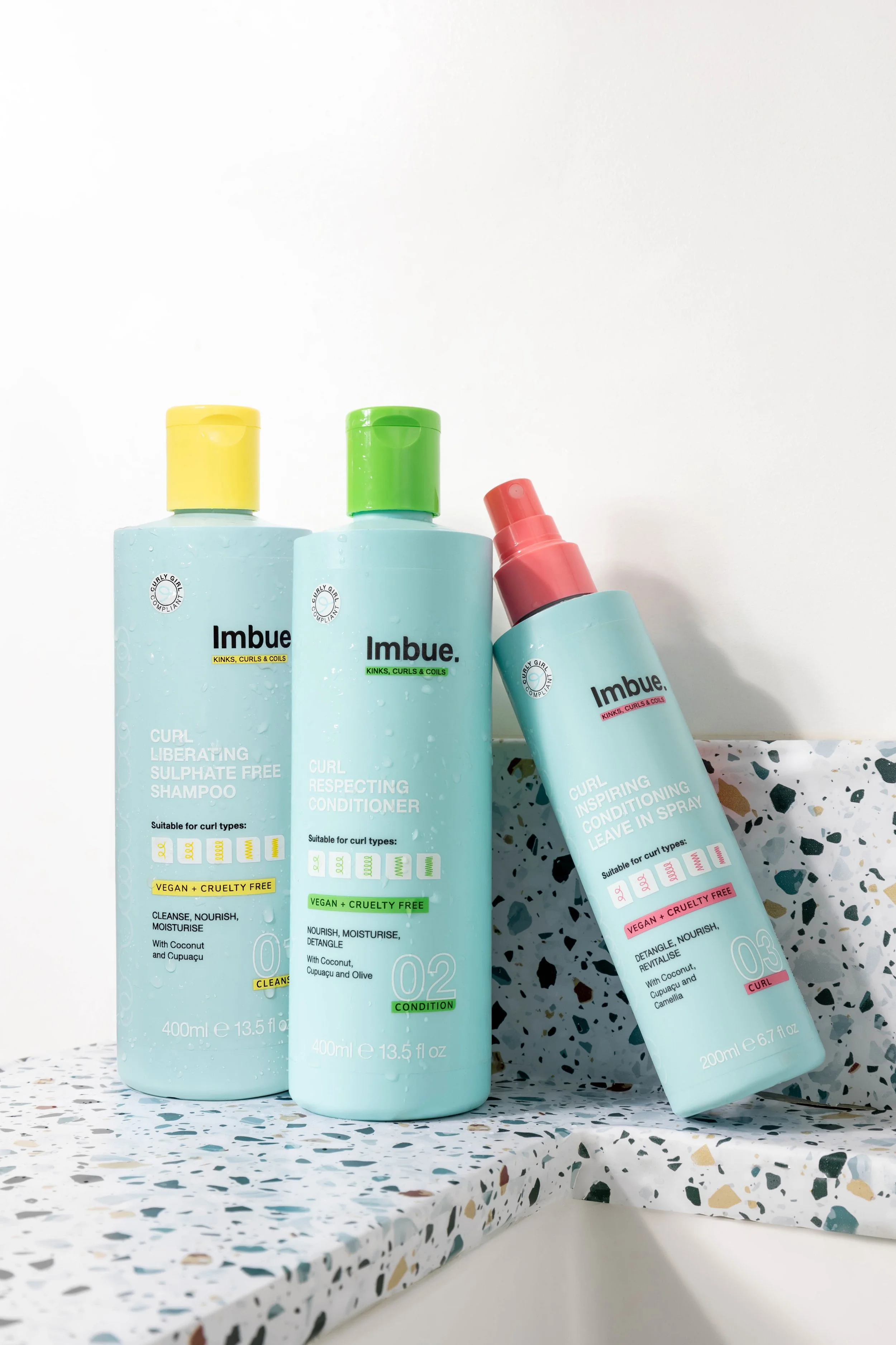
Product Photography
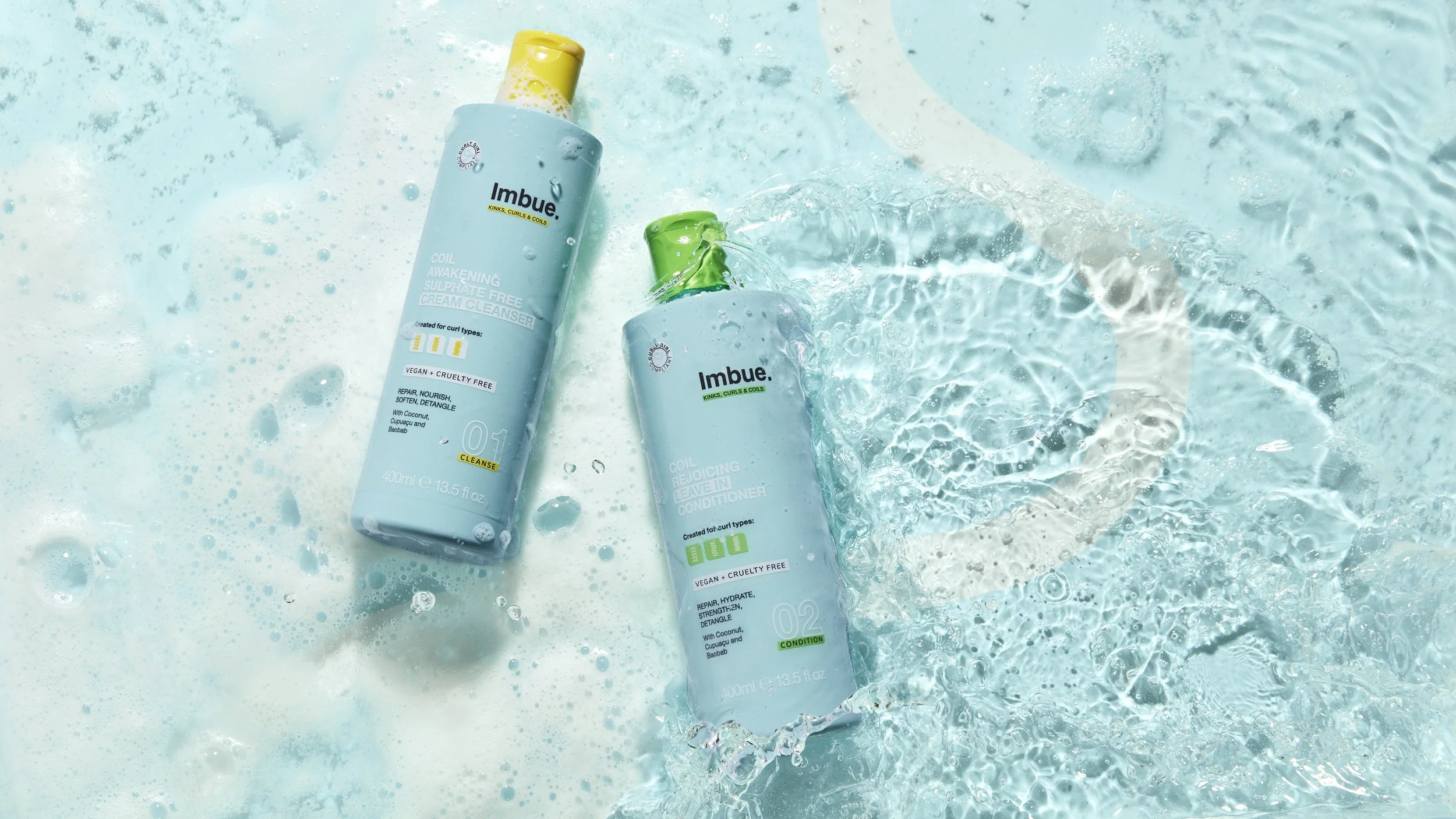
Product photography carried the same sense of movement into a more graphic setting.
Wavy illustrated backdrops, water and mirrors reference hydration and curl movement, while blocks of Imbue colour connect the images directly back to the packaging.
The result feels polished, but still playful enough to sit naturally within the wider Imbue identity.
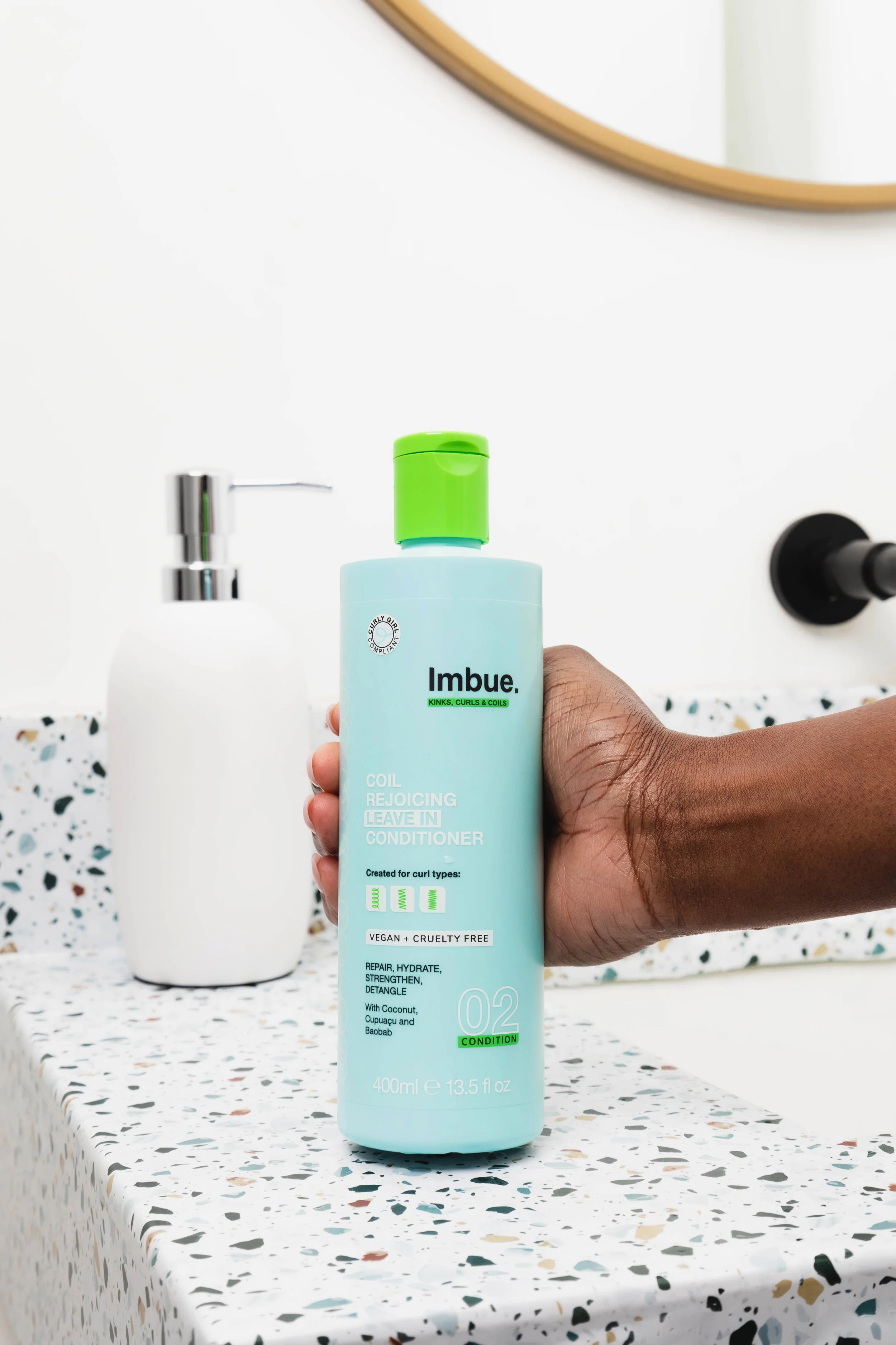
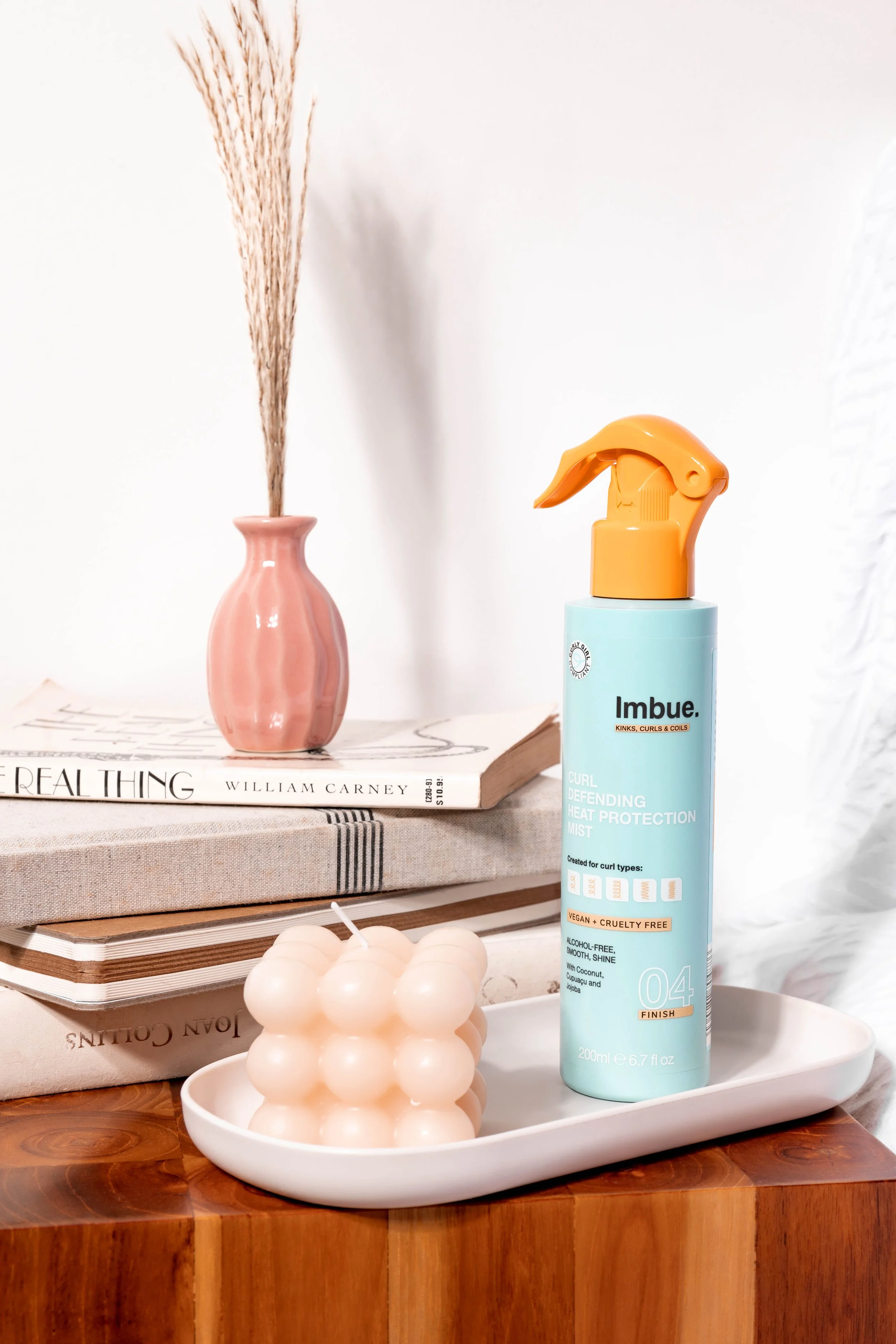
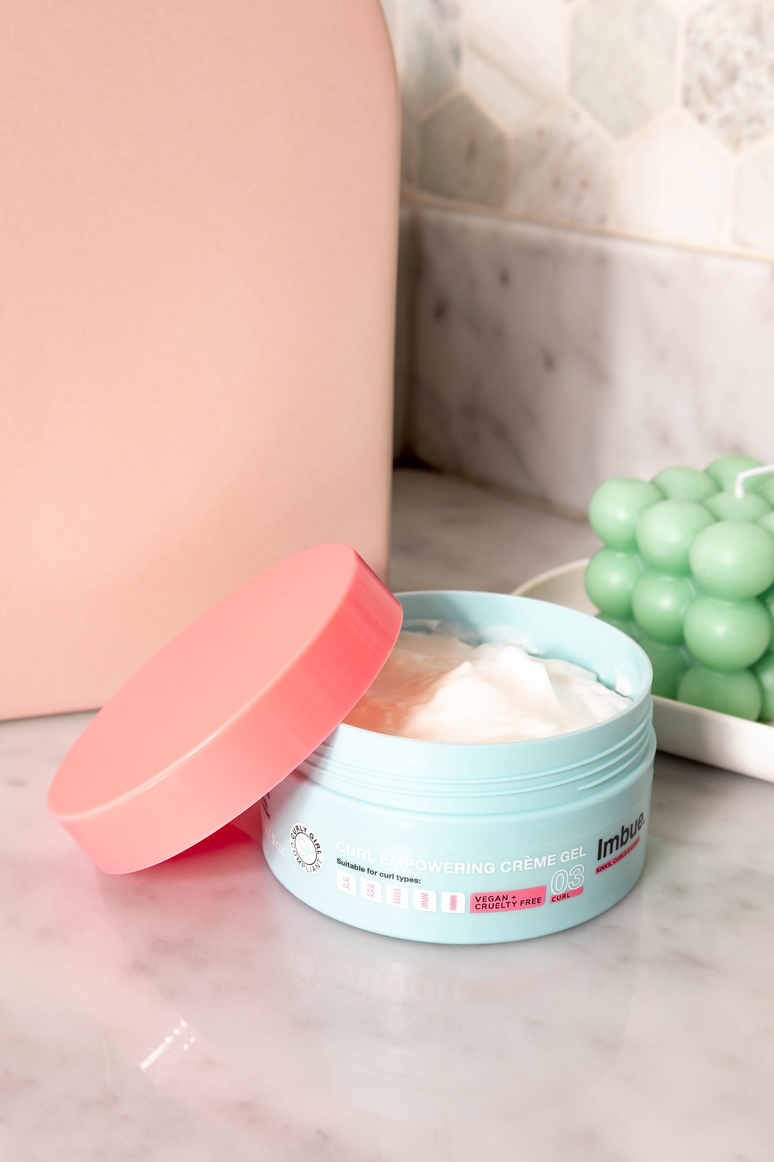
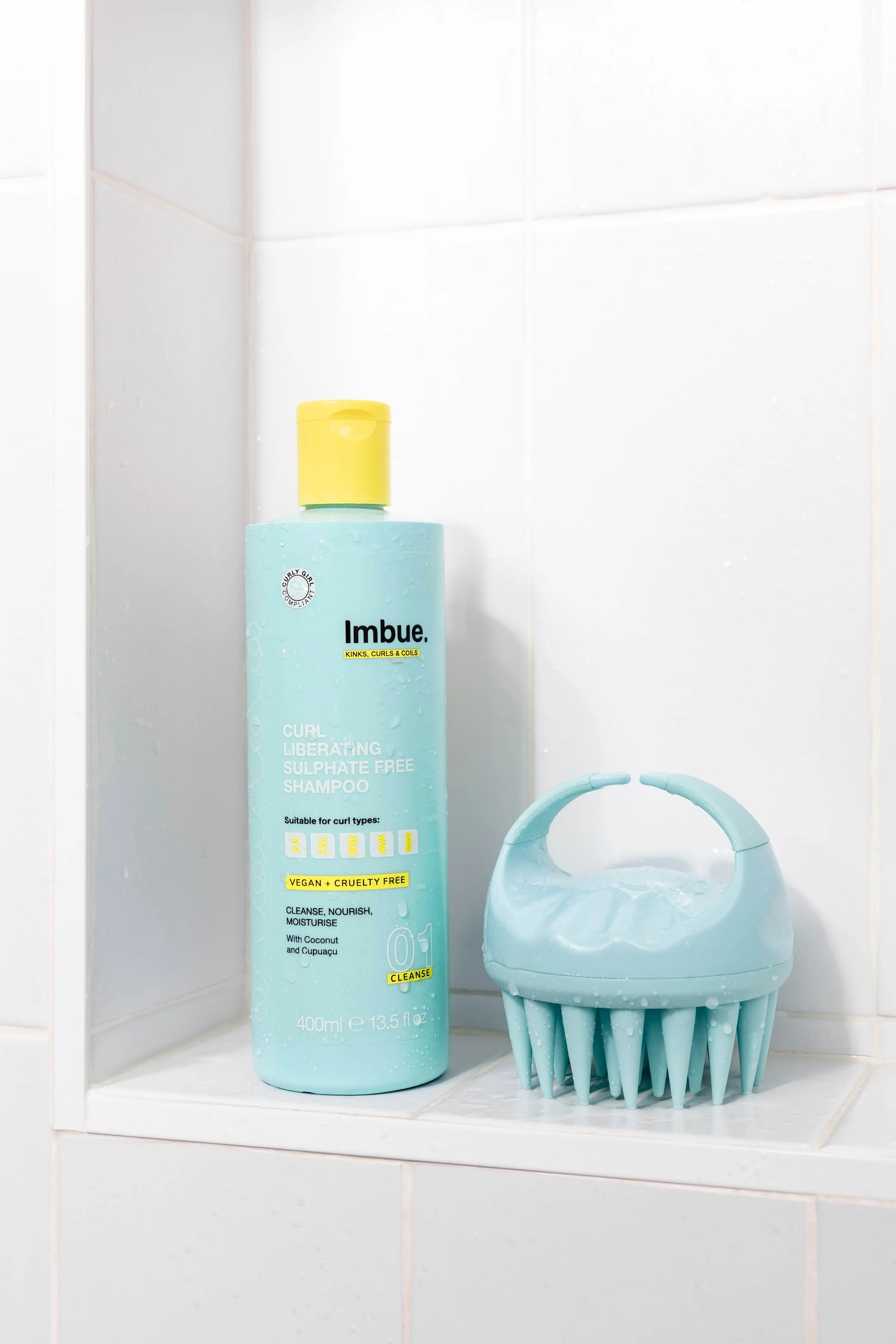
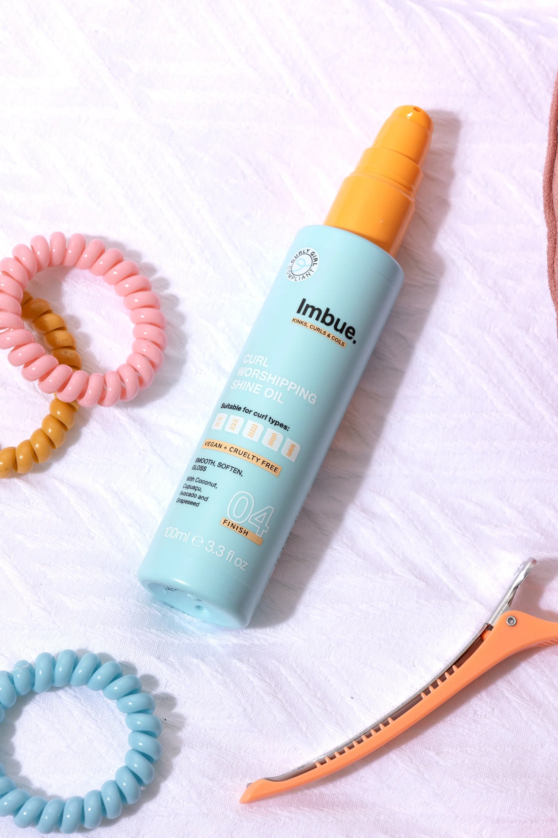
Lifestyle Product Photography
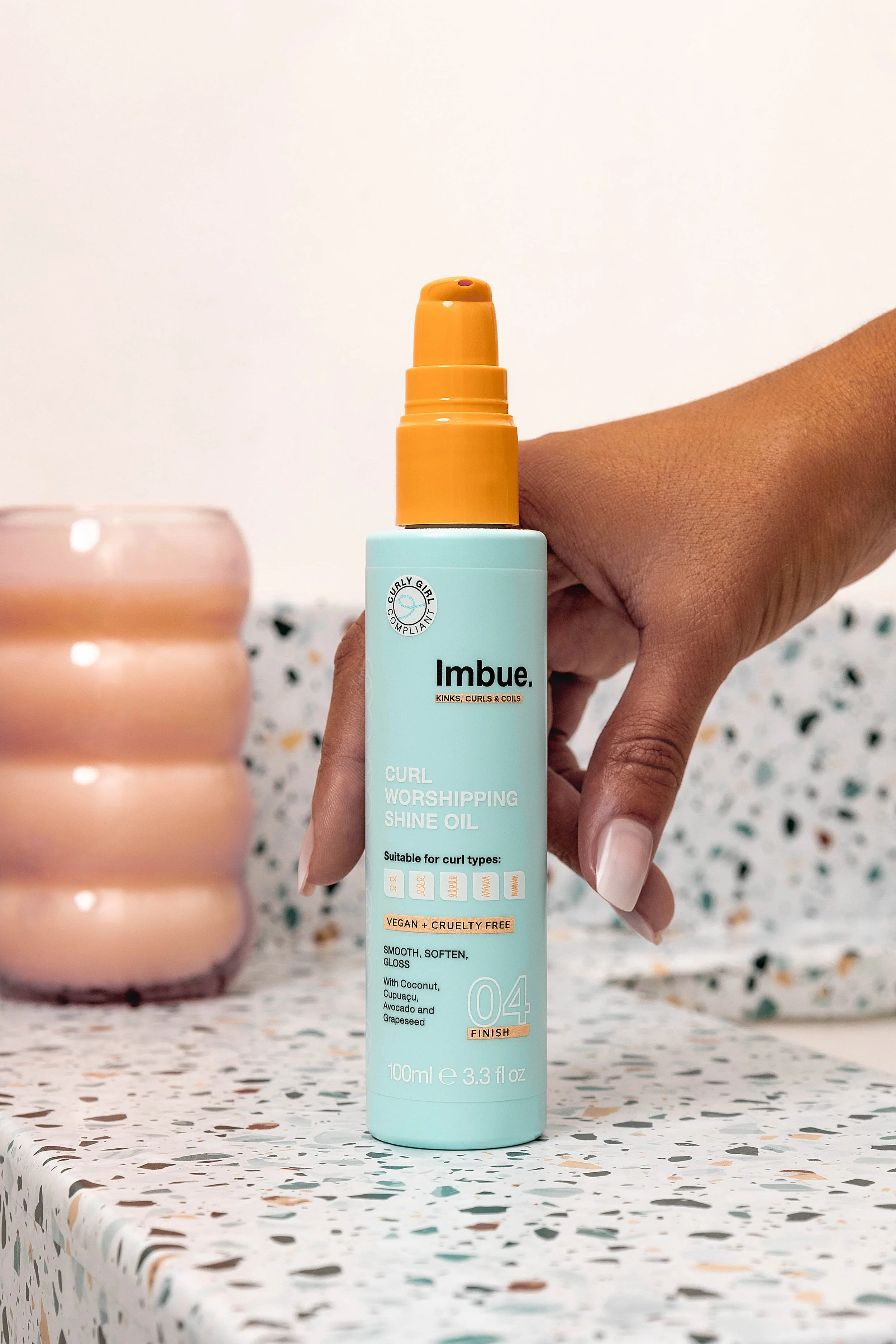
A softer set of lifestyle images gave the campaign a more natural product layer, balancing the graphic studio photography with something warmer and more relaxed.
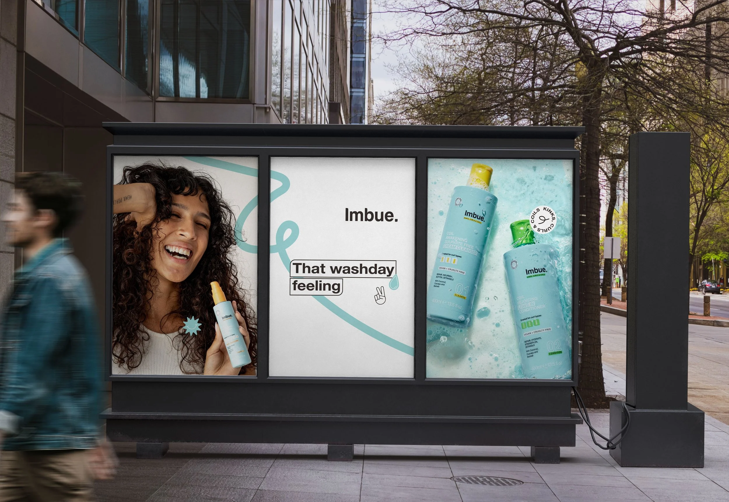
Campaign creative
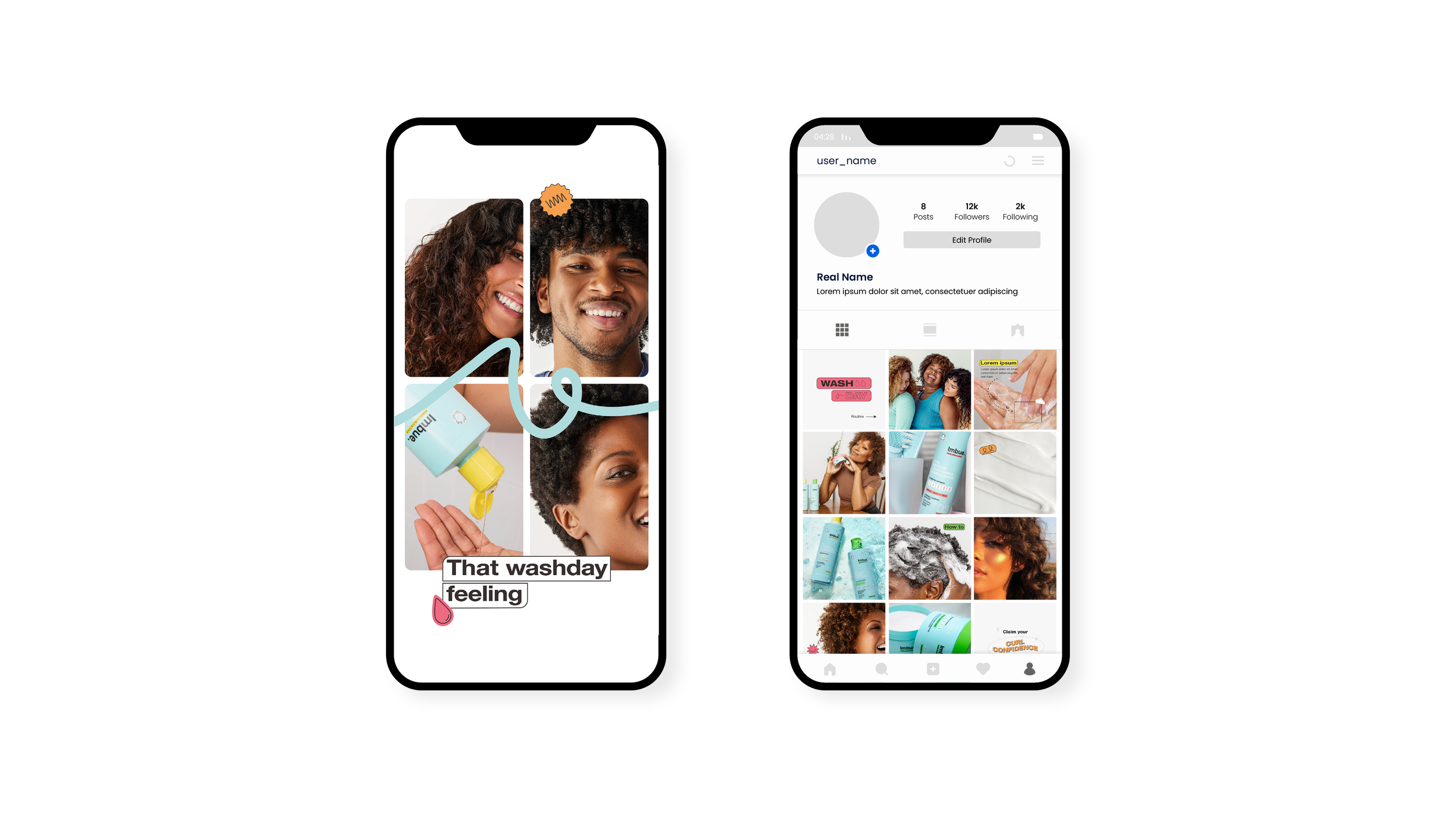
The layouts bring different parts of wash day together rather than treating product, application and result as separate messages.
Combining the photography creates a simple visual story: the product, the process and the payoff.
Strong colour contrast and restrained graphic elements keep that relationship clear, allowing the imagery and emotion to do most of the work.

Icons
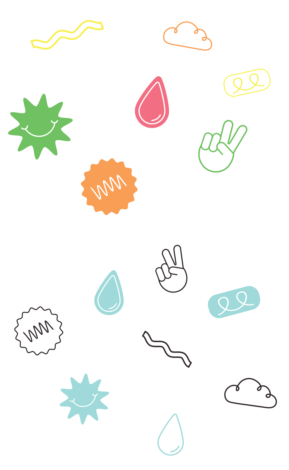
A set of illustrated icons brought some of Imbue’s playfulness into shorter campaign messages, using simple visual cues around the key Washday themes.
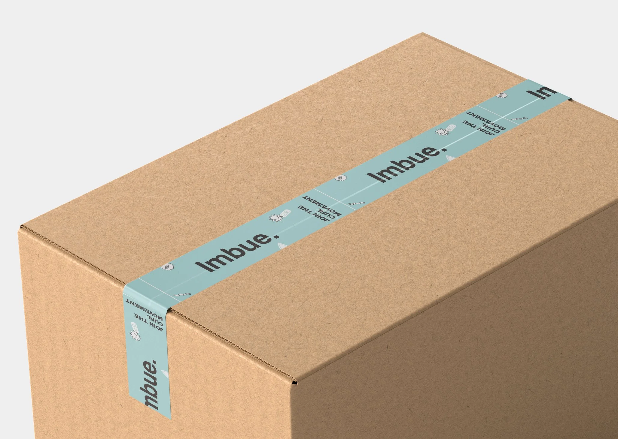
Core and accent colour versions allowed them to work across campaign artwork as well as smaller pieces such as stickers, merchandise and giveaways.

Video
Video extended the campaign story through a mix of model, application and product footage, keeping the same focus on movement, curl results and the positive feeling behind Washday.
I worked with the production team on the visual direction and footage requirements, before shaping the content through the final edits.
Campaign guide
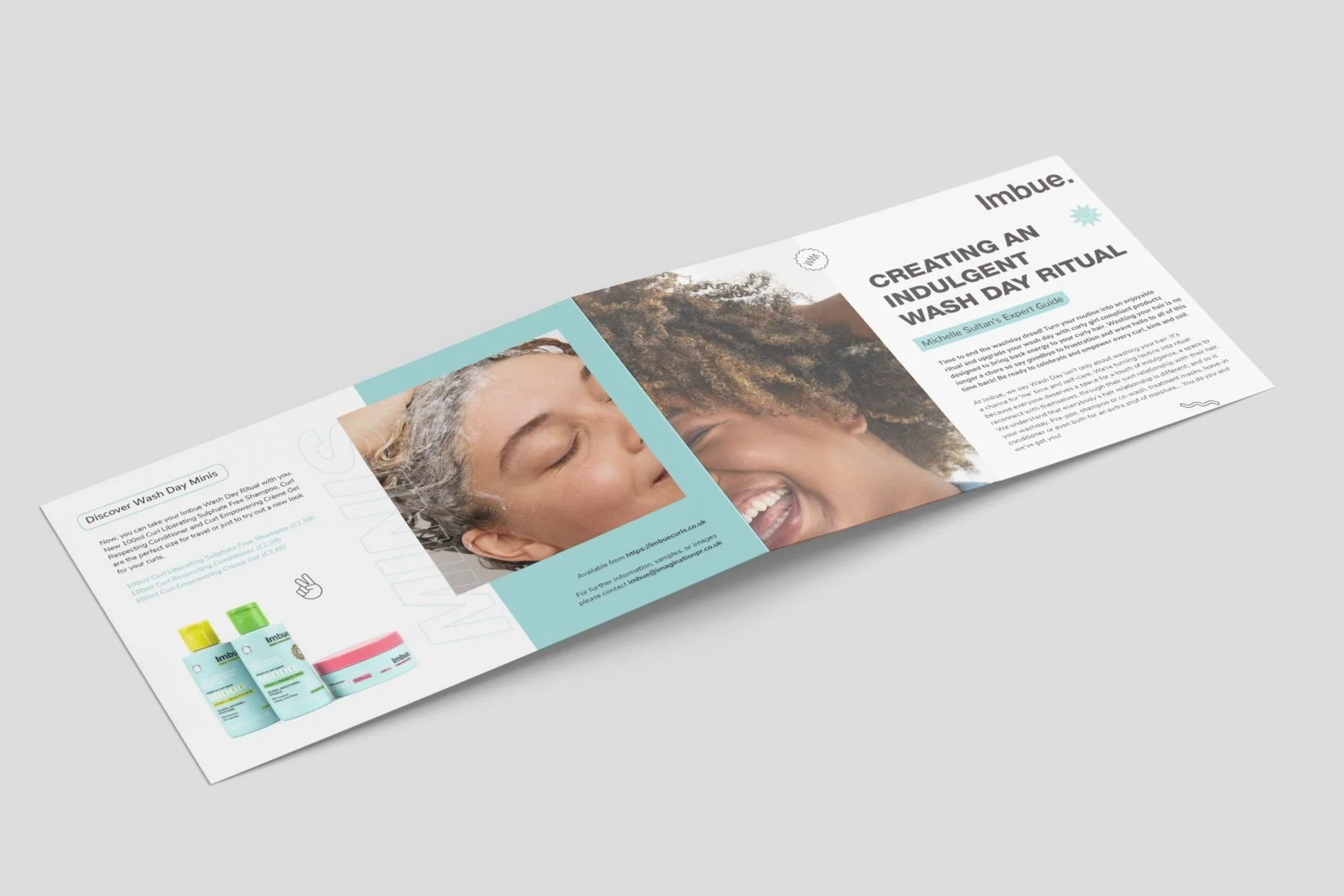
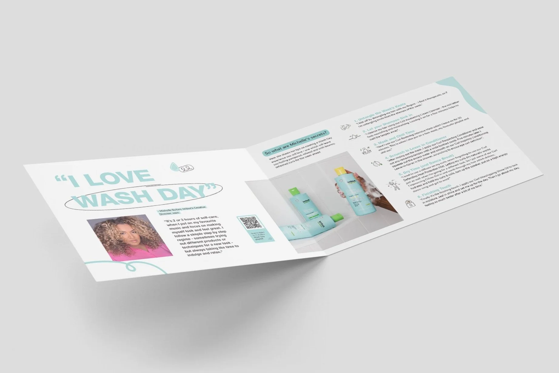
The final campaign guide brought the photography, graphic system and key applications together, giving teams a clear reference for rolling the idea out consistently across markets.