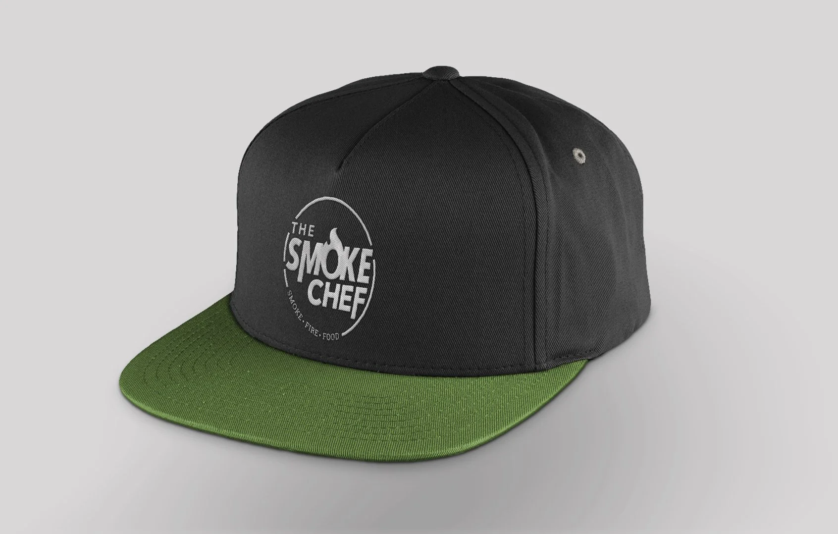
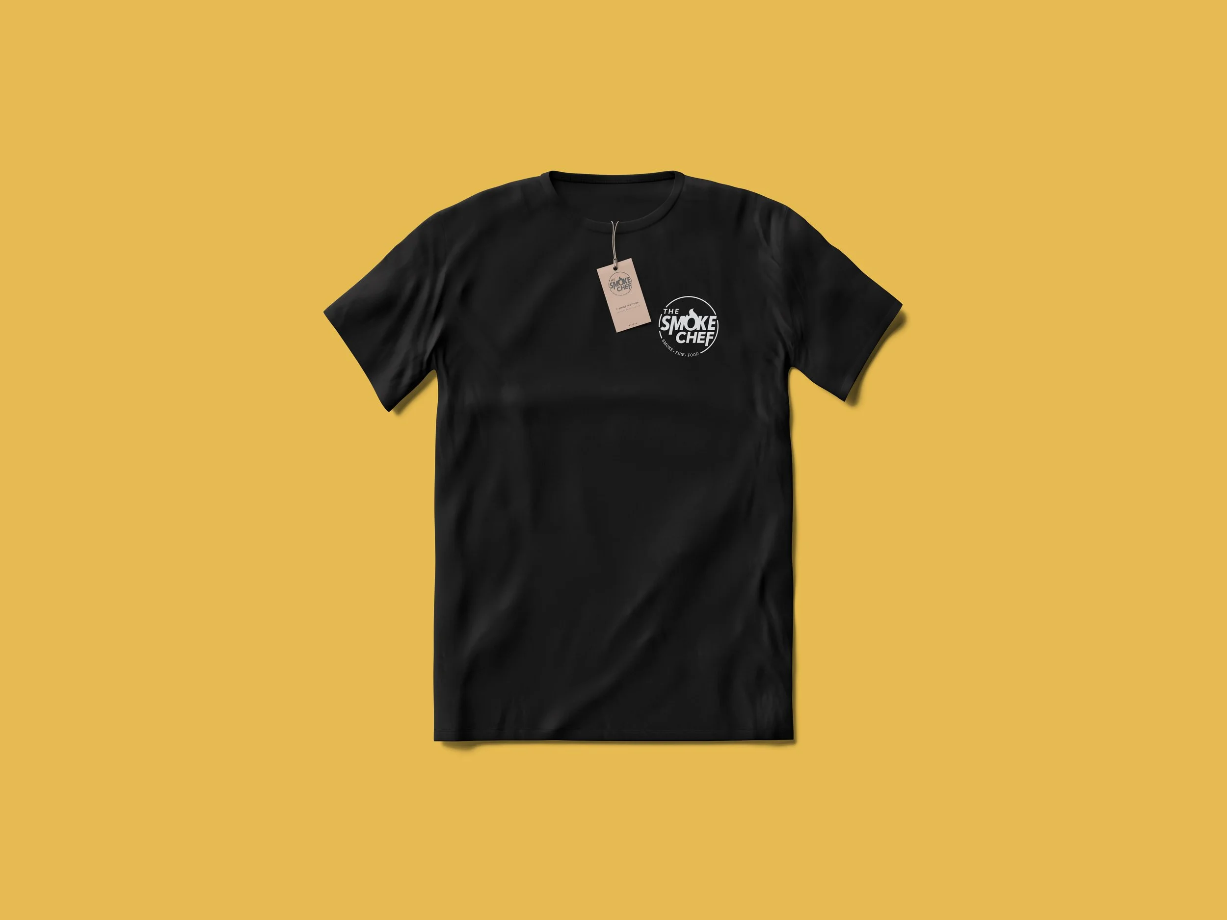
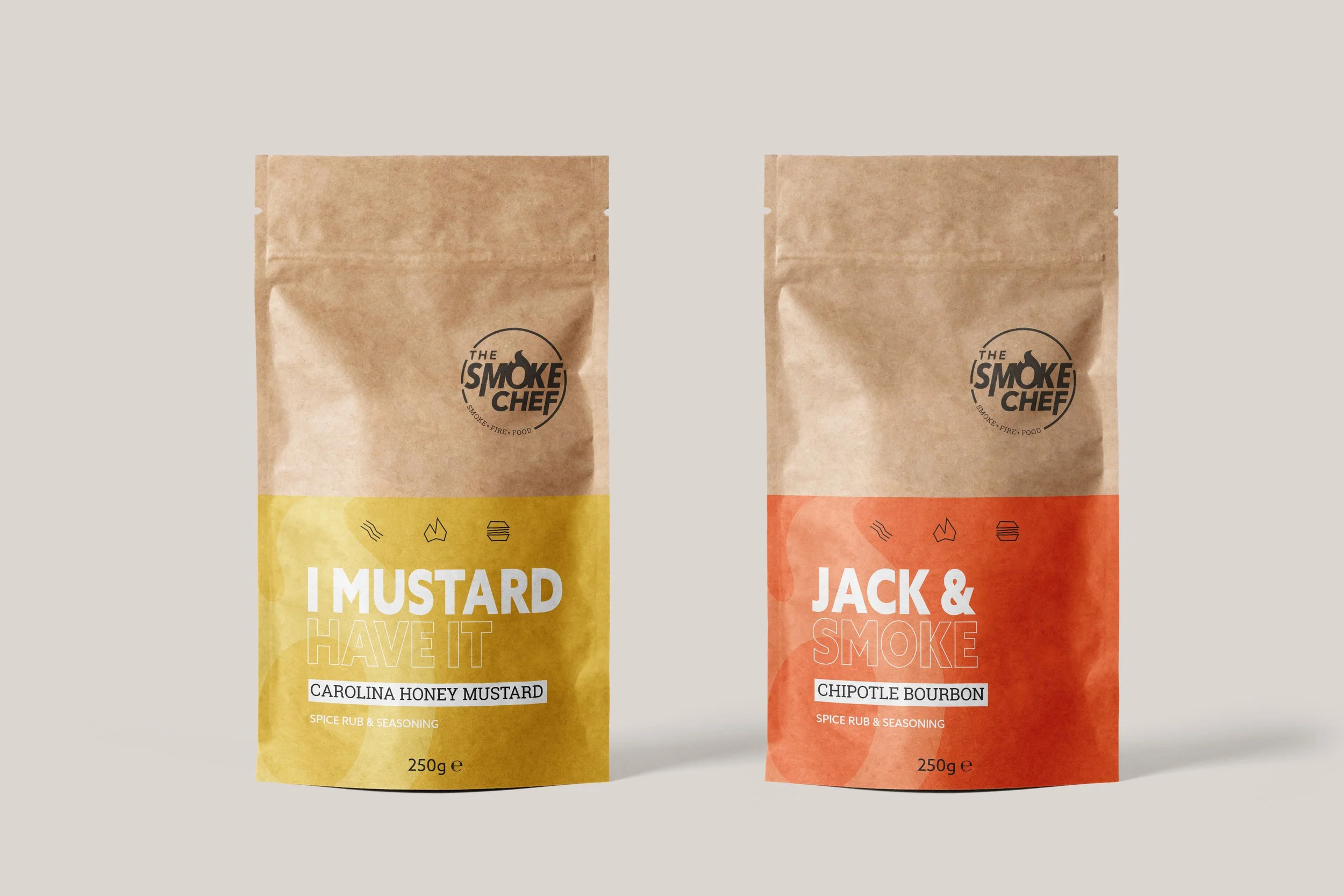
The Smoke Chef
Bringing a contemporary perspective to BBQ culture
The Project
Smoke Chef was created to bring a more contemporary perspective to BBQ culture.
Inspired by traditional fire cooking but influenced by modern food culture, the brand needed to appeal to experienced BBQ enthusiasts while remaining approachable to a wider audience. The identity was designed to provide a recognisable foundation that could extend across content, events, products and future brand growth.
-
Logo design, branding, identity design, creative direction
-
Myself

The Brief
The challenge was avoiding many of the visual clichés commonly associated with BBQ branding.
The category is often dominated by distressed typography, heritage-inspired marks and heavily rustic aesthetics. Smoke Chef needed enough credibility to feel authentic, but also enough warmth and personality to engage people drawn to the social side of food, cooking and gathering around a fire.

The Development
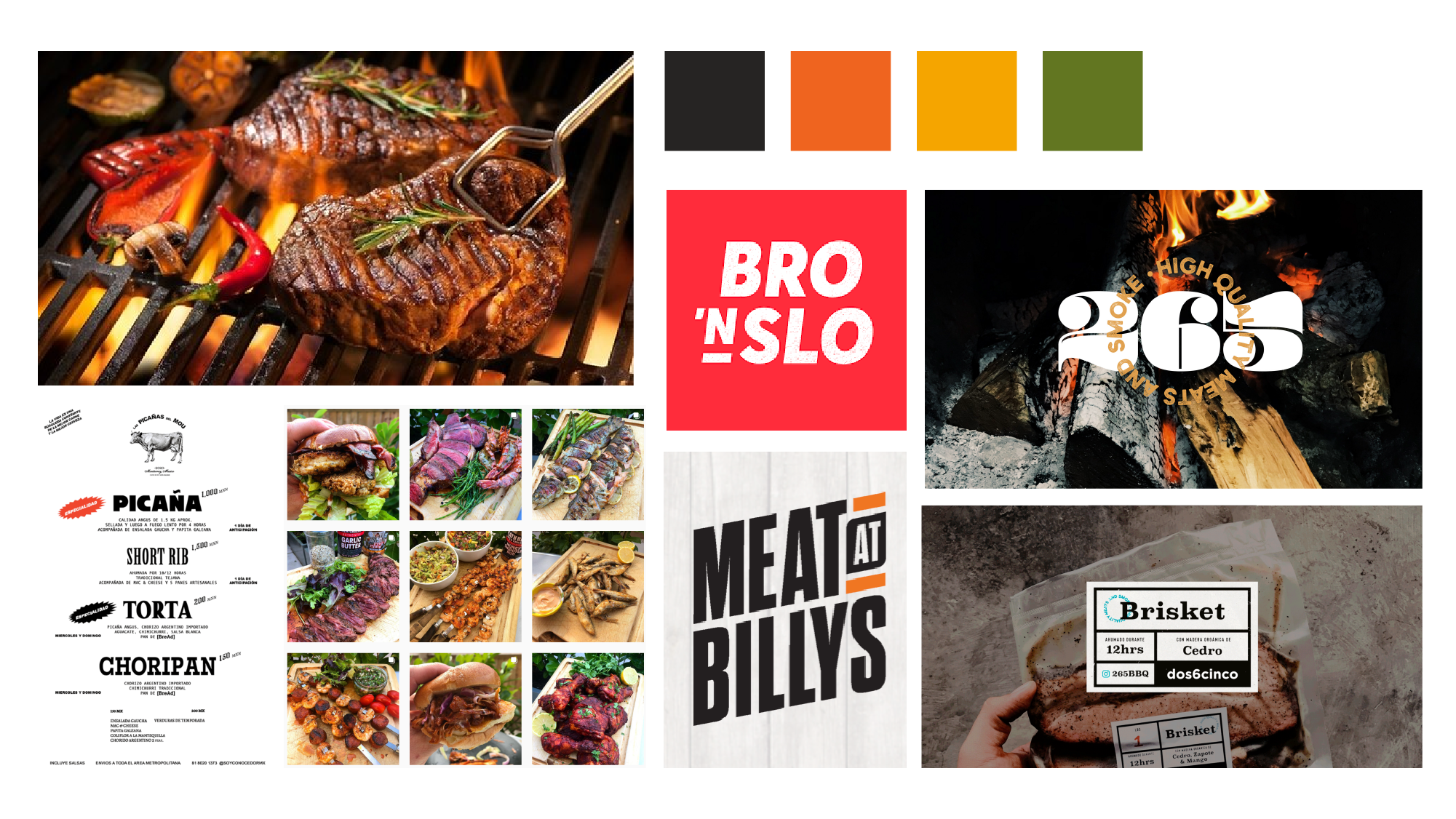
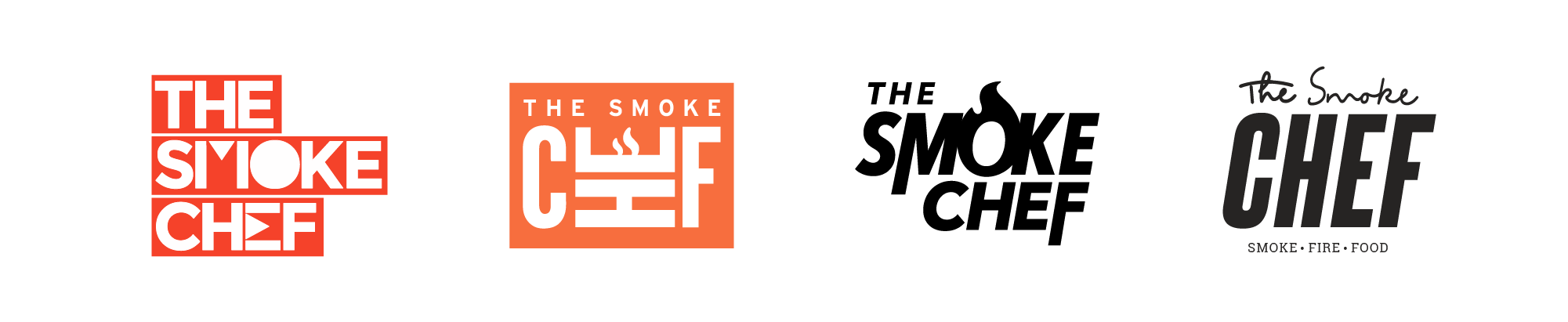
Early exploration ranged from traditional BBQ-inspired routes through to cleaner, more graphic directions.
While some concepts reflected the category well, they also risked feeling too familiar. Development gradually focused on a more contemporary approach, retaining the energy and character of BBQ culture without relying on artificial ageing, excessive texture or visual nostalgia.

The Solution
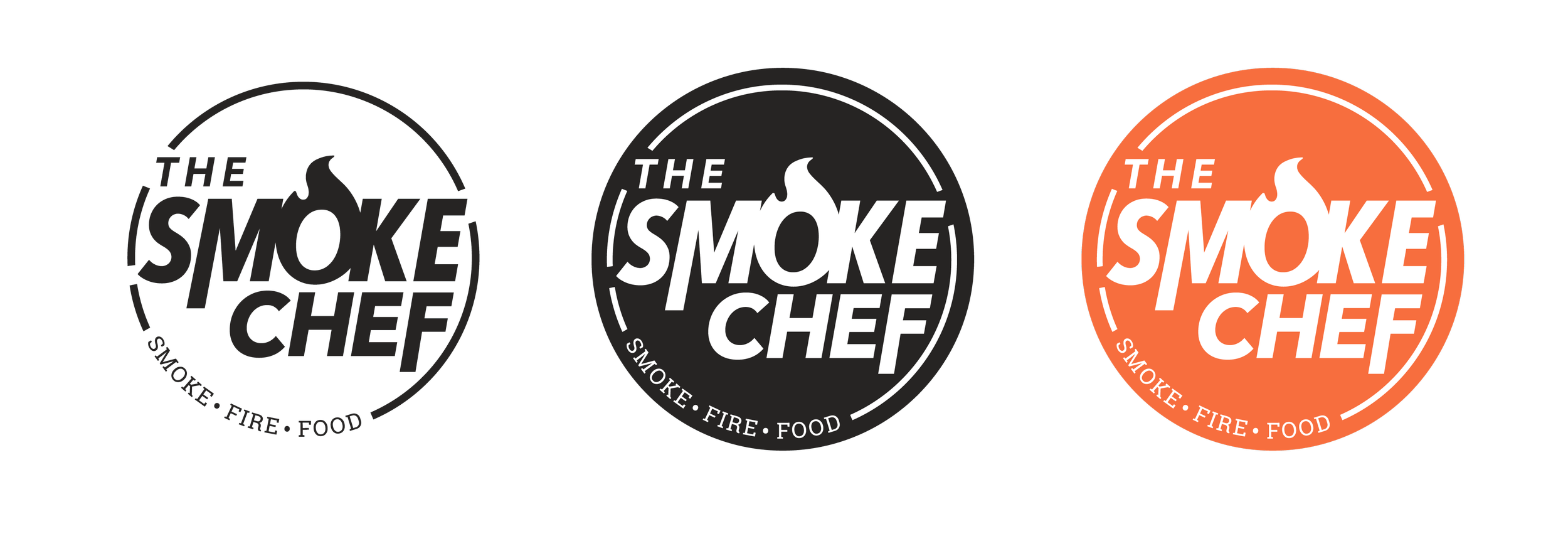
The final identity balances confidence with warmth. Bold typography provides a strong foundation, while a brighter palette inspired by fire, ingredients and food brings energy and personality to the brand.
The logo was intentionally simple and versatile, designed to work as the starting point for a broader visual language of graphic patterns, photography and content. Rather than looking backwards, the identity positions BBQ as a modern, social and evolving culture.
The Application
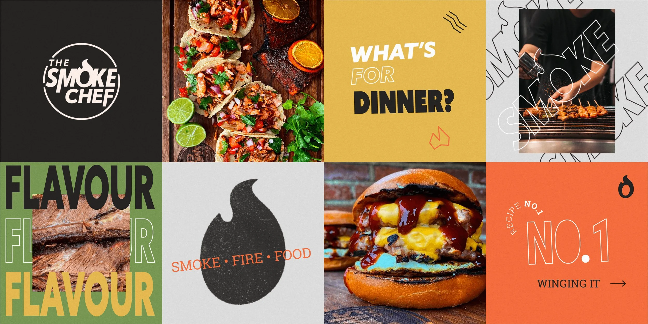
The system was designed to flex between structured brand communications and more personality-led content.
Typography, colour and graphic elements provide consistency across touchpoints, while photography and layout create enough freedom for the brand to adapt across social media, events, merchandise and future product development. The result is a visual language that feels coherent without becoming restrictive.