Krispy Kreme Mocktail Campaign
Speculative campaign · Interview brief
The Project
A summer campaign concept for Krispy Kreme’s mocktail-inspired range, built around the idea of flavour as an escape from the everyday. I developed the central concept and visual direction, then explored how it could extend across digital, OOH and experiential. The original brief asked for one strong creative hook that could stretch well beyond the key visual.
-
Campaign concept · Visual direction · Campaign lockup · Key visual · Digital & social · OOH & experiential concepts

Take a Taste-cation
The starting point was the feeling that flavour can take you somewhere else. A bite can bring back a memory, change your mood or transport you to a completely different place through taste and association.
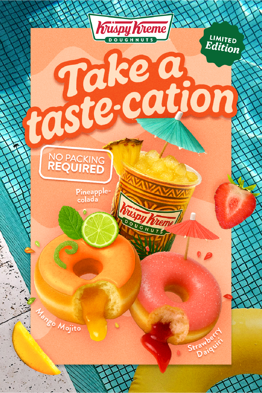
I explored different ways of framing that escape before landing on Take a Taste-cation. Its slightly clunky, playful wording made it memorable and felt right for Krispy Kreme, while No packing required turned the thought into a simple campaign promise: holiday vibes, wherever you are.
Options explored
Mocktail Moments
Take a Taste-cation
Bite-size Breaks
Escape the Chaos
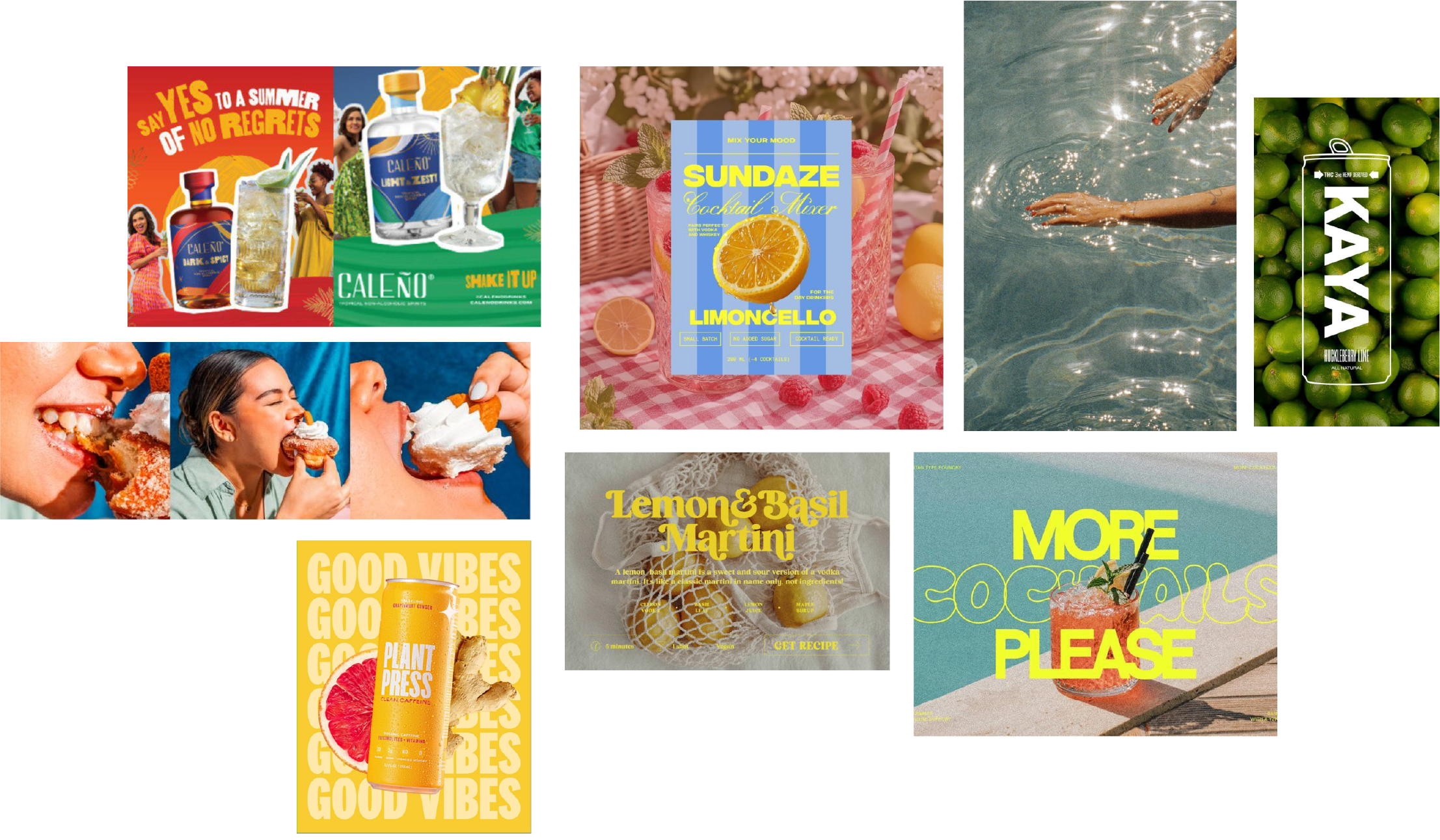
A modern take on holiday nostalgia
The moodboard combined a current visual style with the feeling of vintage holiday imagery, without tying the campaign to one particular era. Imperfect oversized typography, analogue grain and texture, flash-style photography, saturated colour and graphics layered over imagery all fed into the final direction.
I adapted Krispy Kreme’s existing brand type rather than introducing a separate display font, making the forms rounder and more hand-drawn, varying the widths and adding small flick details before shaping them into the loose arched lockup. This kept a clear thread back to the wider identity while giving the campaign its own playful, nostalgic character.
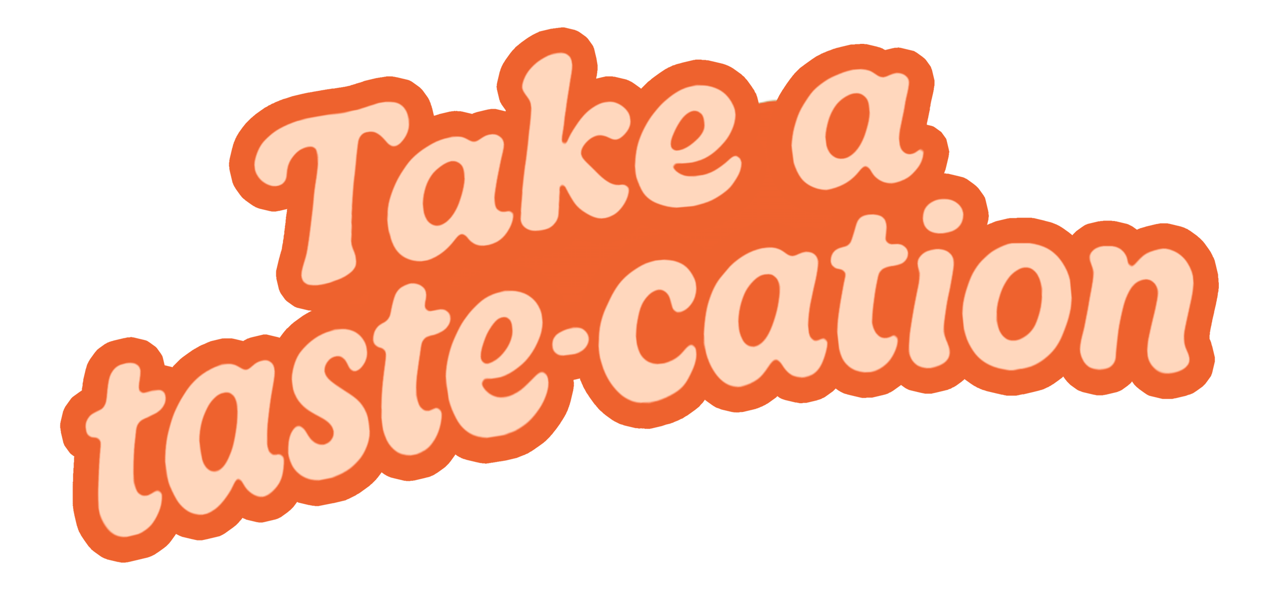
Primary Lockup - Created using a tweaked version of the primary brand font

Secondary Lockup - Passport stamp style graphic to add to the vacation visual story
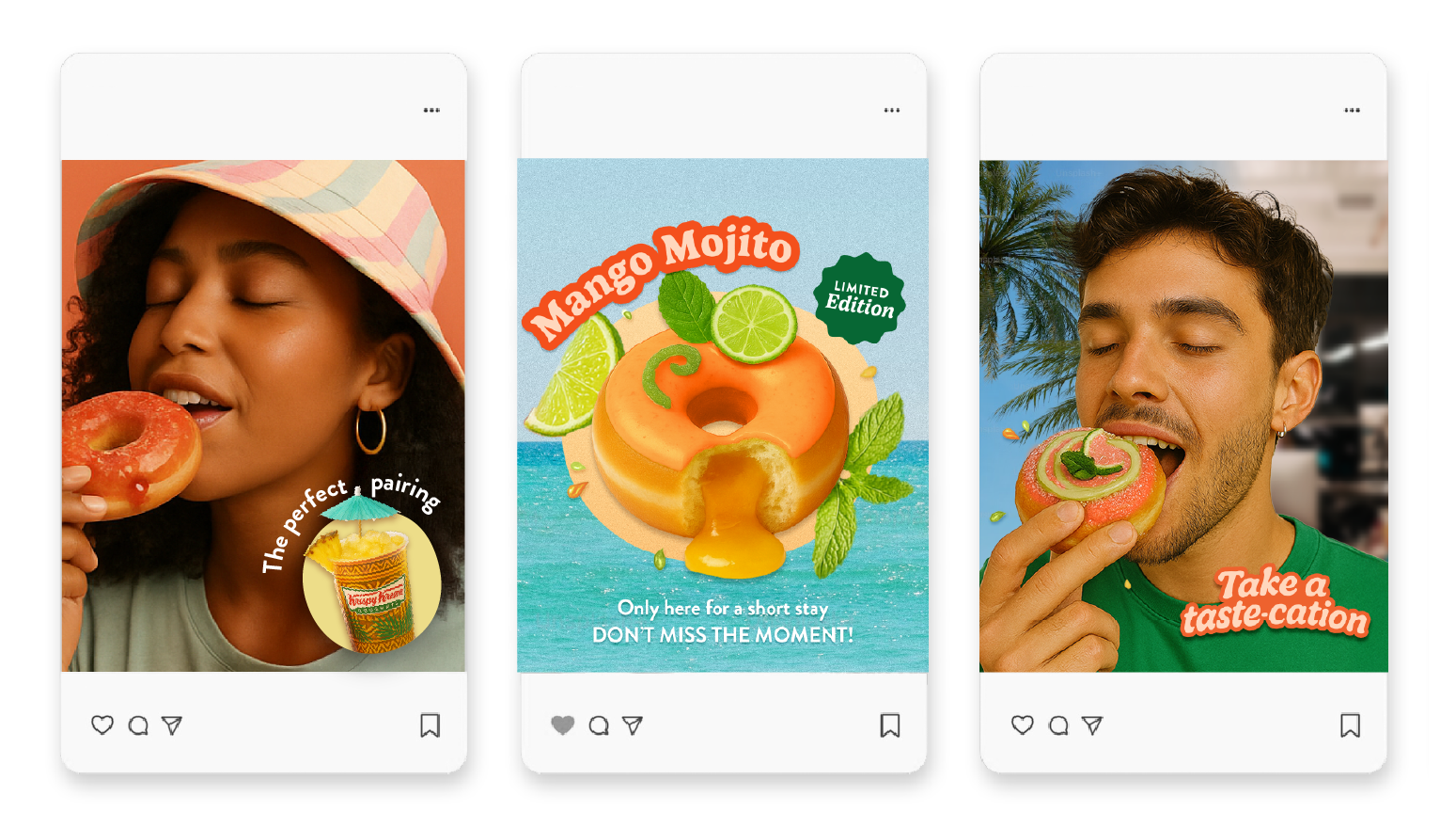
Making flavour feel irresistible
The product imagery leans into the sensory side of the idea. Tight first-bite crops capture the enjoyment of eating, while glossy glaze, visible fillings, fresh fruit and splashes make the doughnuts feel juicy, indulgent and full of flavour.
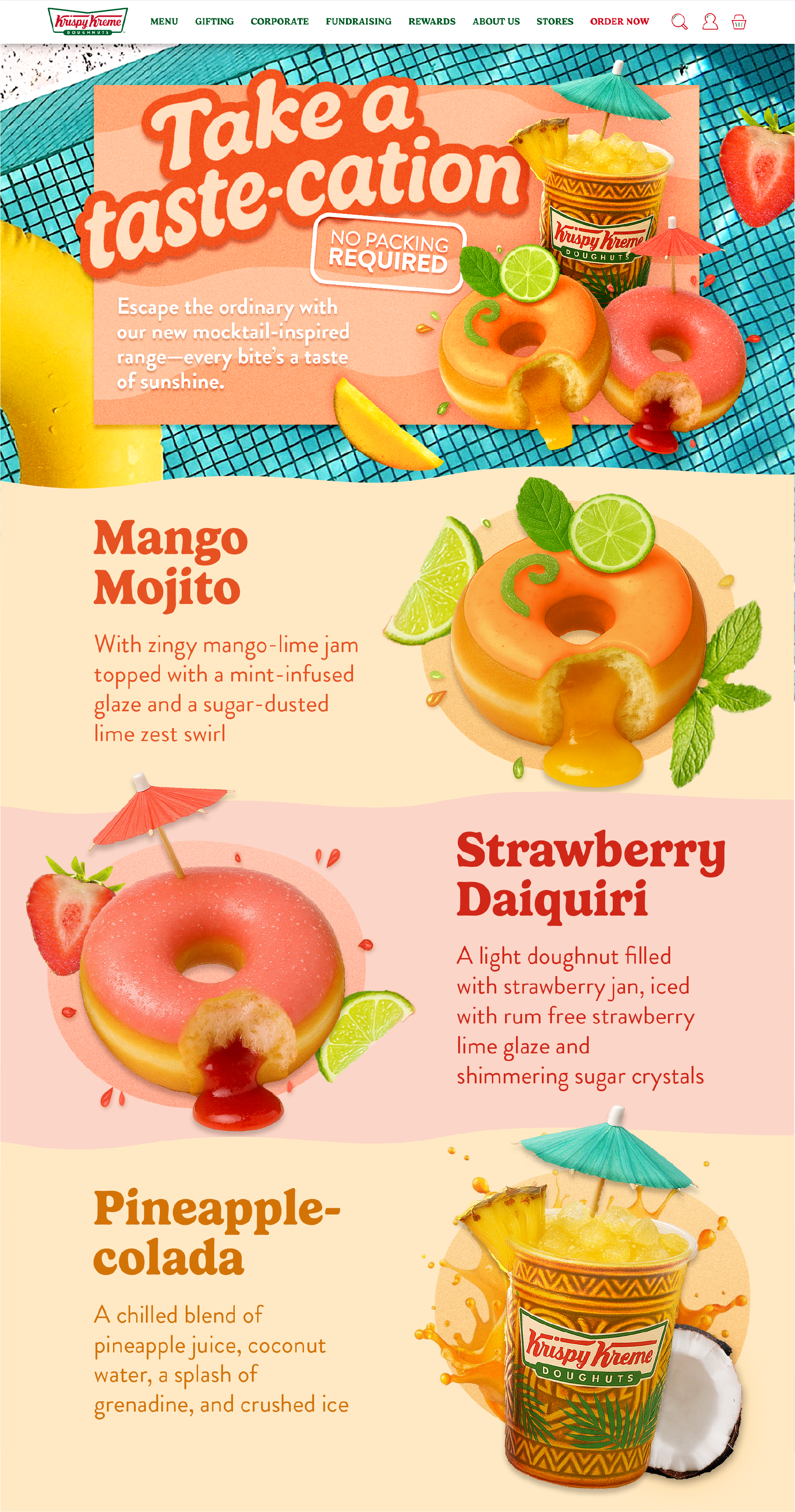
The palette leans into brighter tropical tones to amplify the mocktail flavours and summer mood. Keeping recognisable Krispy Kreme cues through the logo, adapted typography and playful graphic language meant the colour could become more expressive while still feeling naturally part of the brand.
Holiday imagery stays deliberately open-ended. Water, sunlight, sky and candid holiday moments create the feeling of getting away without prescribing a particular destination, leaving space for the viewer’s own memories and associations.
Escape the ordinary
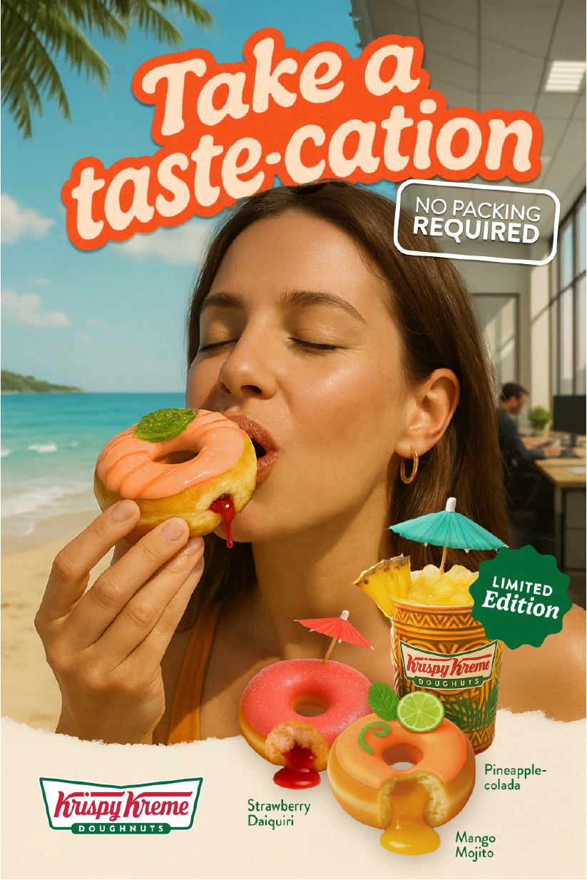
The campaign takes the Taste-cation idea into familiar everyday settings, using the contrast between the ordinary and the feeling of escape as a recurring creative device.
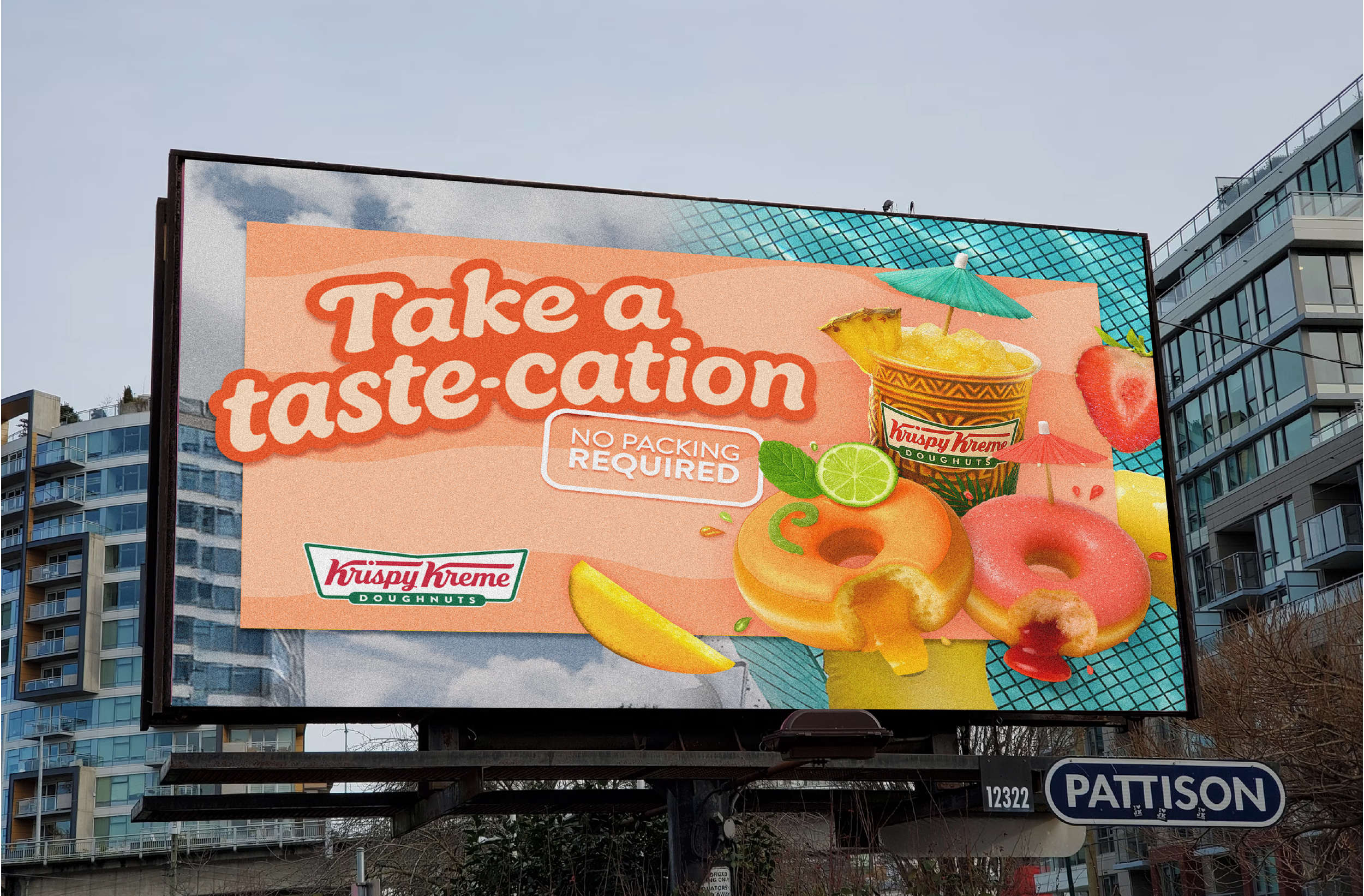
OOH pushes the same thought further by making the surrounding environment part of the creative. An everyday city backdrop merges into the brighter holiday world of the campaign, giving the sense that the Taste-cation is breaking out beyond the ad itself.
Bringing the escape into the real world
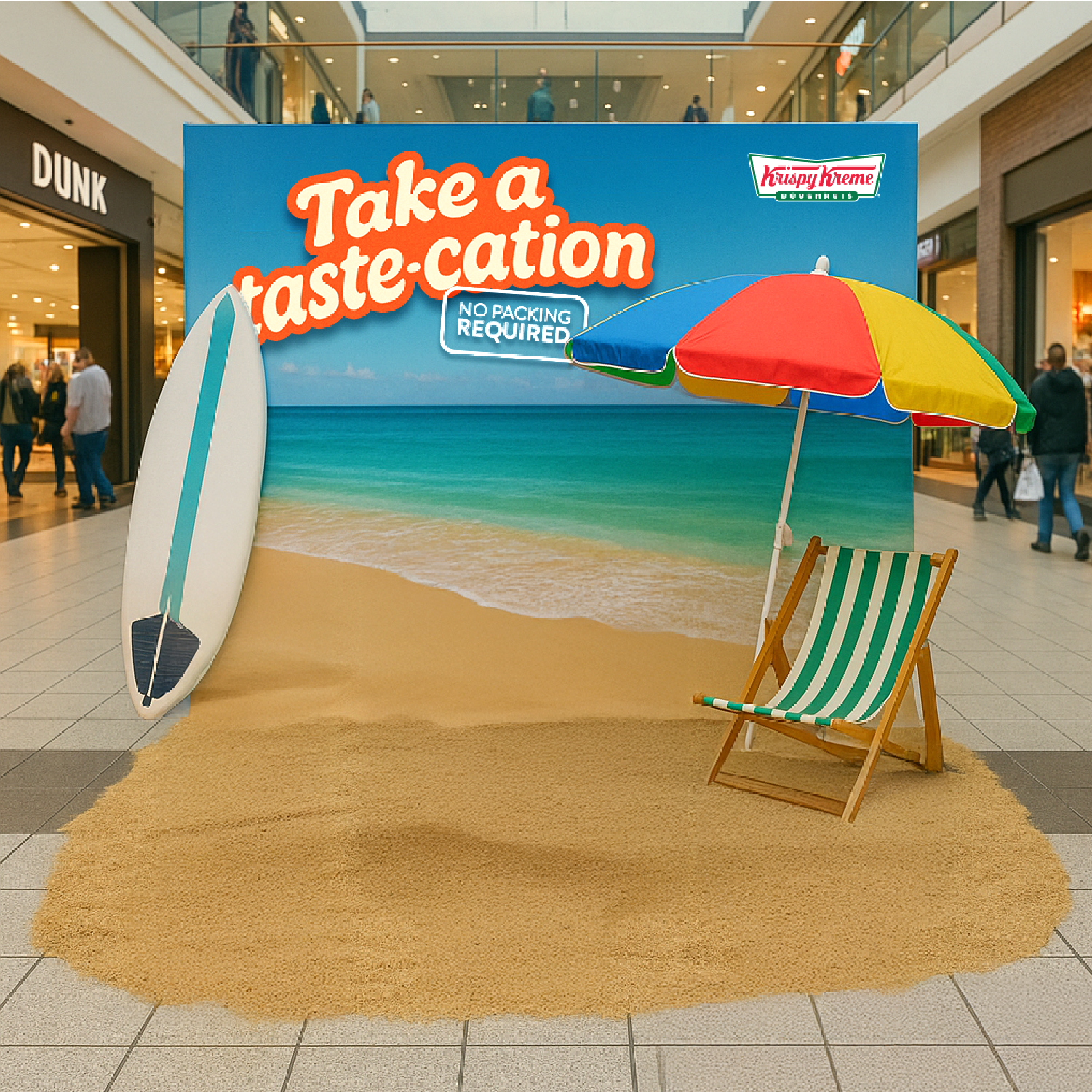
The Escape Zone concept turns the same idea into something people can physically experience, placing deckchairs, umbrellas, sand and sampling into unexpected locations such as stations, parks and shopping centres.
The contrast between those everyday spaces and the sudden holiday setting is what makes the activation work. It takes the central campaign thought beyond advertising and creates a moment people can actually step into, enjoy and share.
Extending the idea
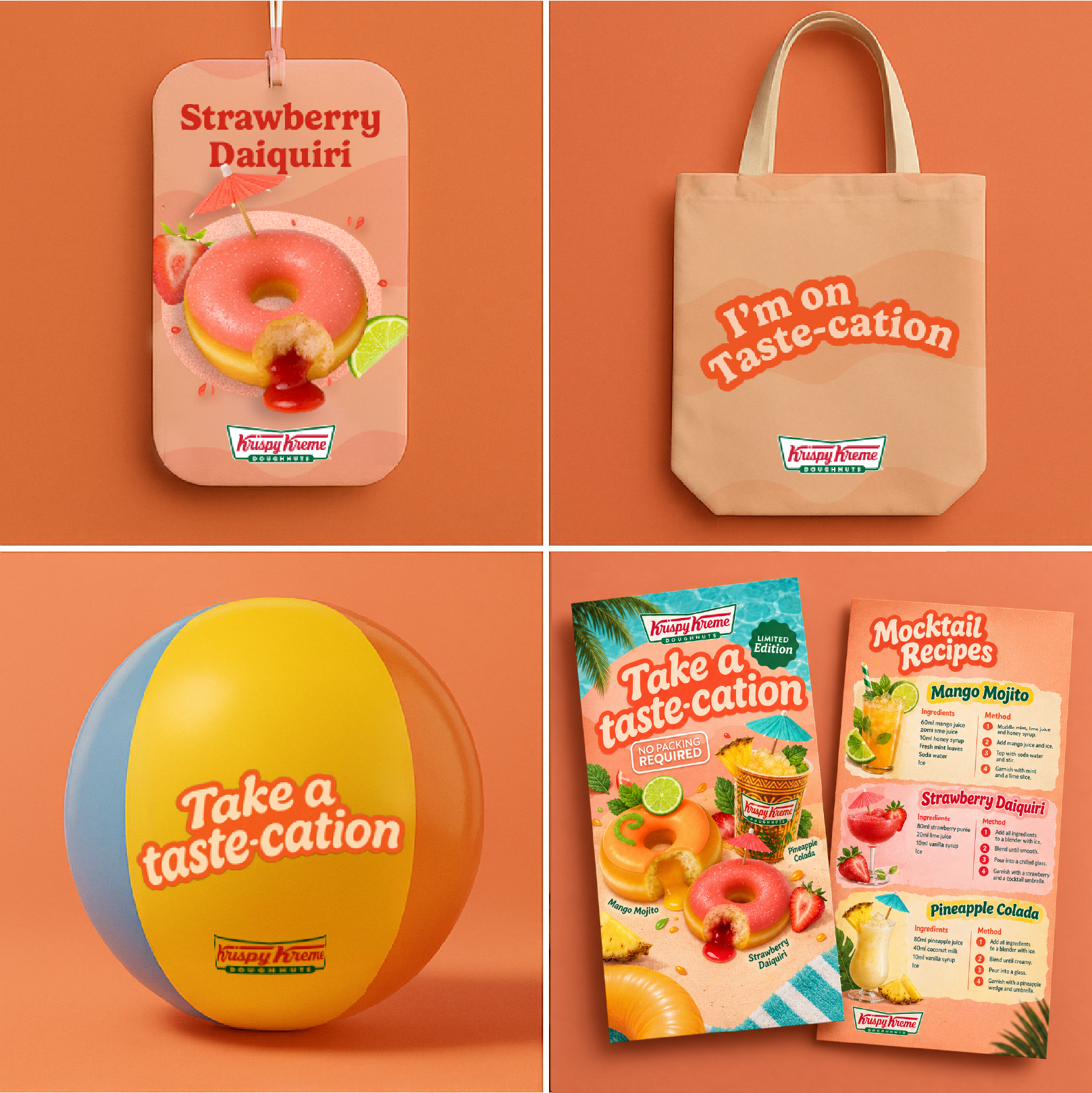
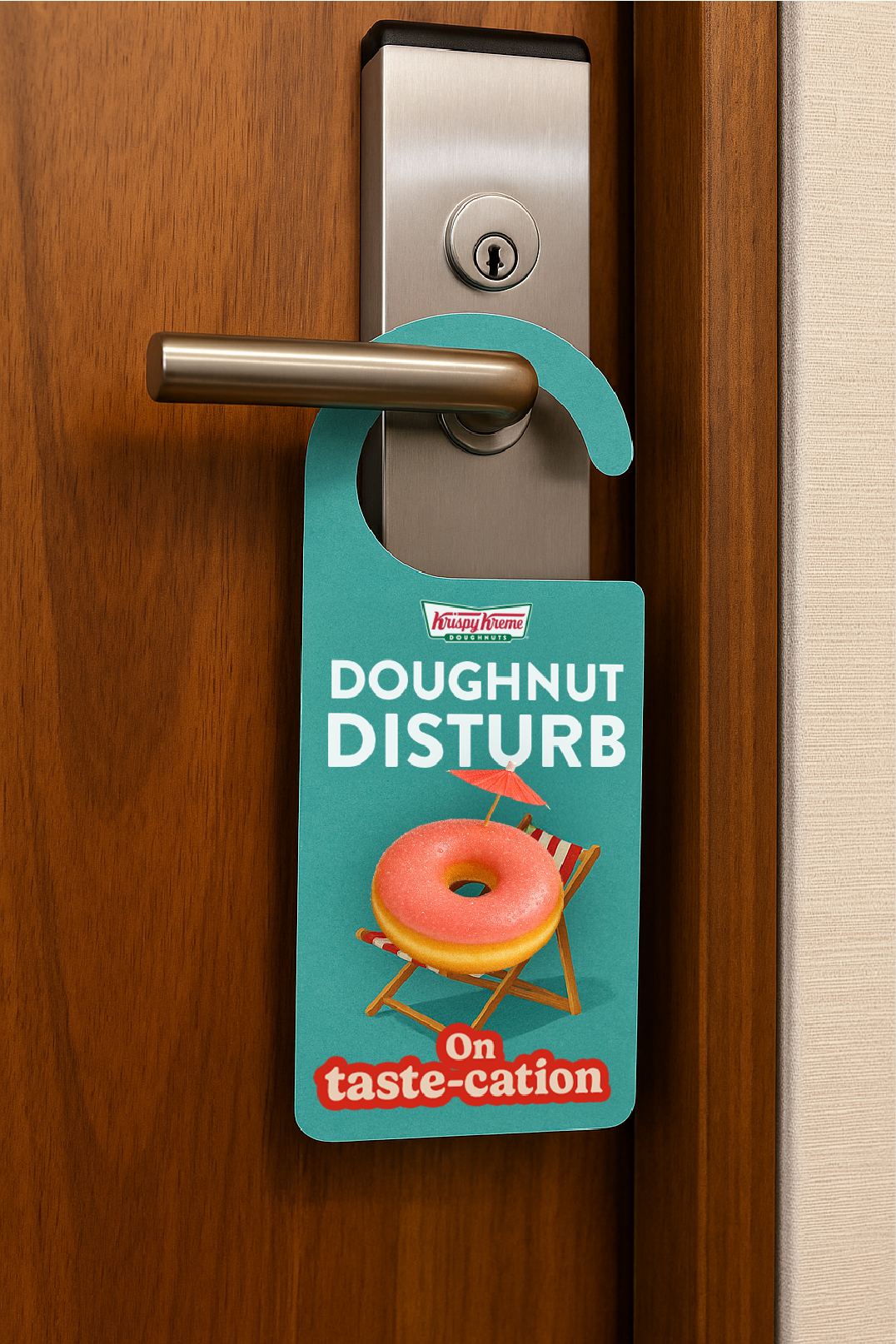
The campaign also opened up a wider set of playful extensions built around holiday rituals and the mocktail flavours, from Dough Not Disturb door hangers and scented air fresheners to recipe cards and beach-ball drops containing offers. Each takes a familiar holiday cue and gives it a Krispy Kreme twist, creating more ways for the Taste-cation idea to show up beyond traditional advertising.