
Sally Loyalty
Building a recognisable loyalty identity across retail and trade.
The Project
Sally Europe was expanding its existing Trade Card offer while introducing a new retail loyalty programme. The identity needed to build on familiar trade recognition, establish something new for retail, and work across markets, brands and channels.
-
Senior Designer
Visual identity · Creative system · 3D card treatment · Key assets · Toolkit · Animation direction
-
Brand Manager · Junior Designer
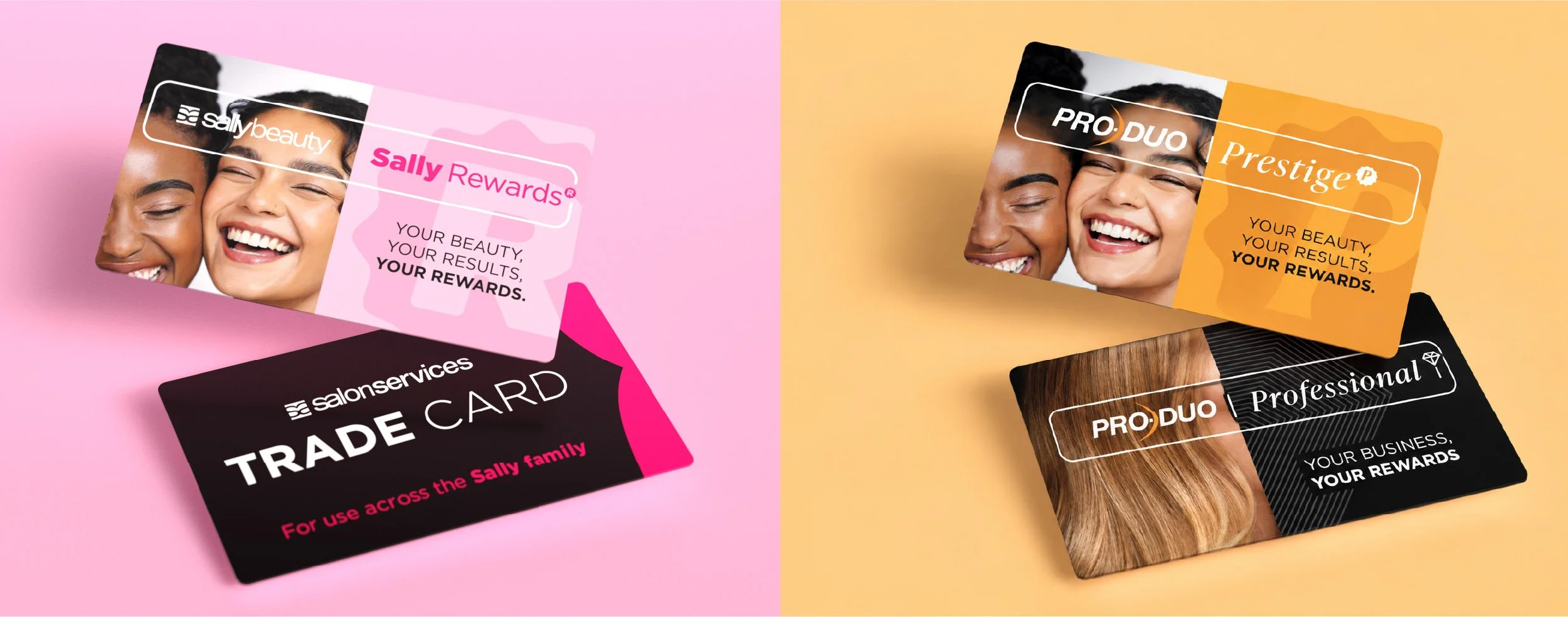
Building Recognition Beyond The Name
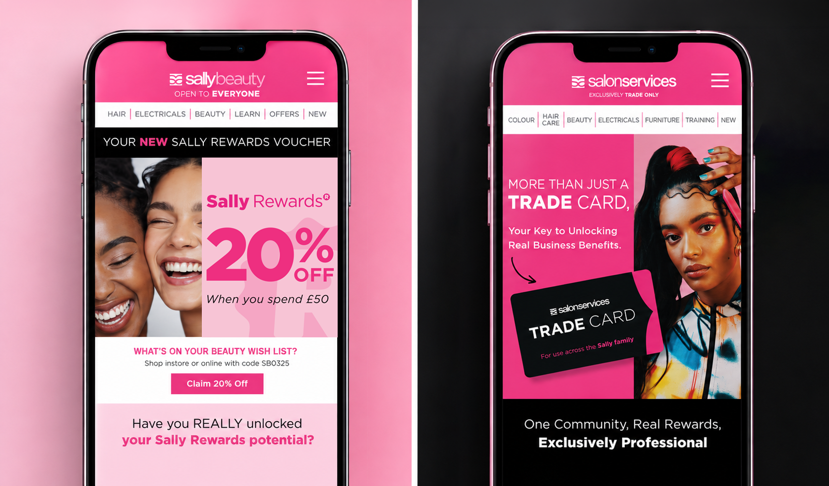
The card became one of the strongest visual anchors, particularly for trade where it already carried recognition. The floating 3D treatment gave the physical card a more contemporary presence in digital creative, while keeping something customers already knew at the centre of the identity.
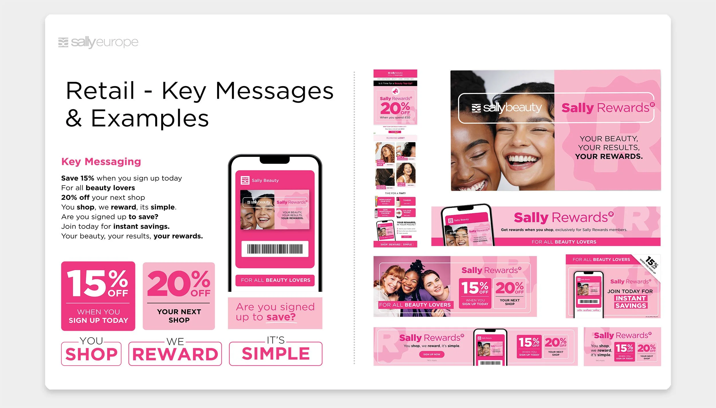
As programme naming evolved, recognition needed to come from the wider visual language too. The card, phone and larger programme graphics became repeatable cues that could carry the identity across different formats without relying on the name alone.
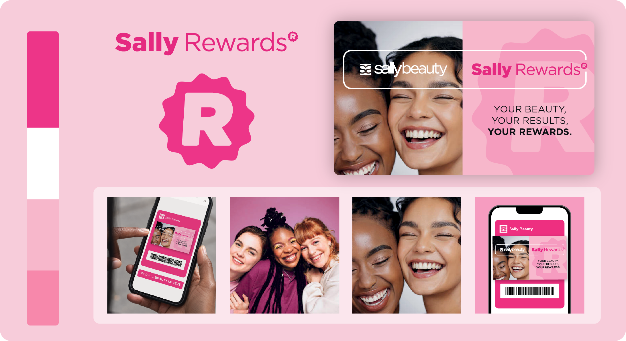
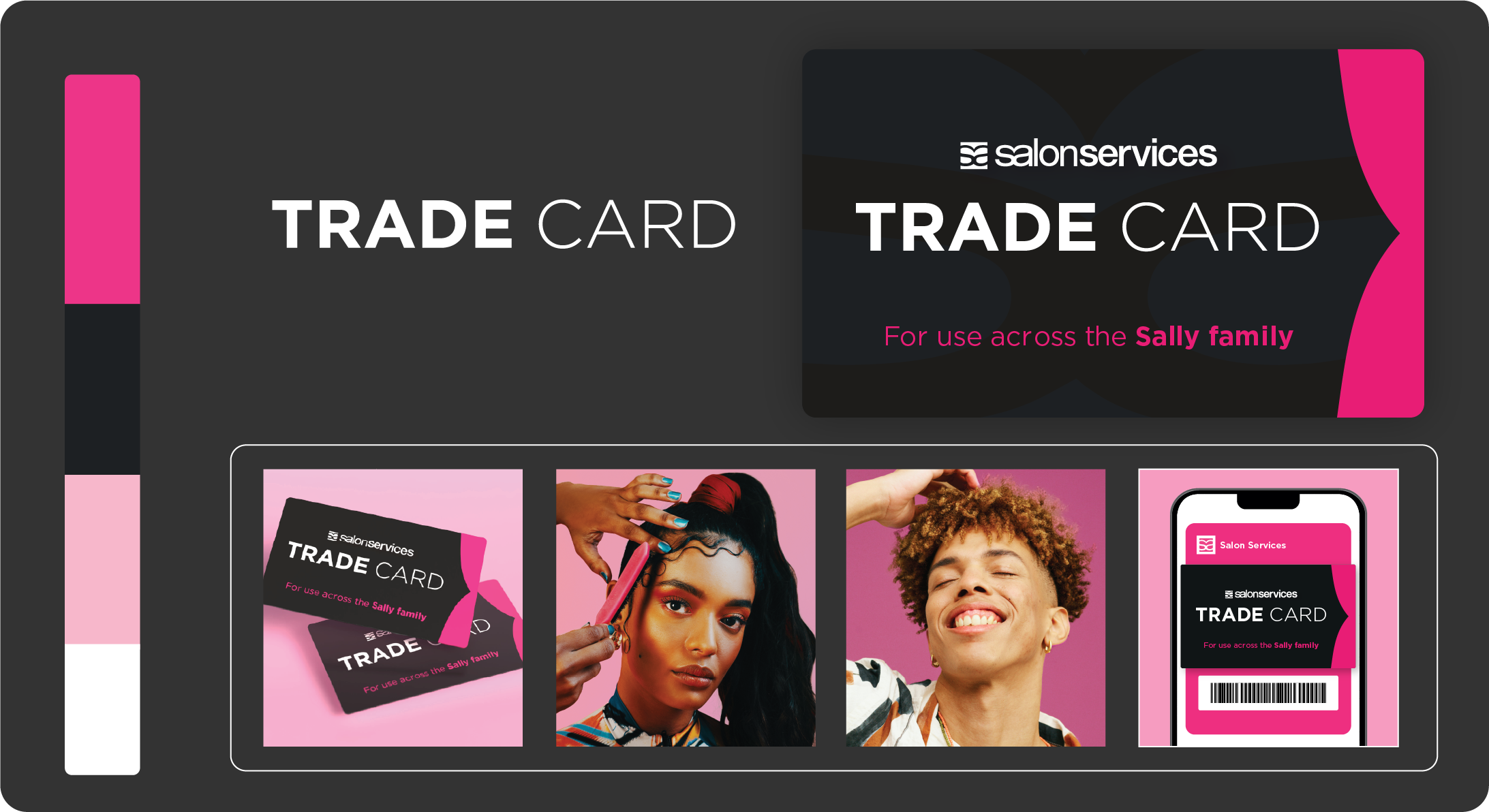
Retail And Trade, Designed Differently
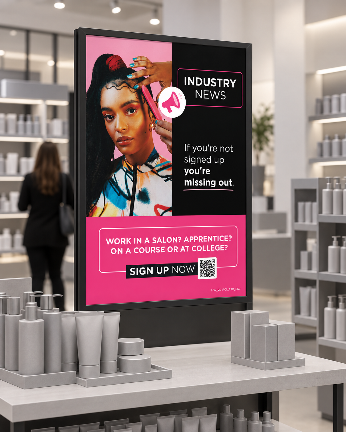
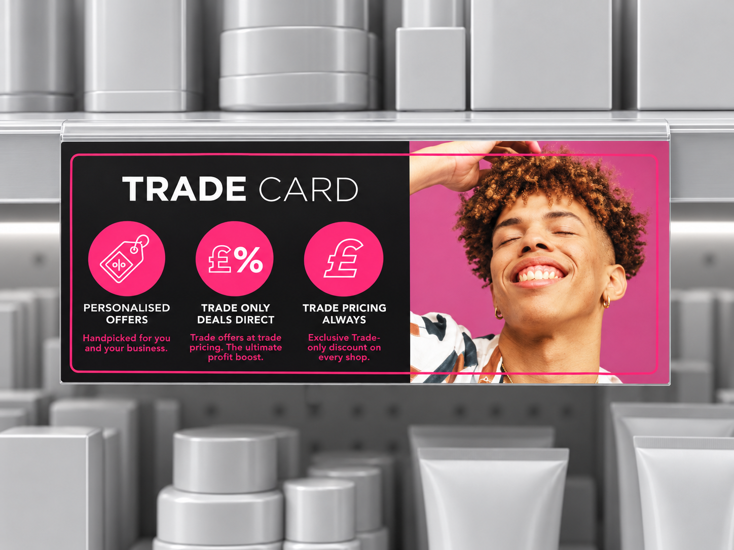
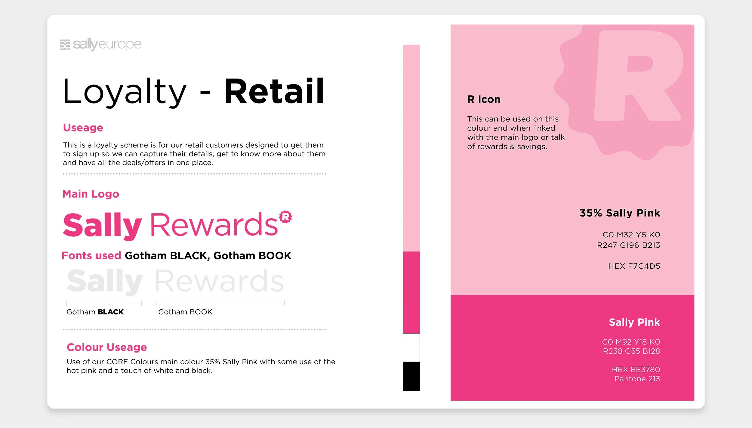
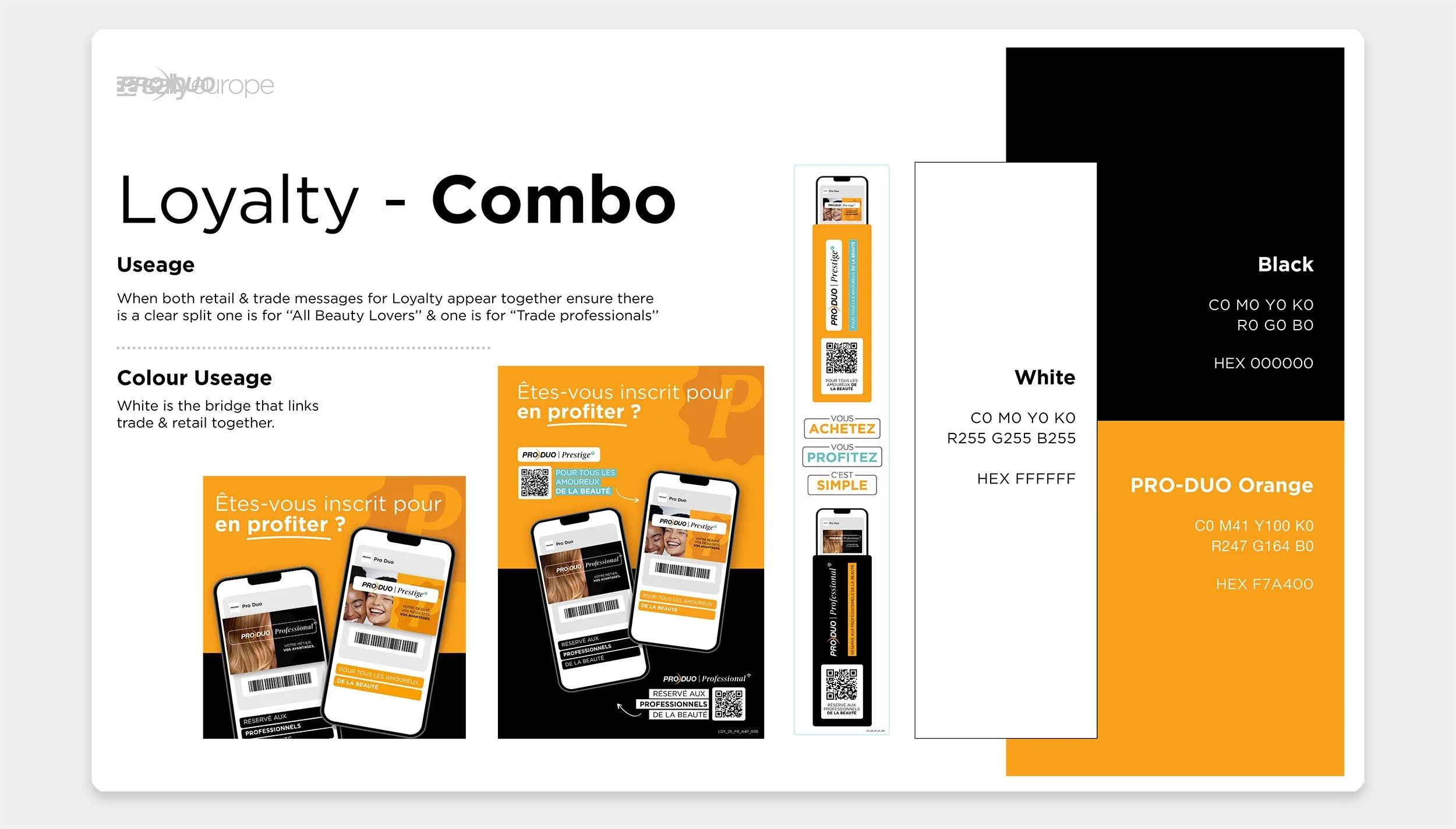
Retail and trade were deliberately given different personalities rather than treated as colour variants of the same campaign.
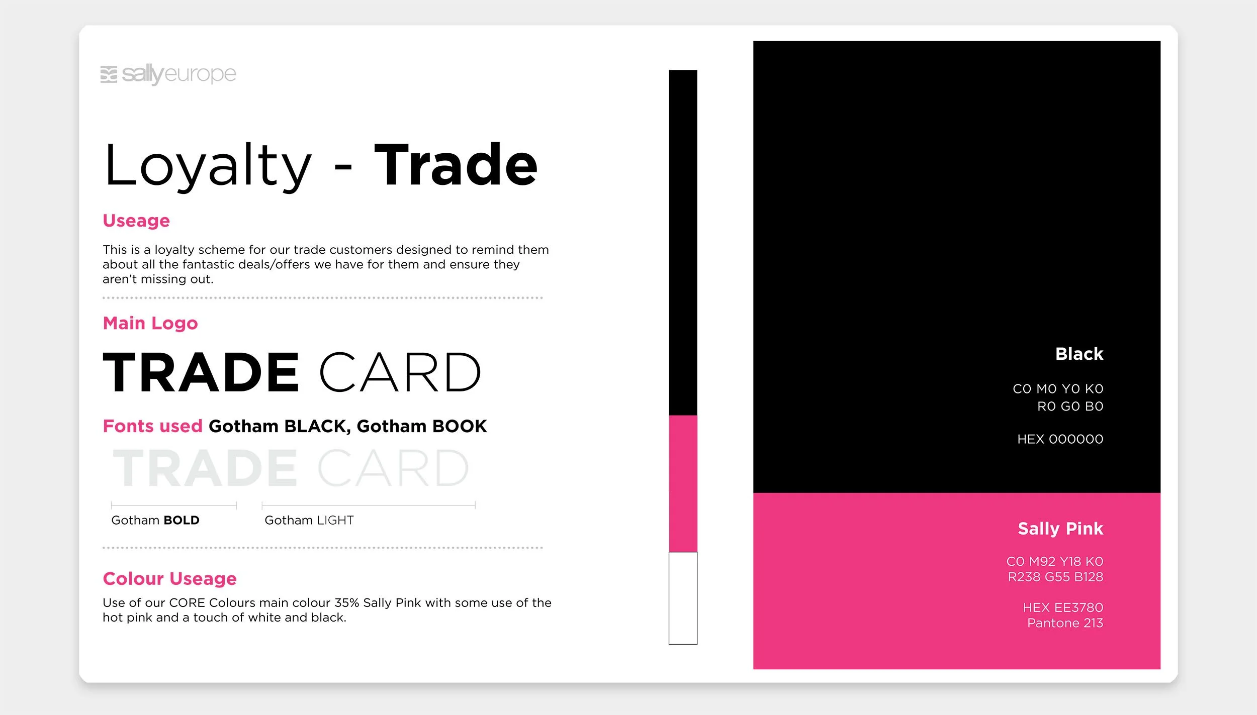
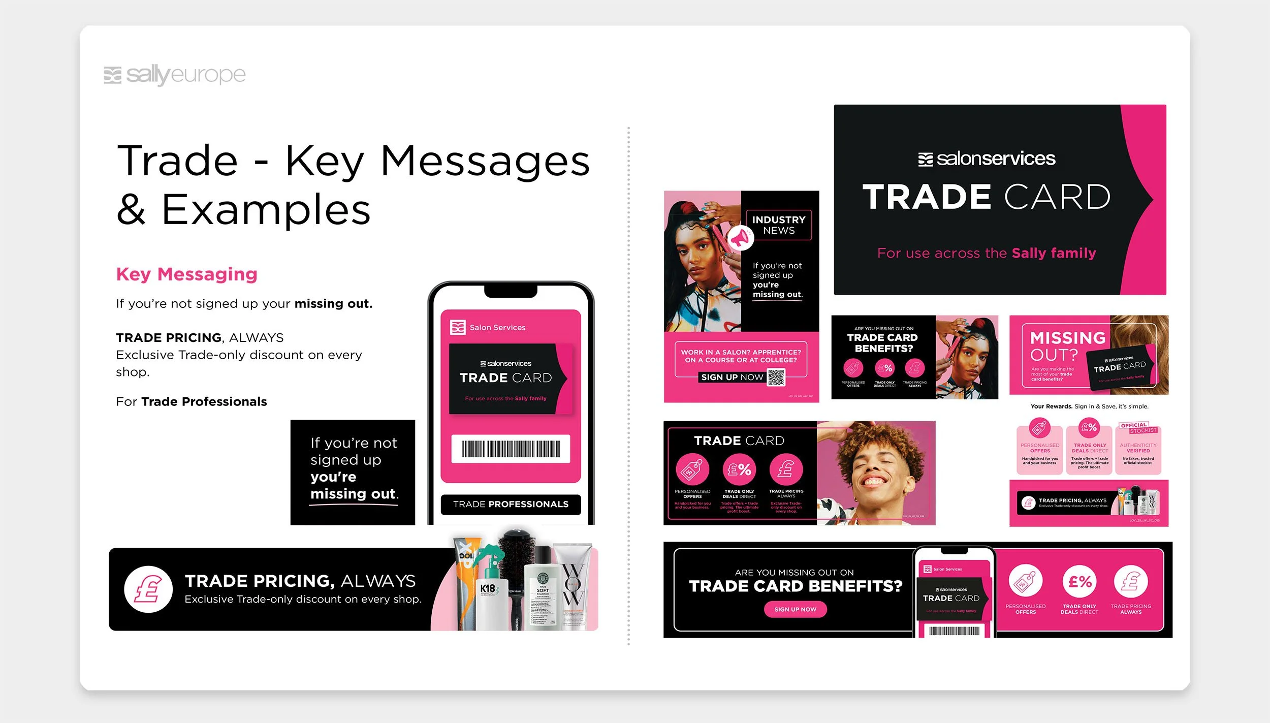
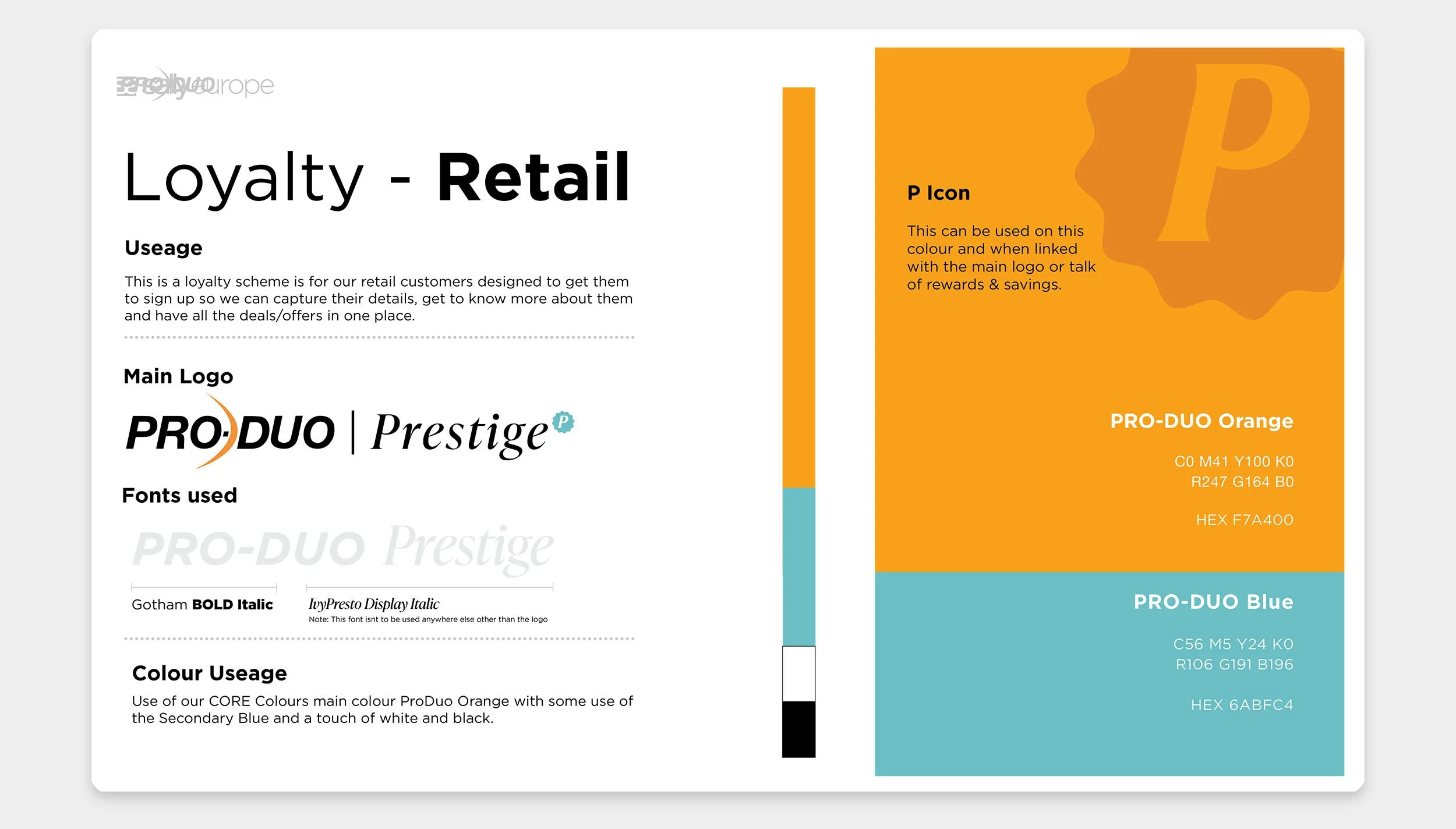
Retail is lighter and more playful, using softer typography, brighter pinks and photography built around warmth, personality and community. Trade uses stronger contrast, more black and imagery that feels aspirational within a professional beauty world.
Bringing The Two Together
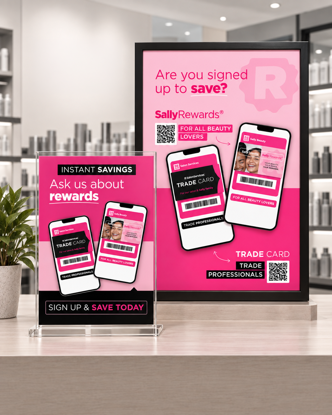
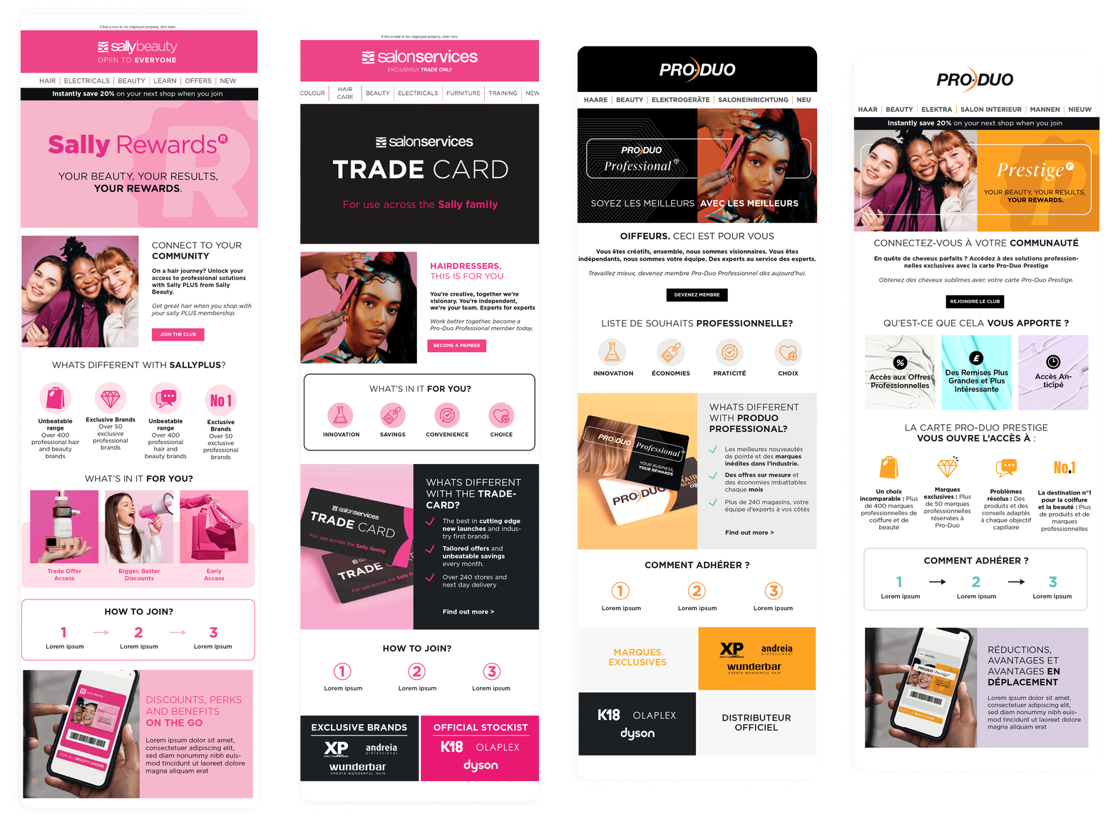
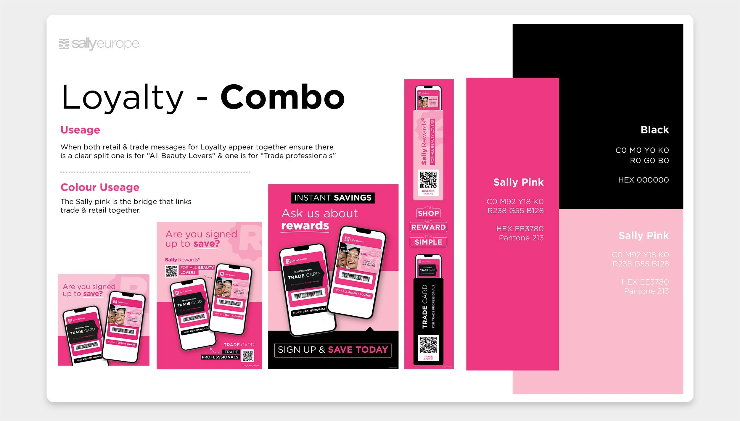
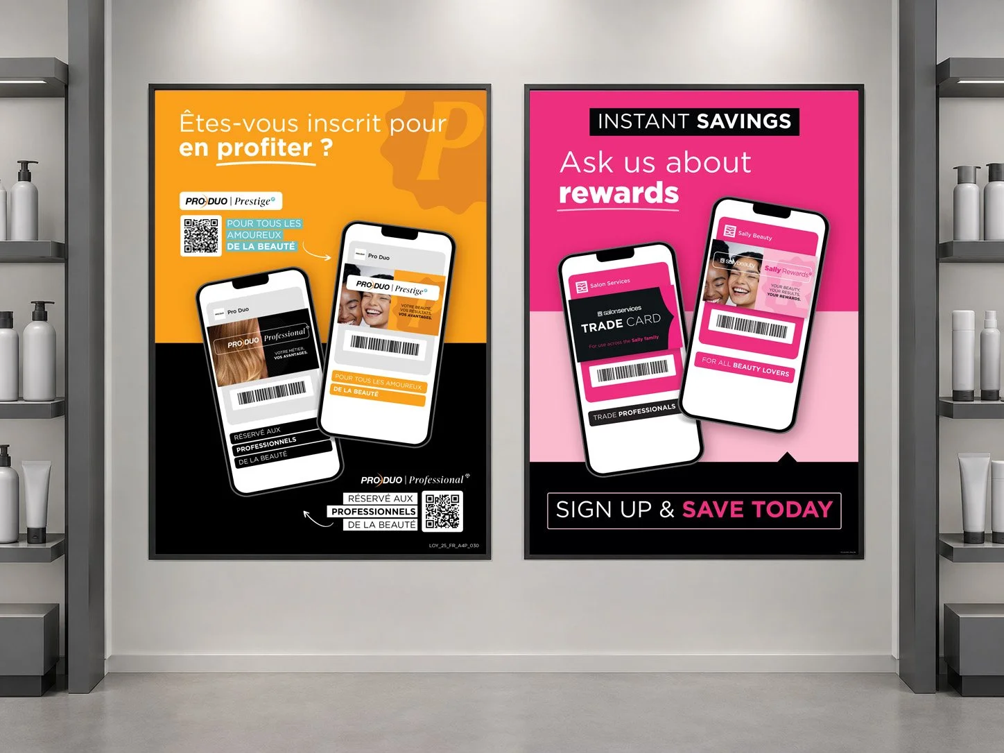
Some touchpoints needed to speak to both audiences at once. The challenge was to keep Retail and Trade clearly distinct without making them feel disconnected. Combined creative keeps the strongest cues from each programme intact, while the shared card, phone and layout structure brings them back together as one Sally loyalty offer.

A System Built To Flex
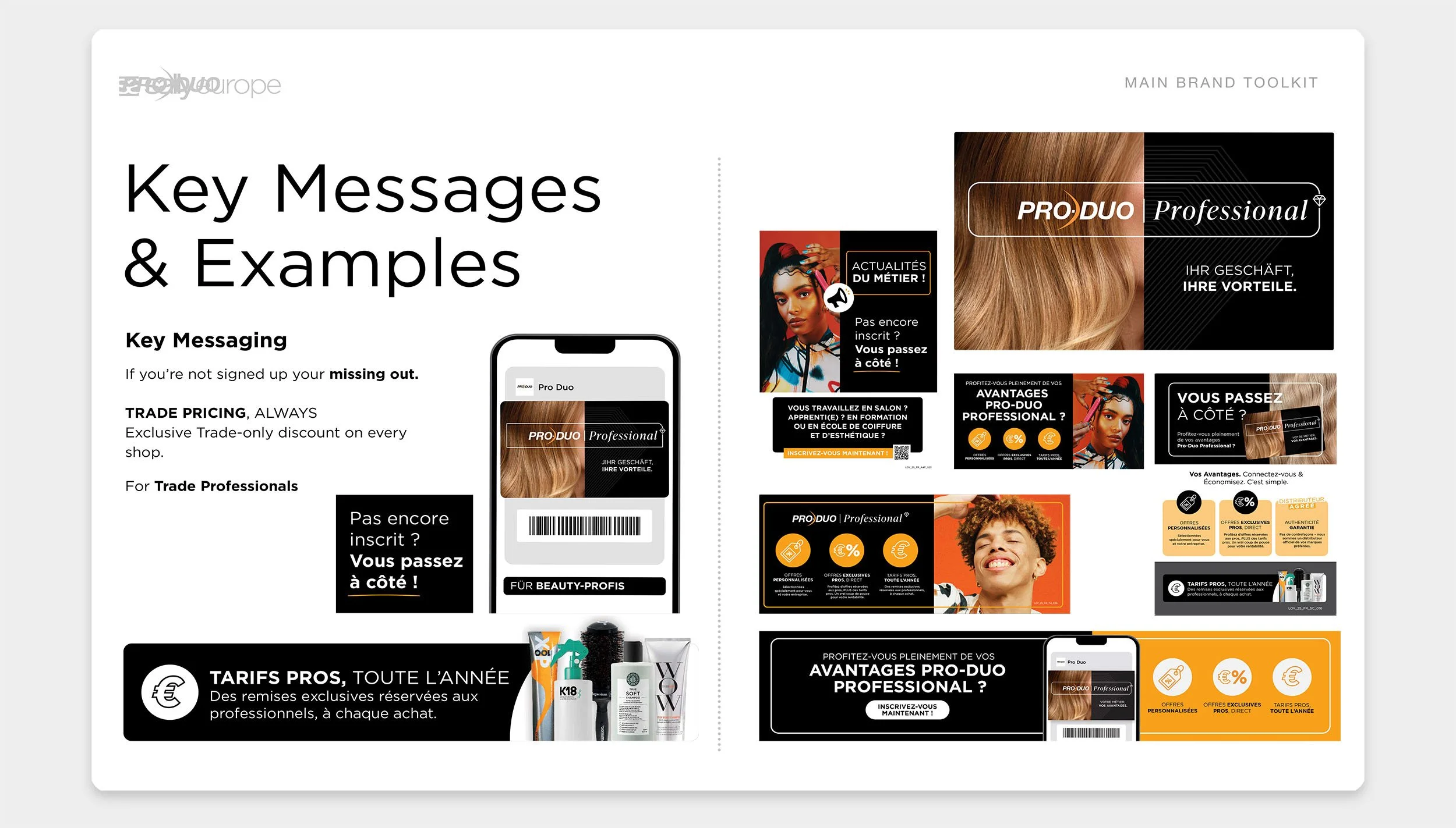
The scale of the rollout meant the work needed to function as more than a launch campaign. The visual language was built around a small number of repeatable components, including the card, phone, programme graphics, benefit messaging and photography.
Those elements could be rebalanced depending on the message, allowing the system to support everything from acquisition and rewards to ongoing member communications without every execution feeling the same.
Built Across Brands And Markets
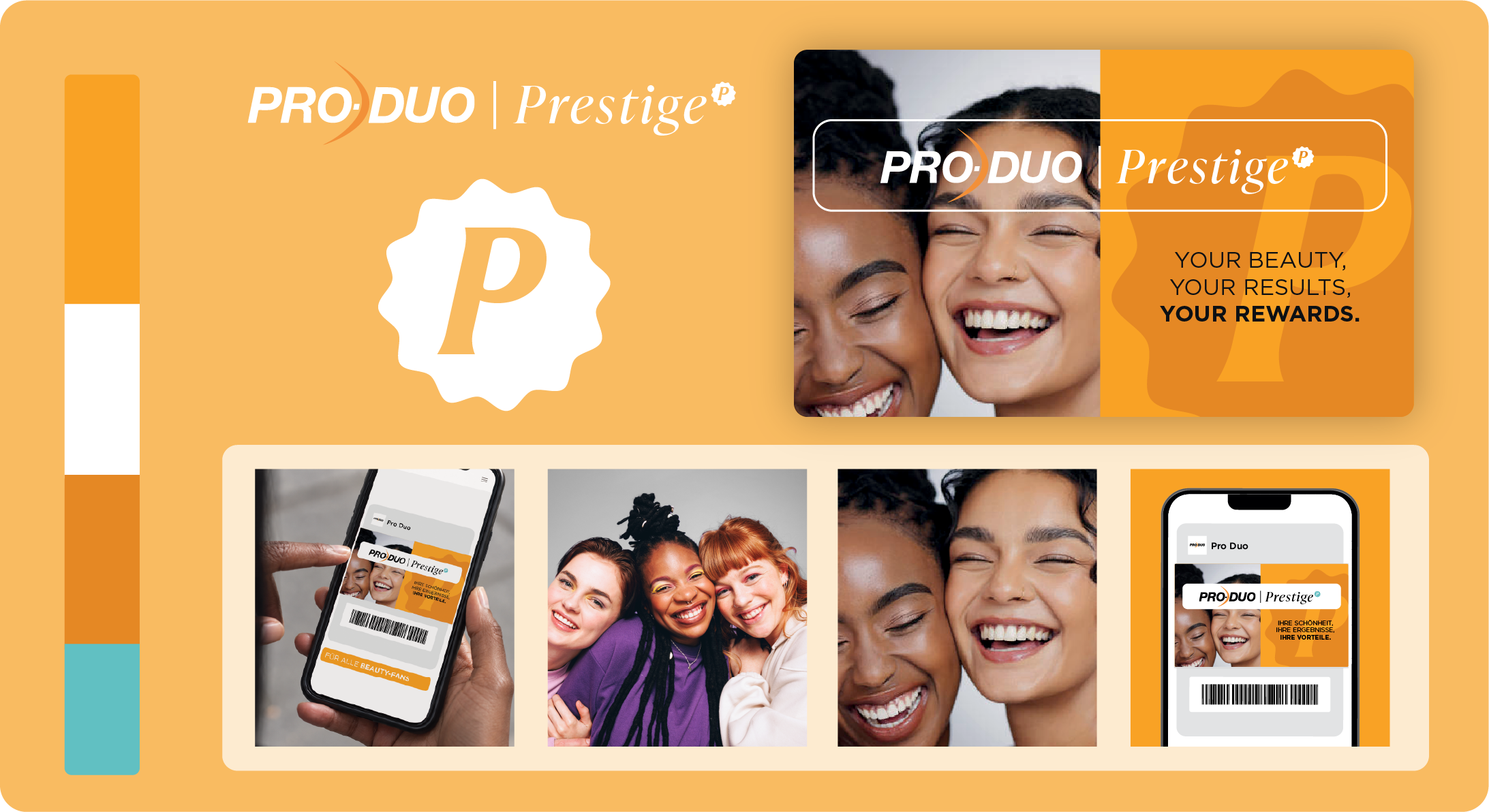
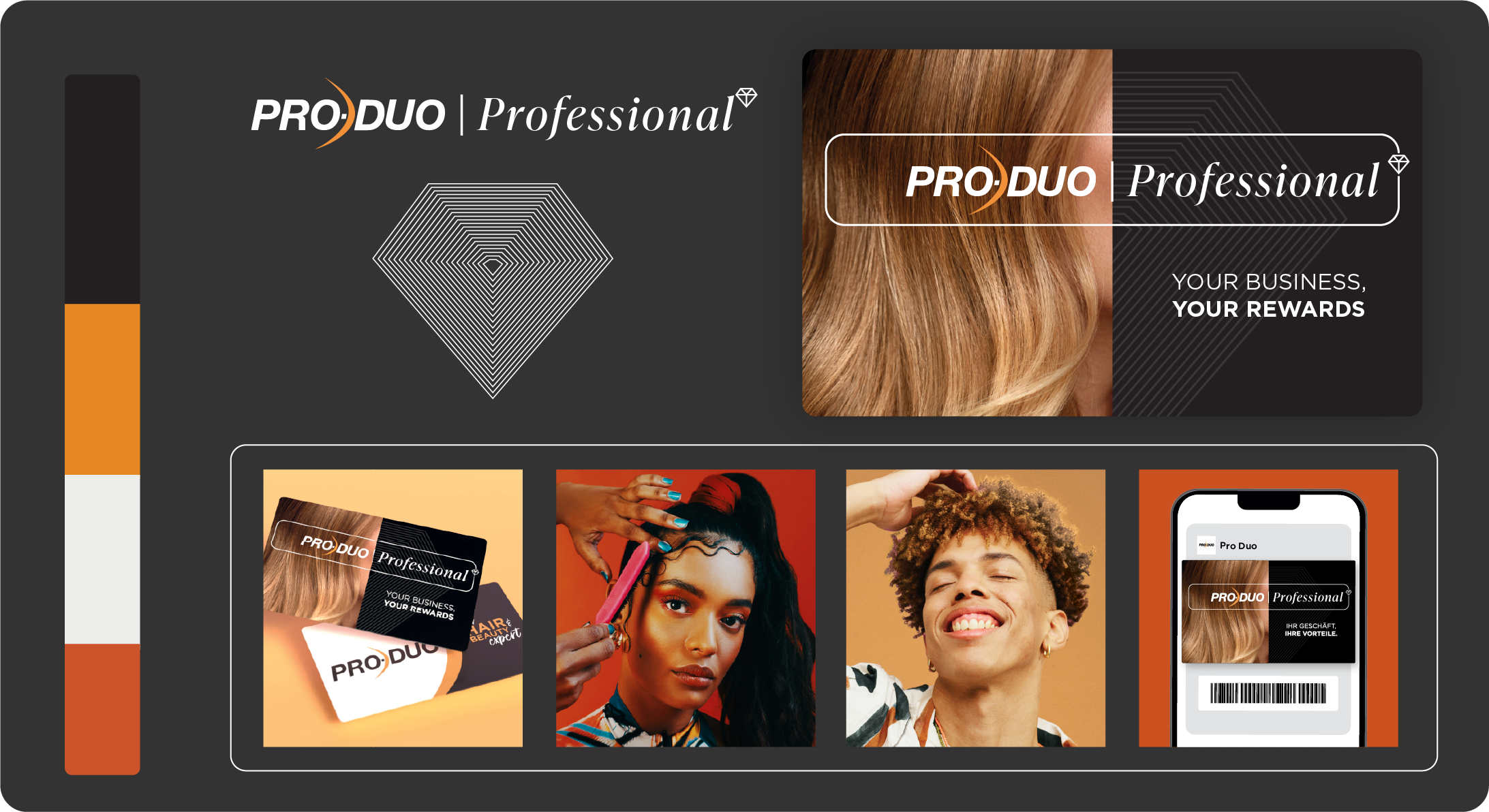
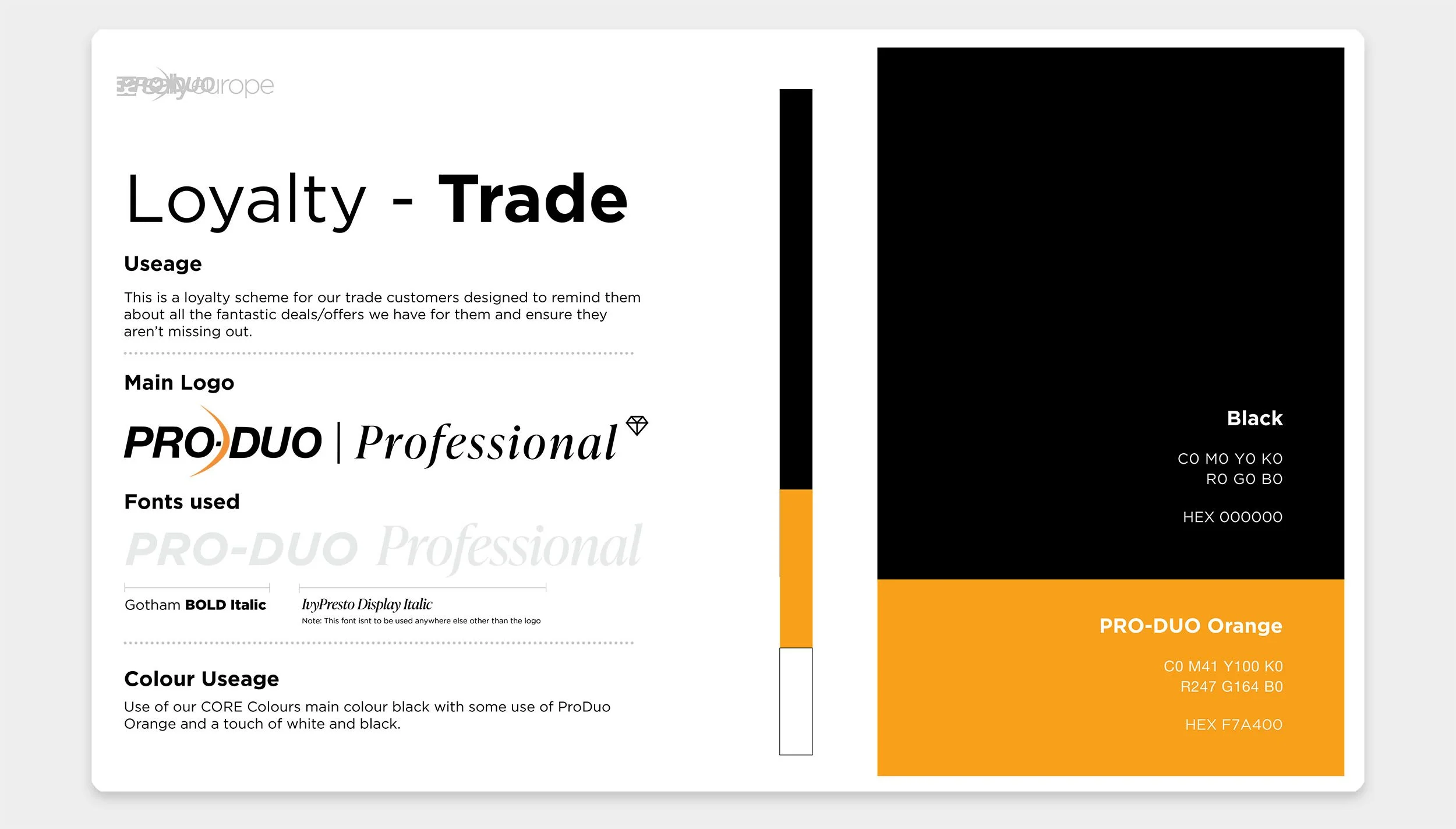
The system was developed across Sally and ProDuo from the start, with retail and professional audiences needing to feel distinct within each brand.
The same underlying principles carry through Sally Rewards, Trade Card, ProDuo Prestige and ProDuo Professional, while colour, typography, photography and brand cues shift around them. This gave each programme its own character while keeping enough shared structure for the wider loyalty system to feel connected across markets and languages.