Imbue
It’s not a trend, it’s a movement.
Creating a curl care brand that balances defiance with conscience.
The Project
Imbue was created in response to a shift in how people were thinking about curly hair, with more people choosing to embrace and understand their natural curl patterns.
It was a growing category, but one still shaped by heritage and loyalty. For something new to earn its place, it needed more than products that performed. It needed a clear point of view and values people could genuinely connect with.
Imbue combined performance with a simpler approach to curl care, building a progressive brand around confidence, individuality and community.
-
I led the visual development of Imbue from the early identity and packaging through to launch and wider brand application.
Visual identity · Packaging · Brand system · Campaign creative · Art direction · Illustration & graphic assets · Brand guidelines · Motion & video · Photography
-
Rebecca Harris, Toni Paine, Amy Miles, Charlotte Heyes, Heather Hamilton, Tapestry Photography Studio
Packaging & identity
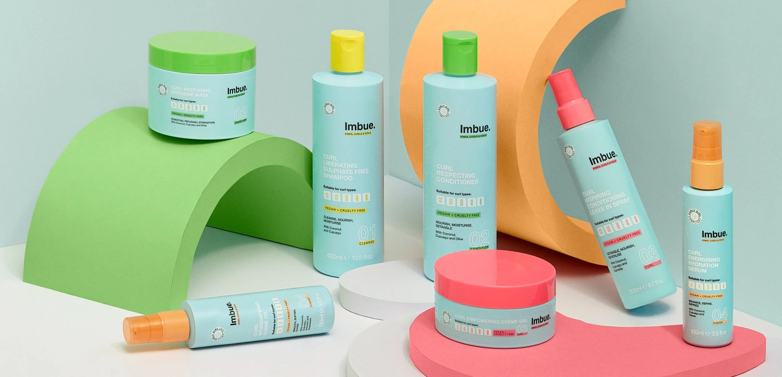
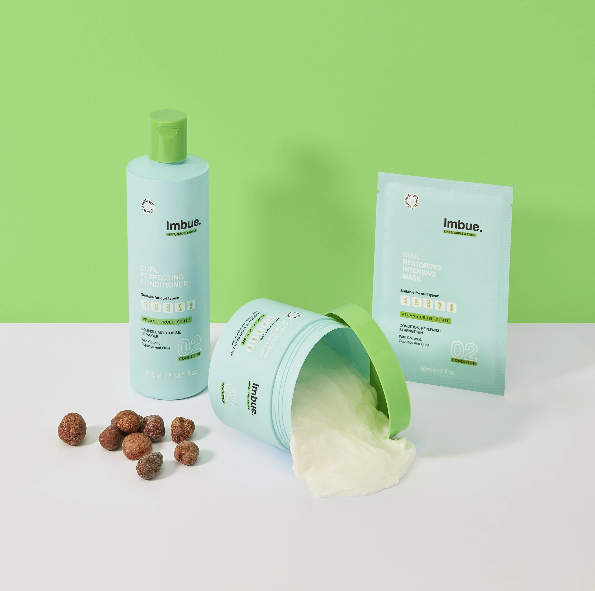
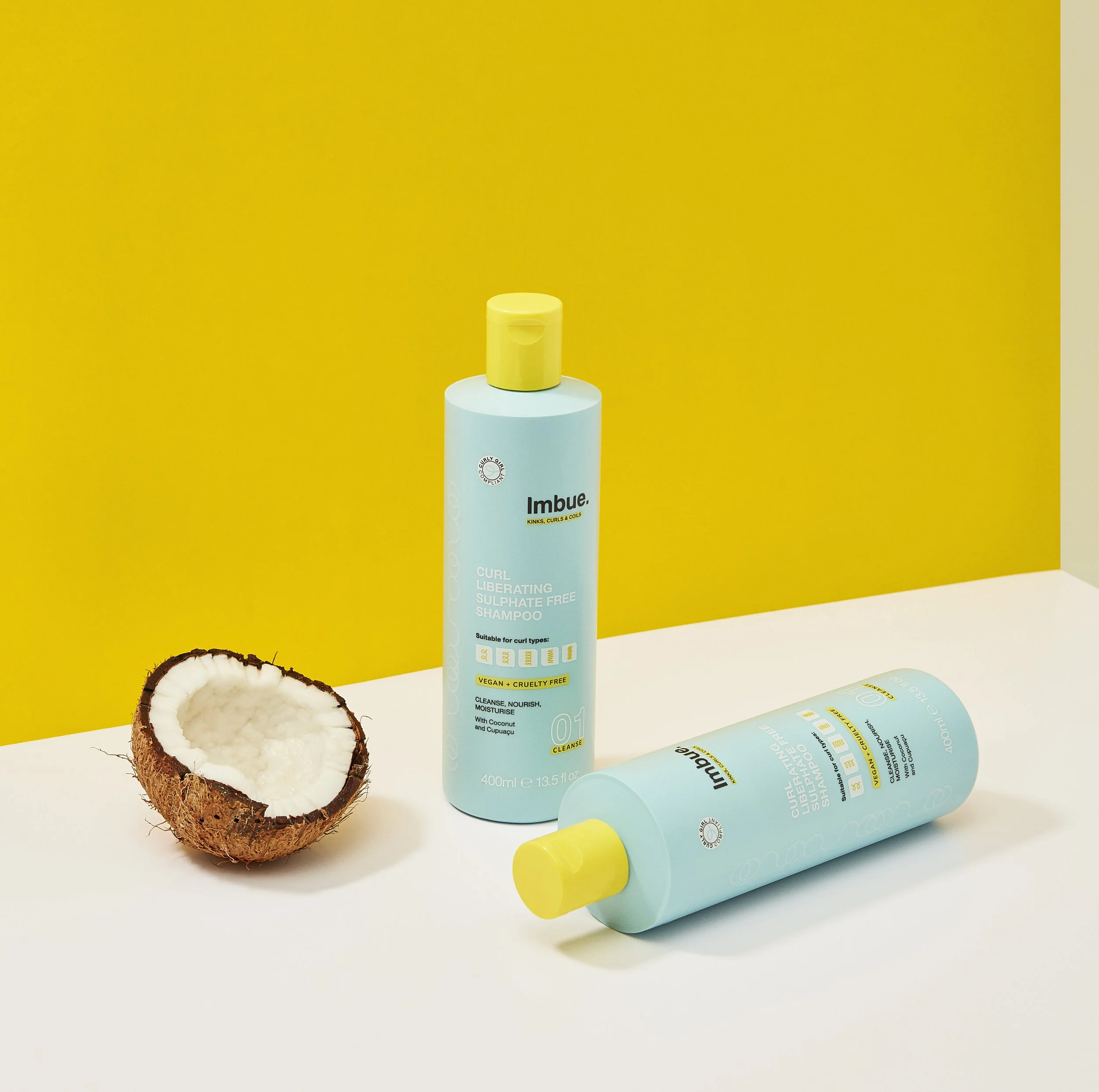
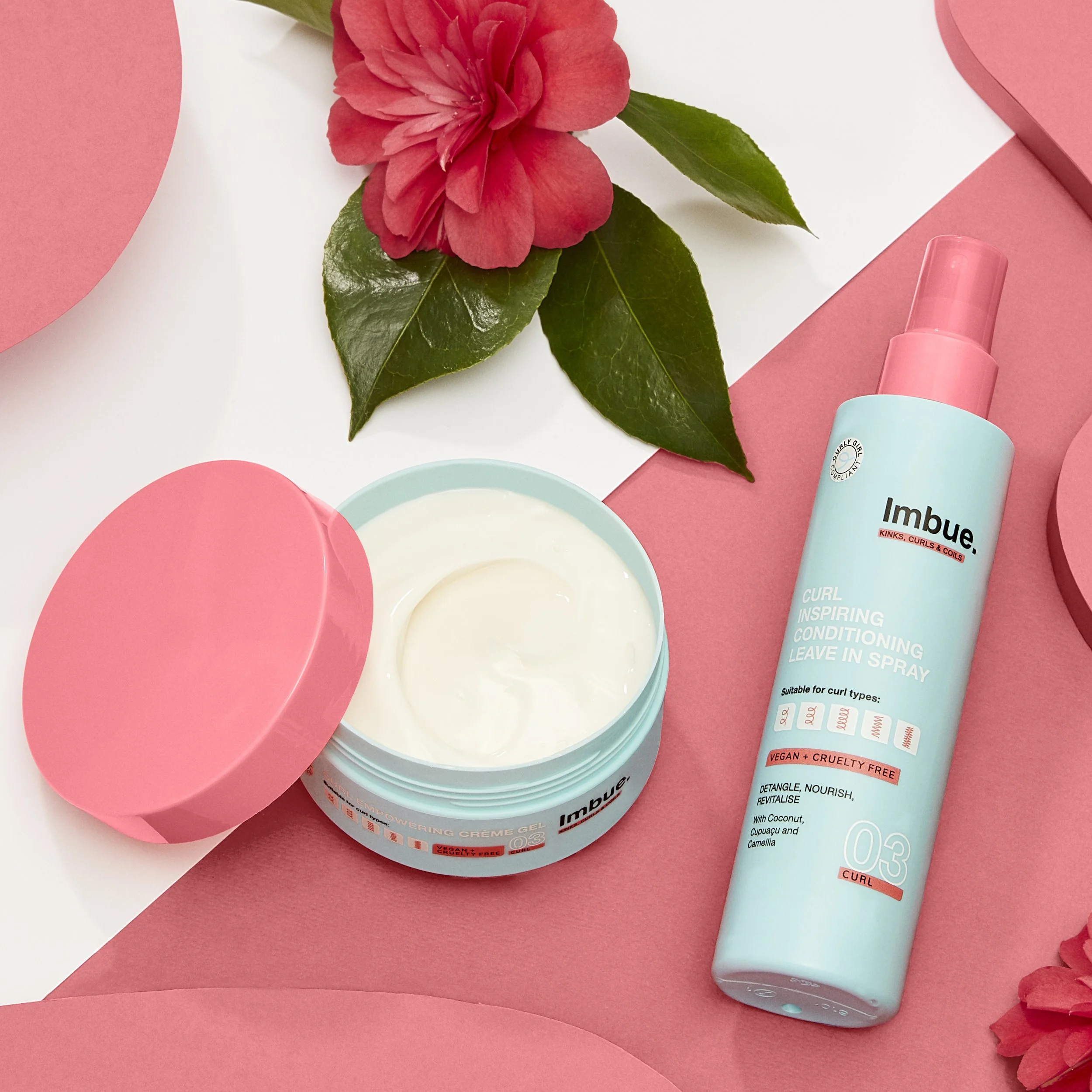
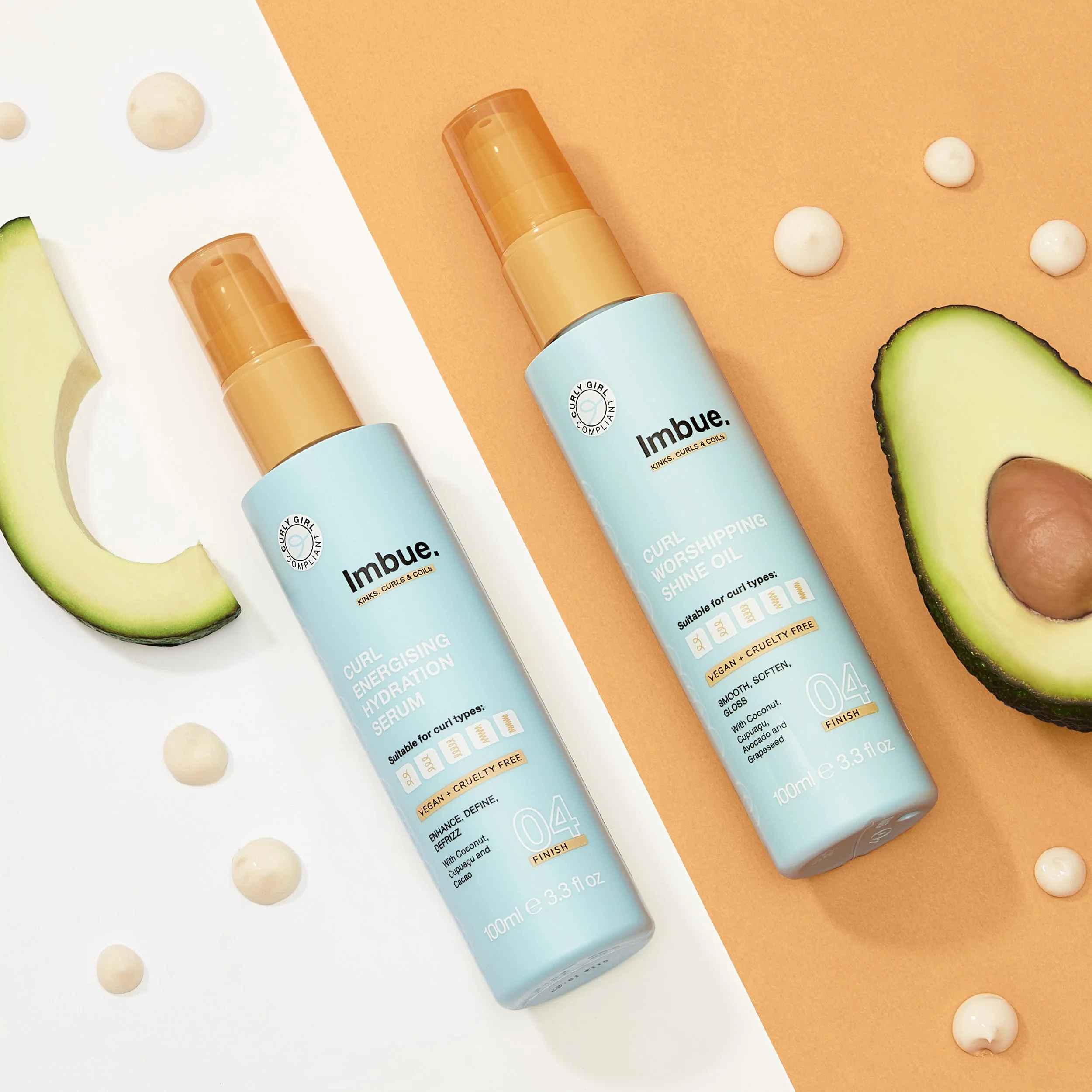
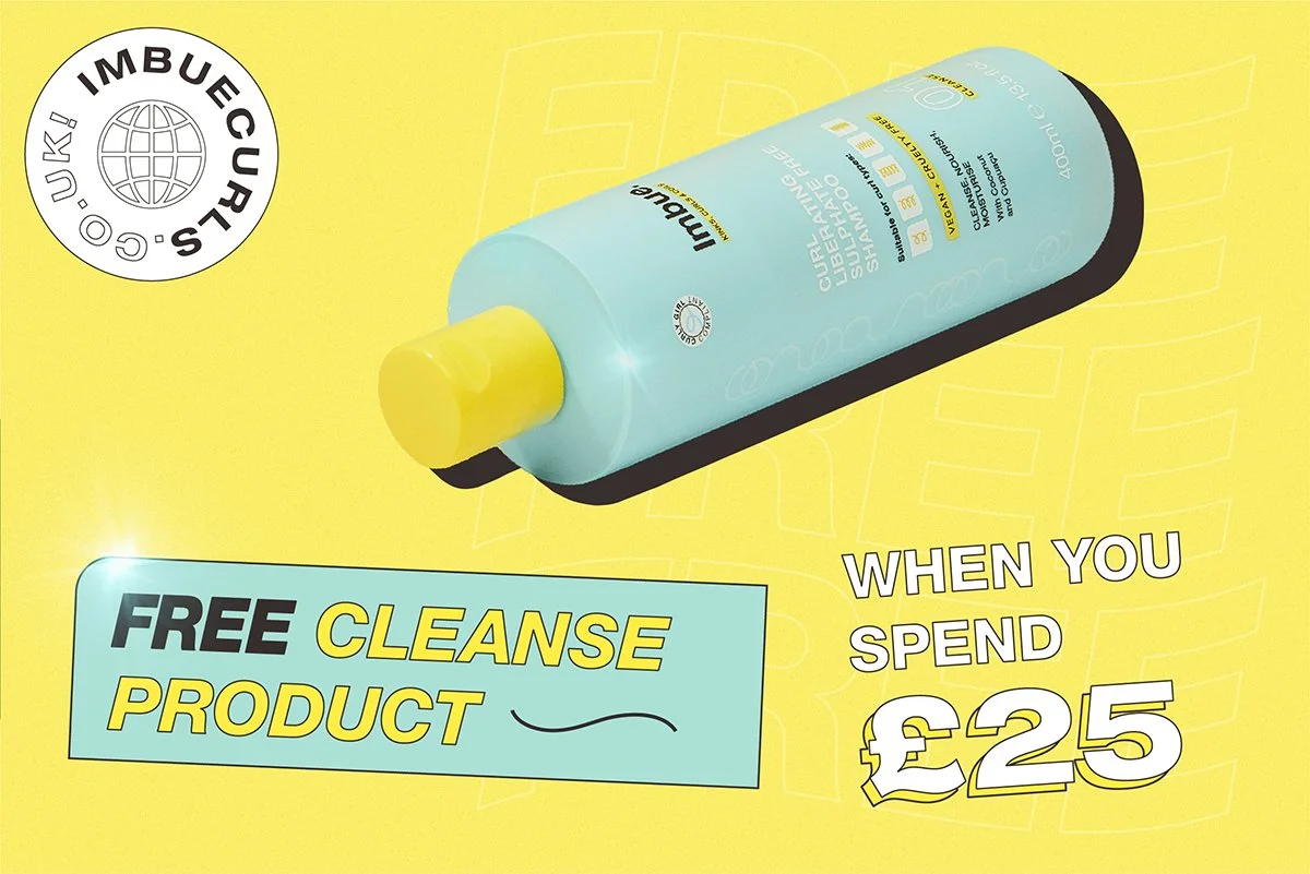
The packaging and colour palette became the visual anchor for Imbue.
Early concepts explored more familiar category colours before moving towards a calming aqua with bright, ingredient-inspired accents. The combination felt optimistic and distinctive on shelf, while still connecting back to the natural ingredients at the heart of the products.
That aqua became a thread through the wider identity, linking the physical products to everything around them.
Reproducing such a vibrant colour consistently on 100% recycled plastic took extensive testing and close work with packaging suppliers before production.
Developing the direction
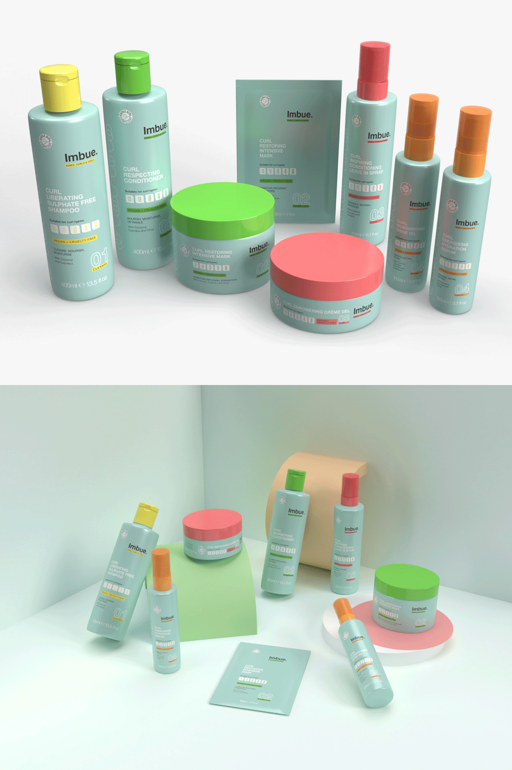
3D visualisation helped make the early identity more tangible and gave internal teams a clearer sense of how the packaging, colour and graphic language could come together.
I also used it to explore composition, lighting and colour for launch photography before moving into production, giving the final shoot a much clearer visual starting point.
Launching through community
The original launch plans changed significantly when Covid hit. What initially felt like a major limitation ended up pushing the campaign closer to something already central to Imbue: its community.
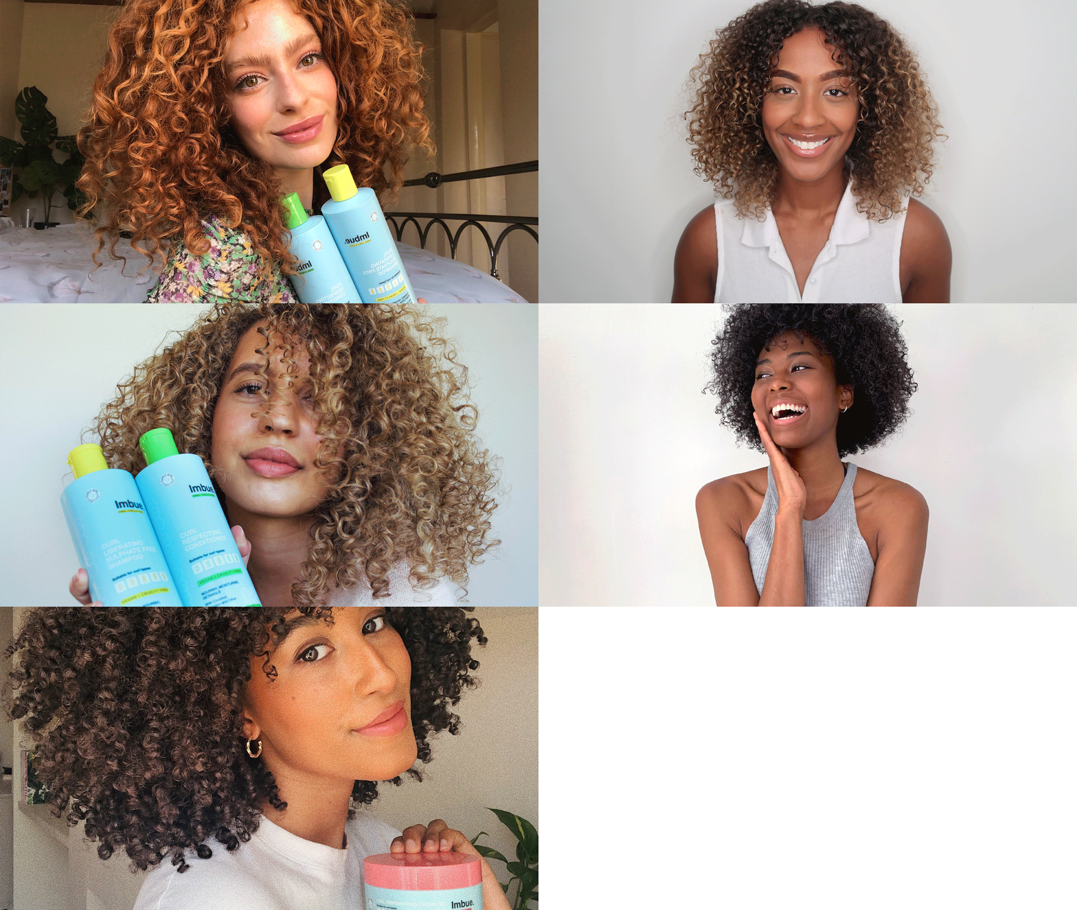
With traditional production disrupted, launch imagery was sourced directly from people with their own curl journeys. Rather than feeling like a compromise, it gave the campaign a more honest and relatable voice, putting real people and real curls at the centre of the brand.

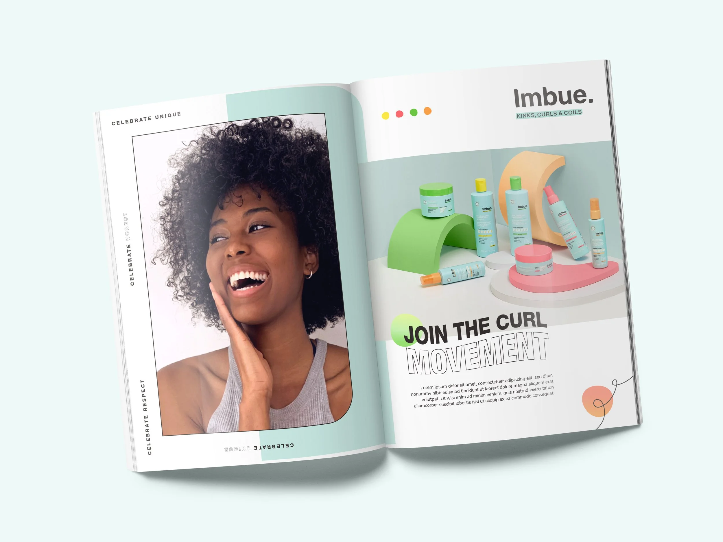
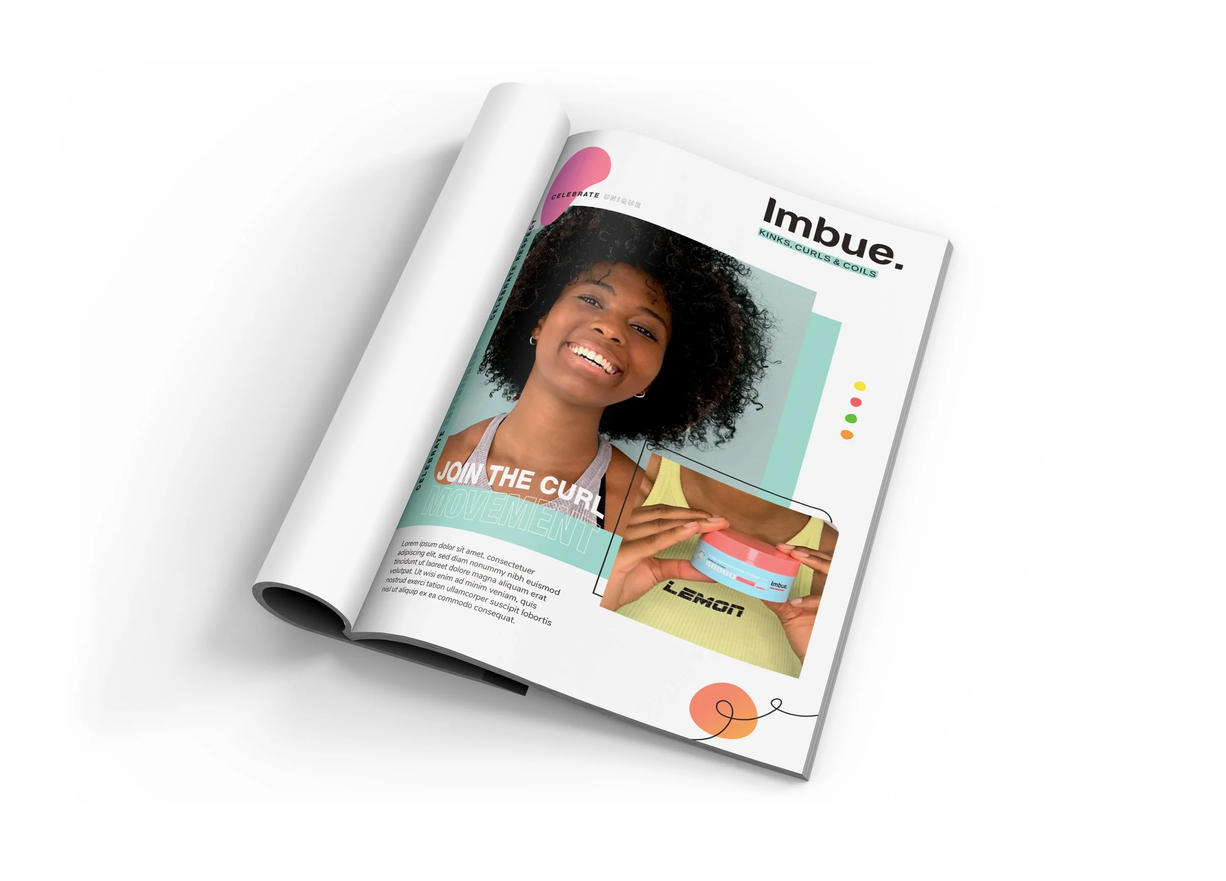
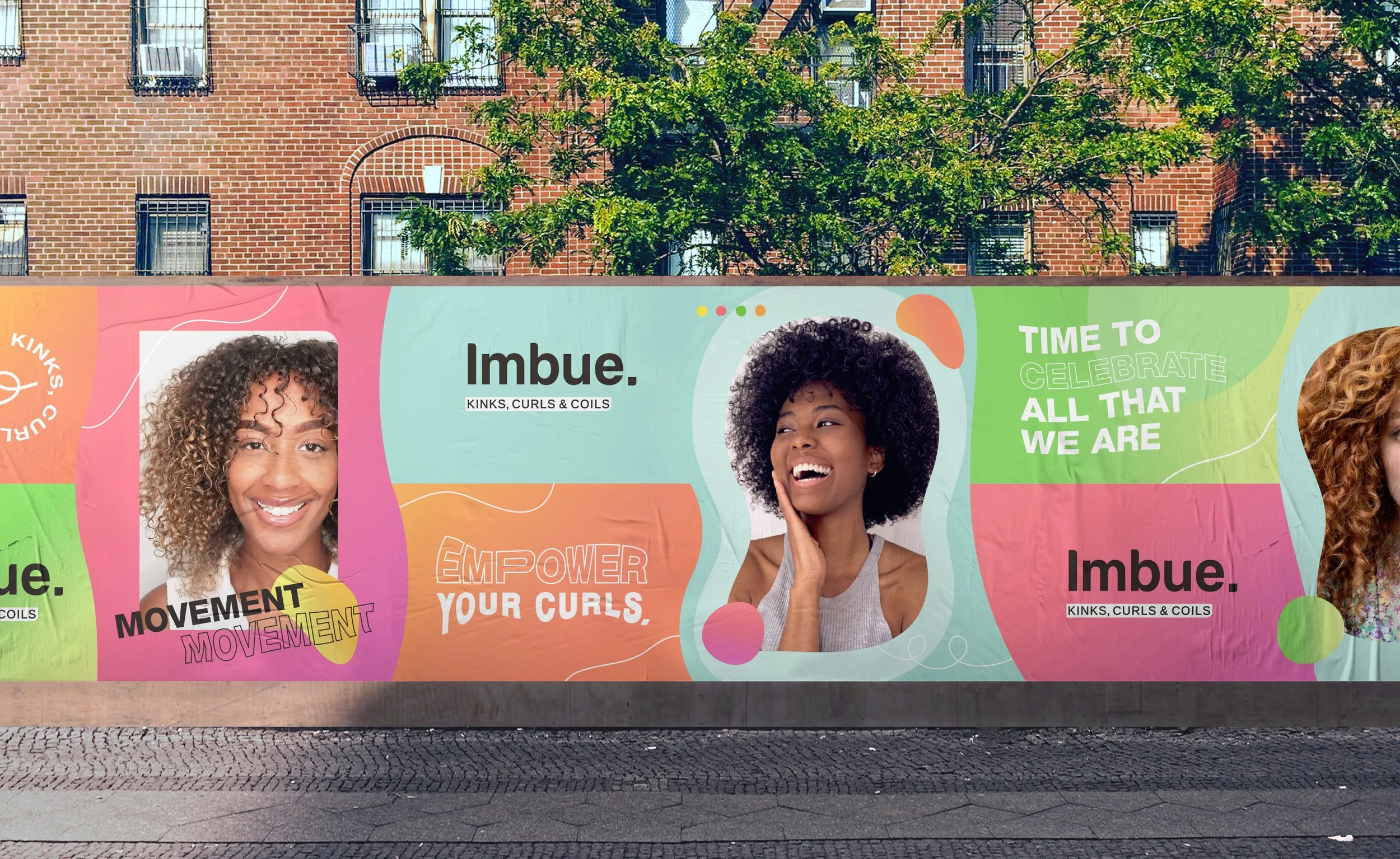
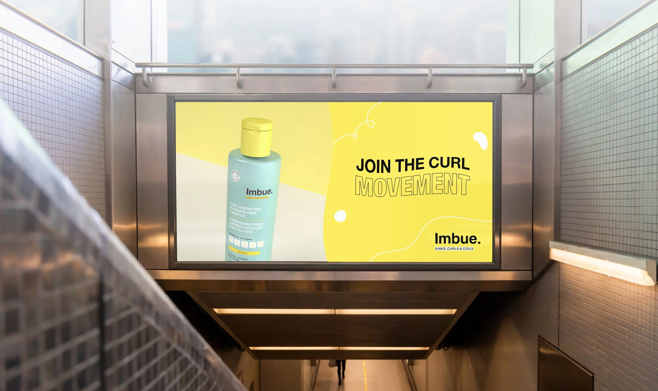
Join the curl movement. We are here to fill your journey with empowerment, positivity, and guidance.
The campaign was intentionally upbeat, celebrating the individuality of curls rather than presenting one idea of what they should look like.
Shapes, illustration and expressive typography take their cues from curl patterns themselves. Elements twist, overlap and shift, embracing movement and deliberately avoiding uniformity.
Guidelines
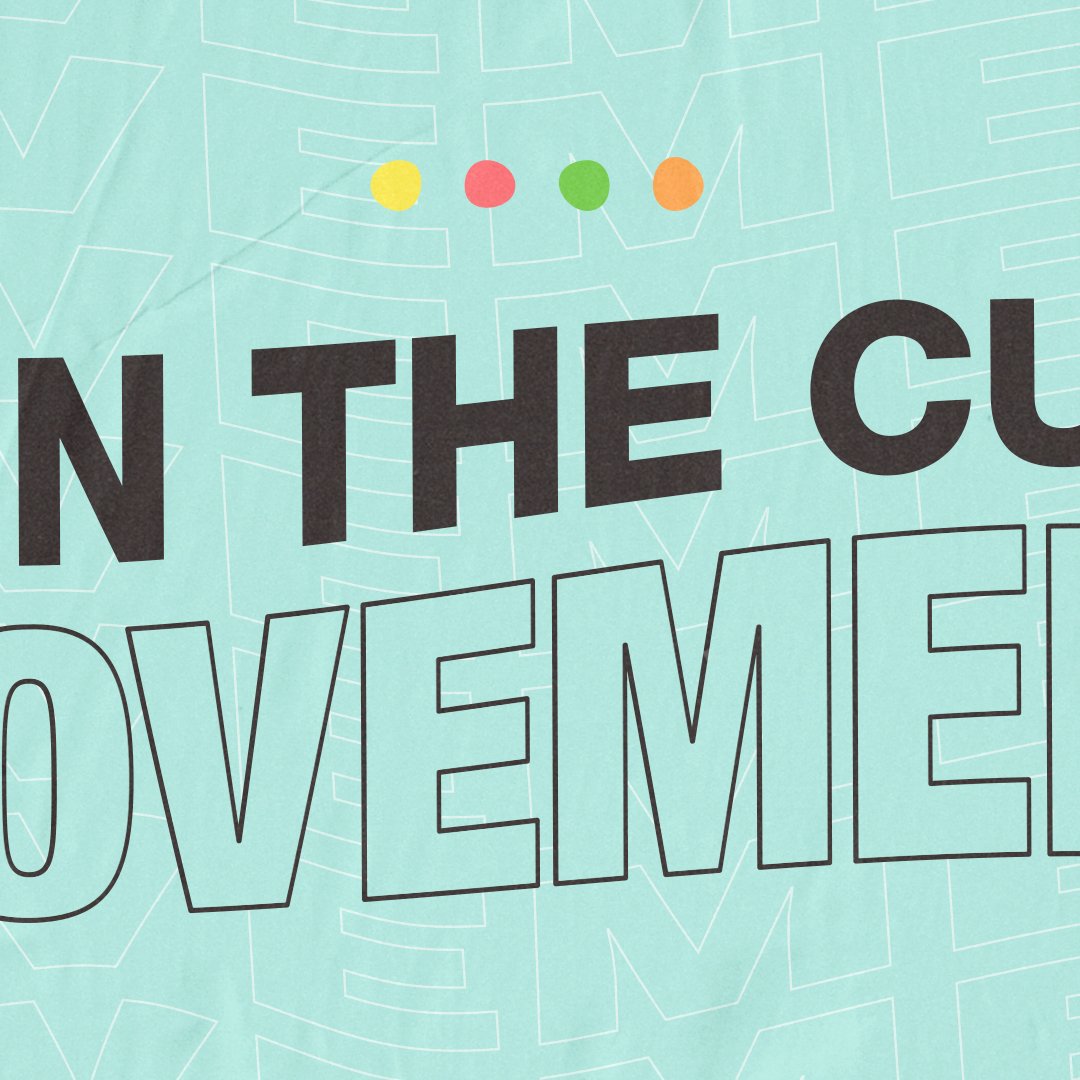
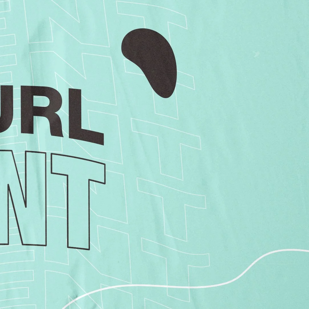
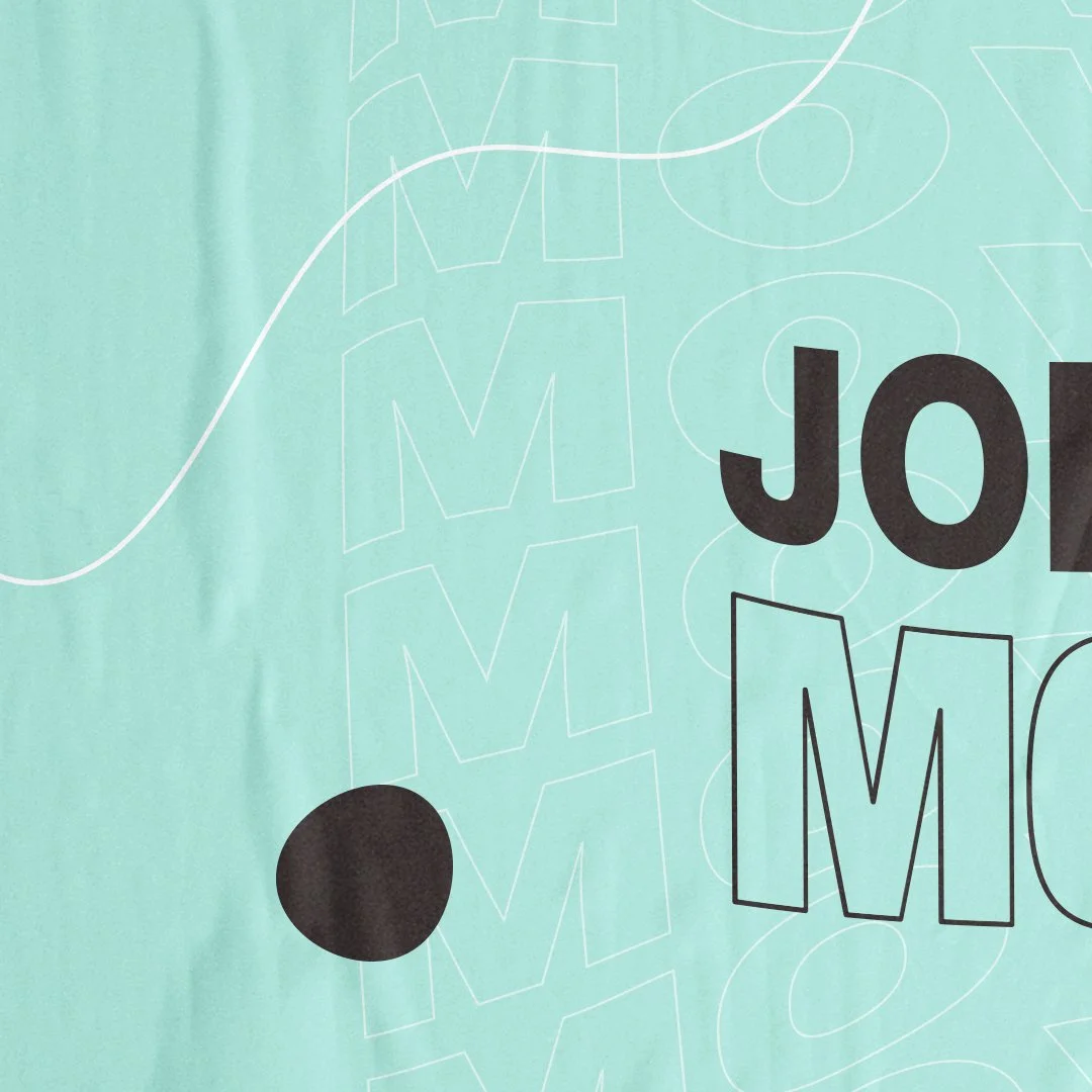
The guidelines were designed to demonstrate the brand as much as document it.
Layouts change, pages feel individual and colour is used generously, so the experience of moving through the document feels recognisably Imbue.
That freedom still sits within a clear system, giving future teams enough structure to work consistently without stripping away the personality of the brand.
Digital & community
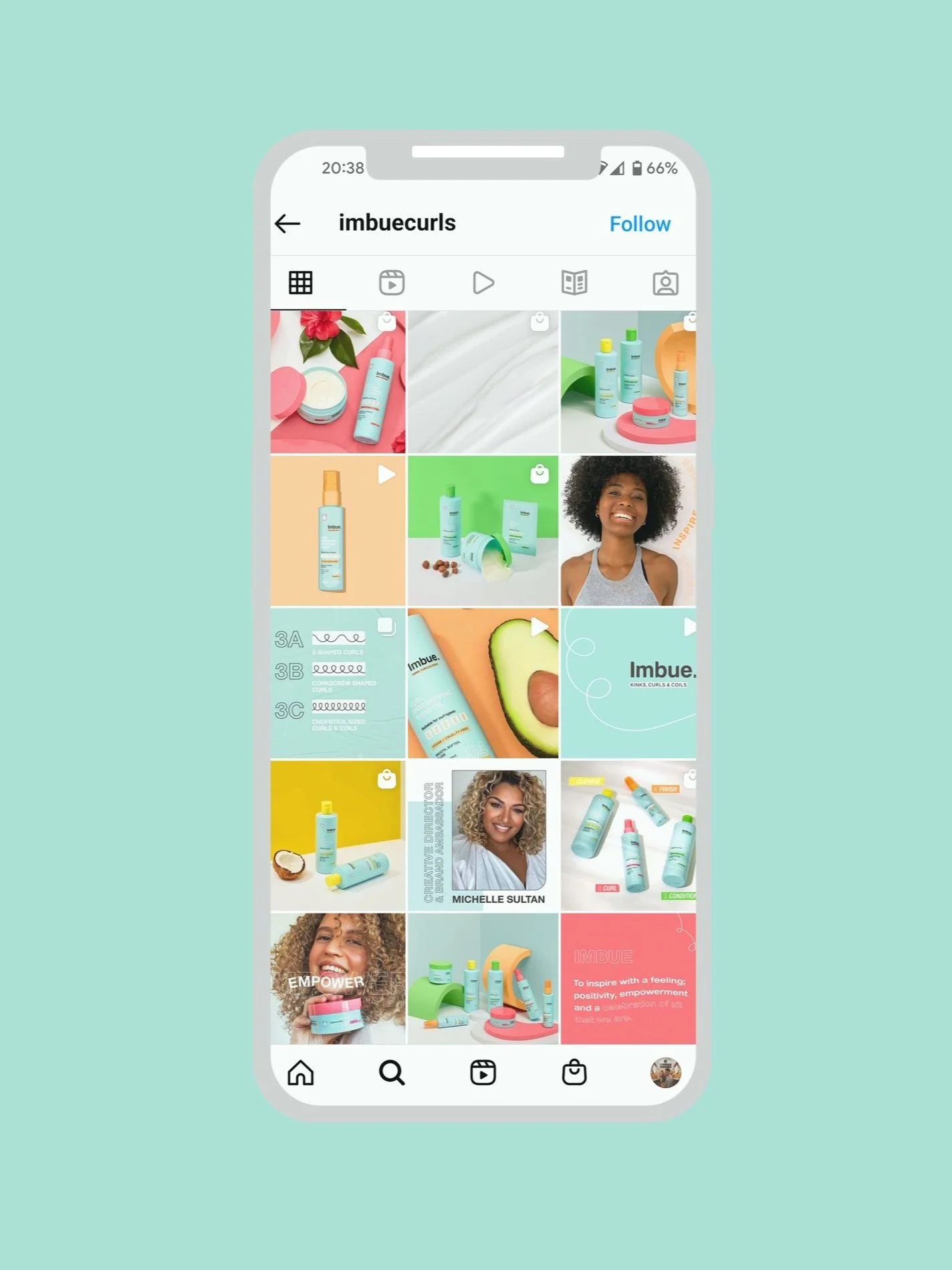
Online, Imbue needed to stand out in a crowded curl care space while remaining closely connected to the physical brand. The core aqua was pushed harder digitally, creating an immediate link back to the packaging. Community imagery, illustration and playful graphic elements brought personality, but the content also had a practical job to do.
Curl care can be complicated, so education, routines and useful guidance were just as important as visual impact. Digital needed to feel like somewhere people could learn and feel inspired, not simply another place to buy product.
Website
The website brought product, education and community content together within the same visual world.
Real curl imagery was paired with the core brand elements, while small animations added moments of personality and interaction. Playful where they could be, functional where they needed to be.
Added value
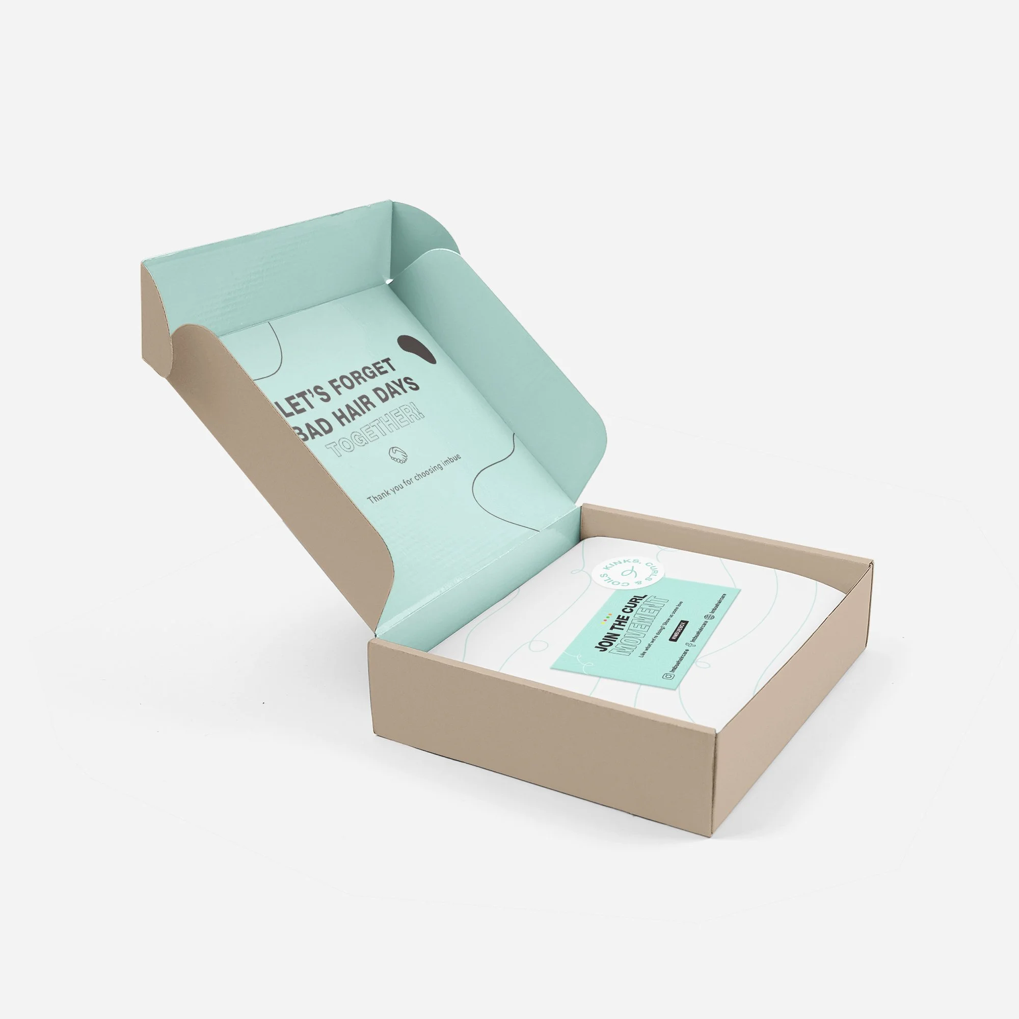
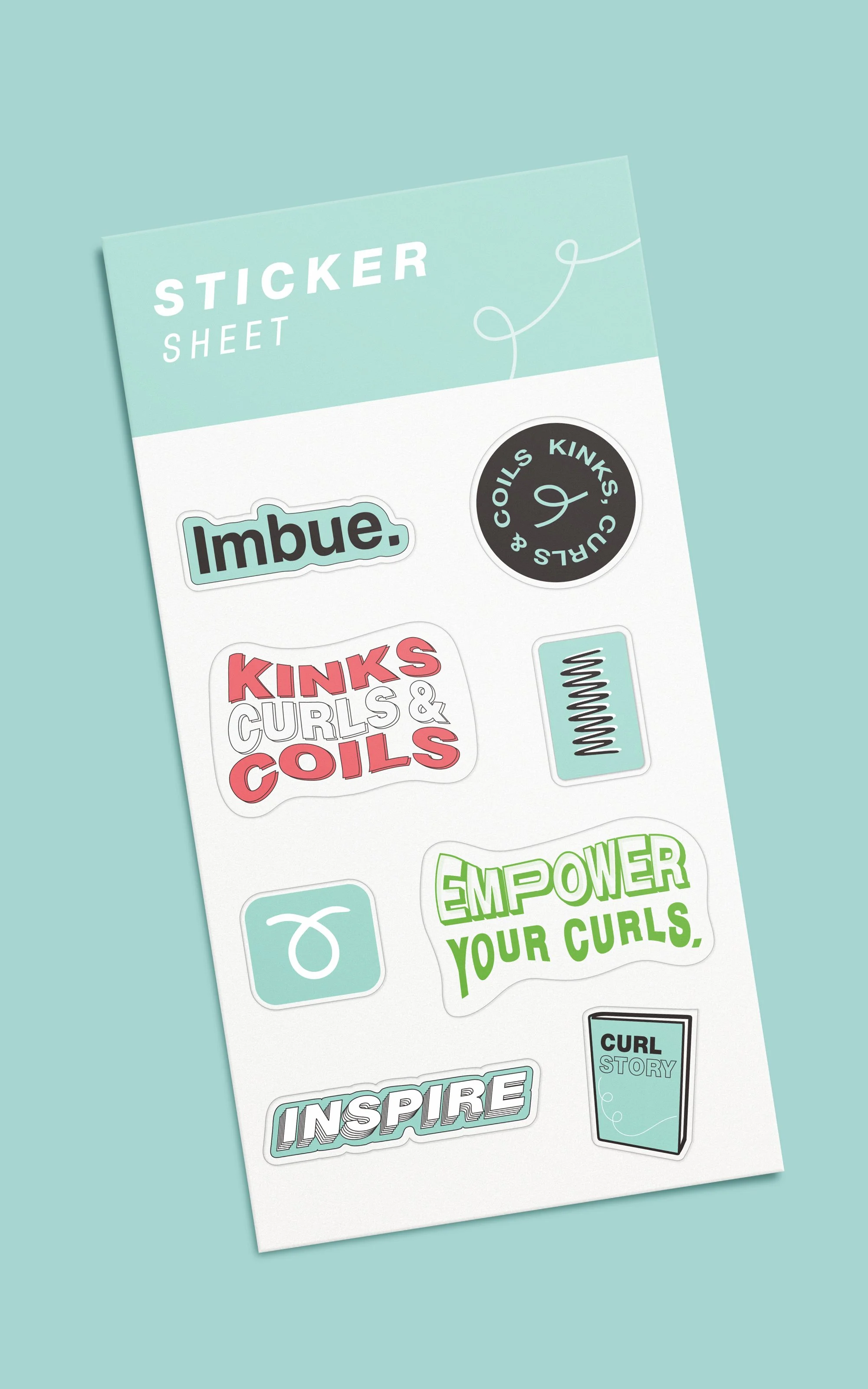
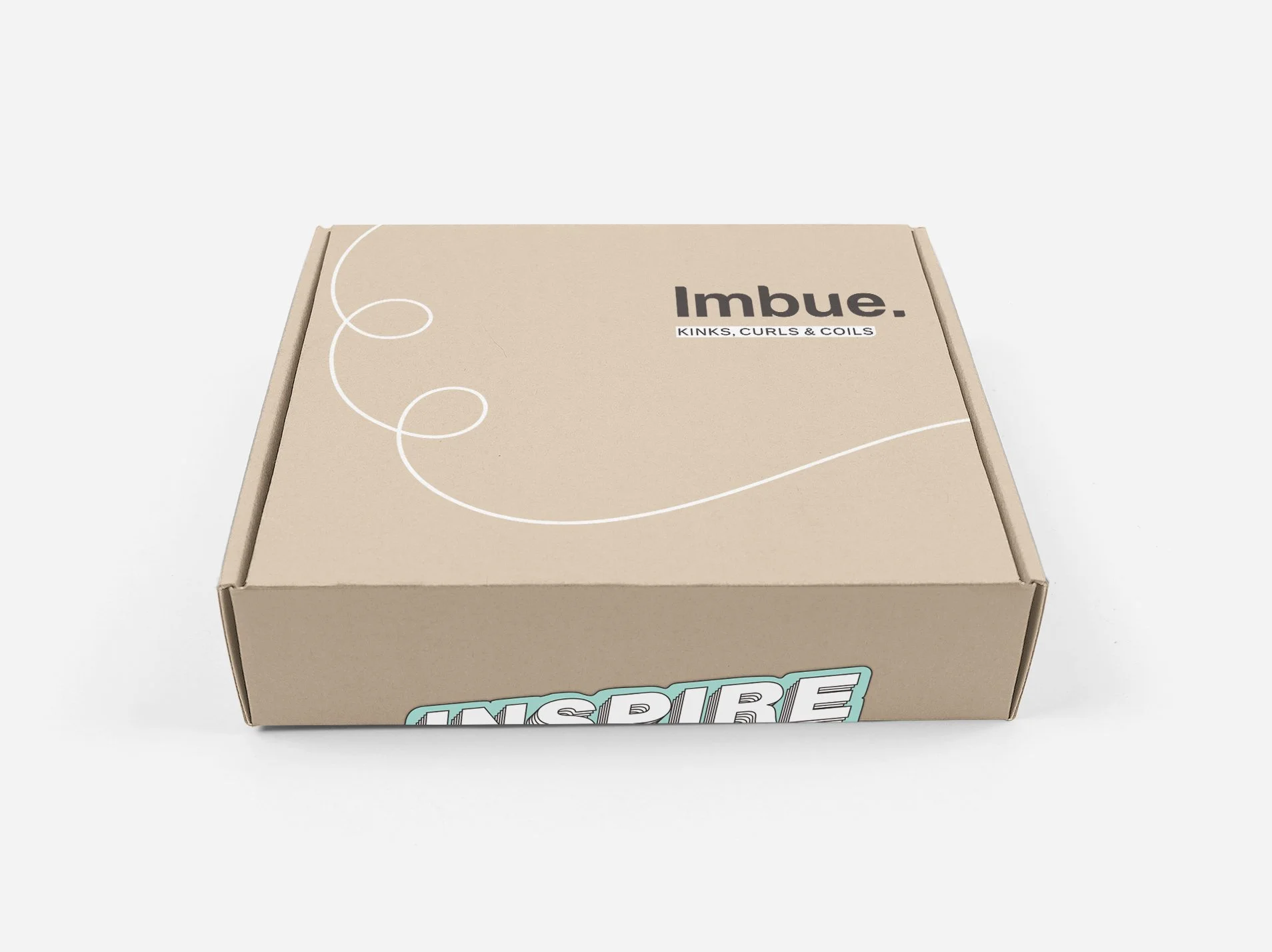
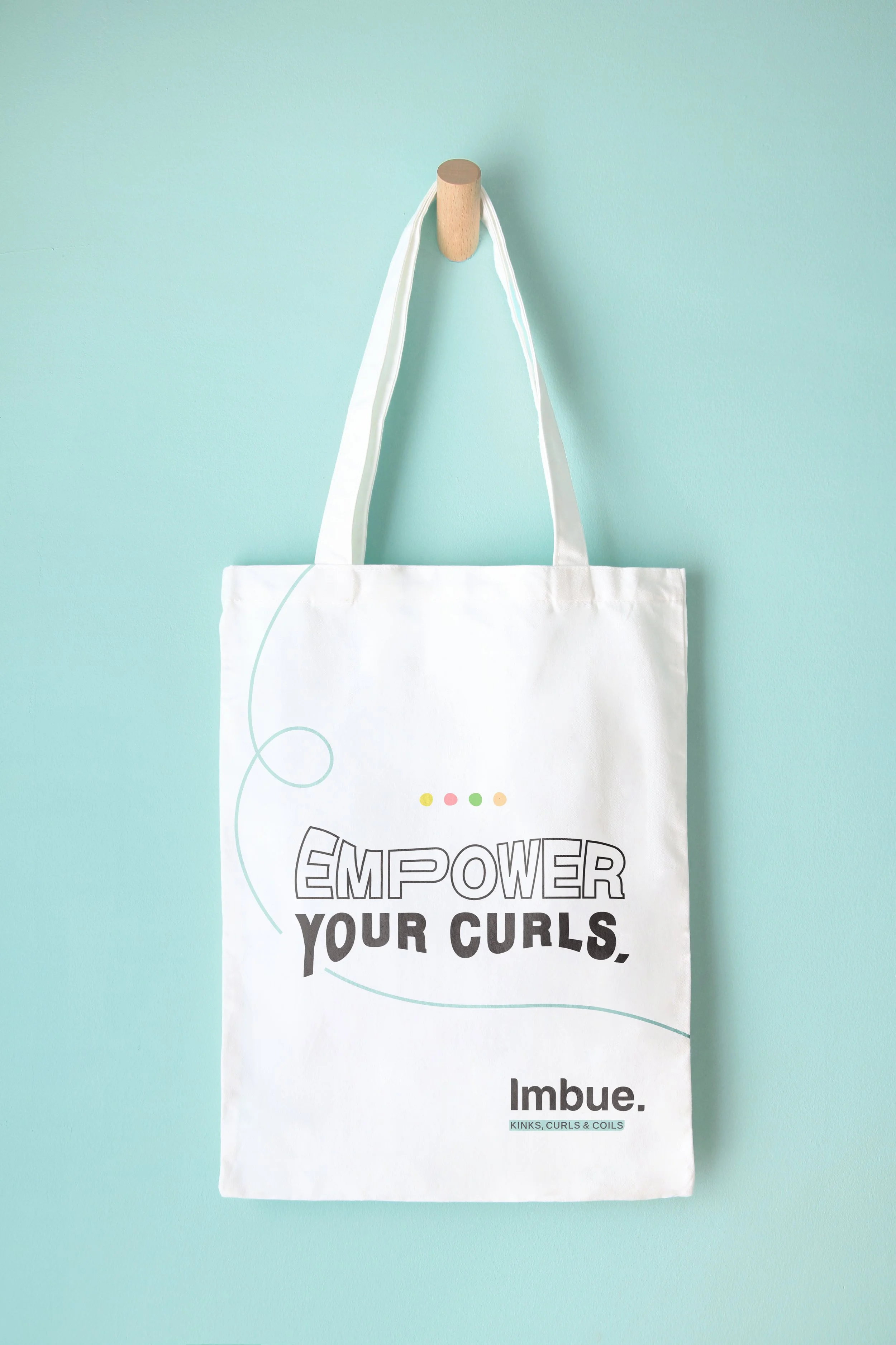
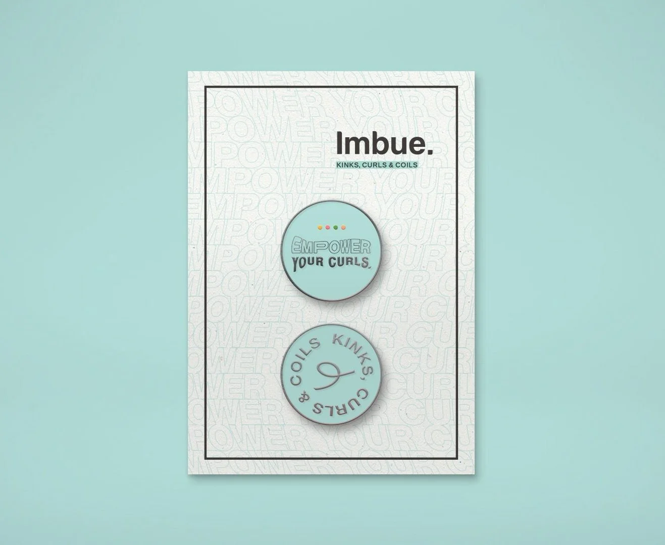
Imbue was intended to become part of people's wider routines, rather than exist only in the moment they used the products. Mailers, stickers, tote bags and smaller branded pieces gave the identity somewhere to be more playful and helped take it beyond the bathroom shelf.
They also reinforced a wider idea behind the brand: creating something people could identify with and make part of their own lives, more than just a range of haircare products.