
Usado BBQ
A bold Pan American BBQ identity built around fire, flavour and the personality of the chefs behind it.
The Project
Usado was created by two fire chefs bringing together North and South American influences, traditional cooking techniques and contemporary flavours.
The brief was to create an identity with enough character to reflect that mix, without falling too heavily into the familiar rustic language of BBQ branding. It also needed enough flexibility to grow with the business across food, events and future brand applications.
-
Logo design, branding, identity design, creative direction
-
Myself

The challenge
Usado needed to feel rooted in fire cooking while still reflecting a more adventurous approach to food.
The audience was deliberately broad, from committed foodies to people drawn in by good food, live music and the social side of BBQ. That meant finding a balance between specialist and welcoming, with enough personality to feel memorable without turning the identity into a collection of obvious BBQ references.
The Development
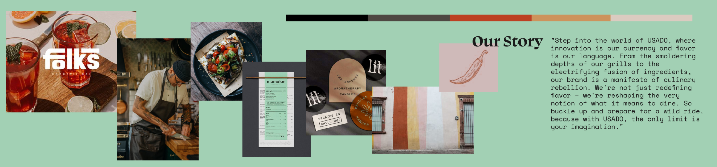
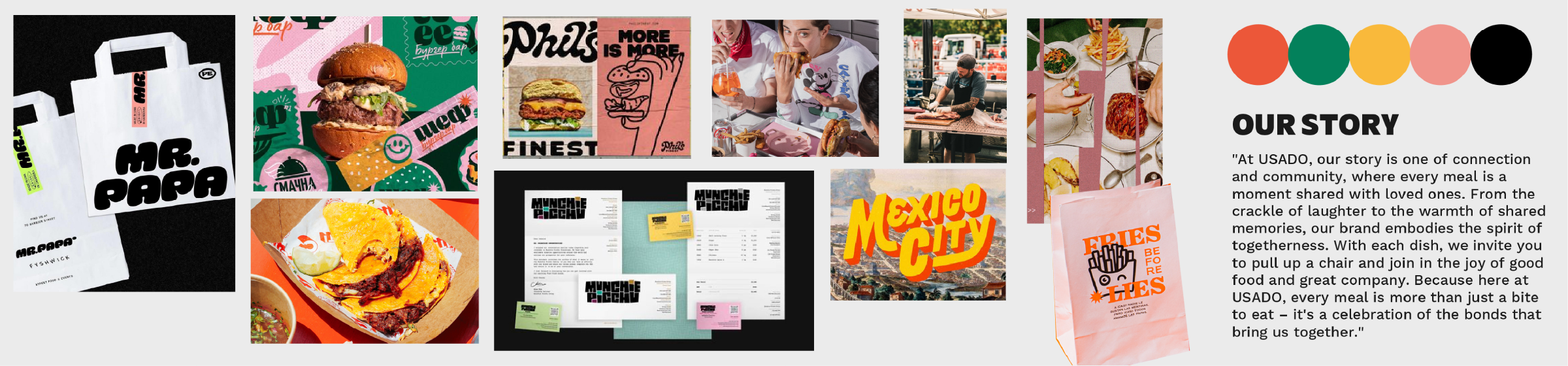
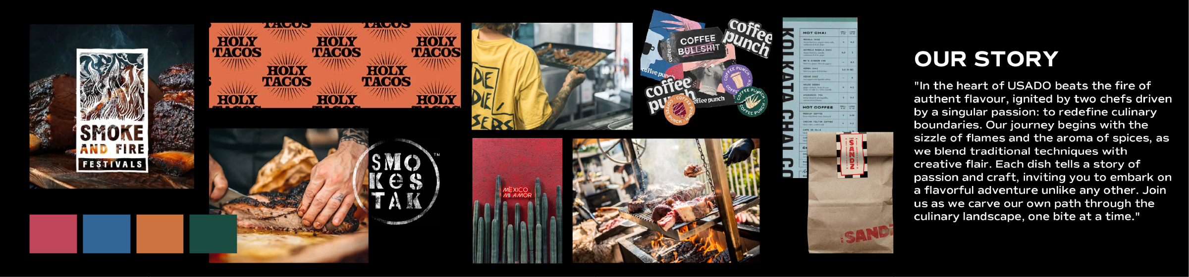
The first routes leaned more heavily into distressed textures and print effects, drawing on the handcrafted feel commonly associated with traditional BBQ.
After reviewing the work with the client, it became clear that this pushed Usado too close to familiar territory. The direction shifted towards something cleaner and more contemporary, retaining warmth through irregular shapes, asymmetry and less polished graphic details rather than artificial distressing.
Stylescapes and typography tests helped find the point where the identity could feel modern without becoming overly slick or losing the character of the food.
The identity
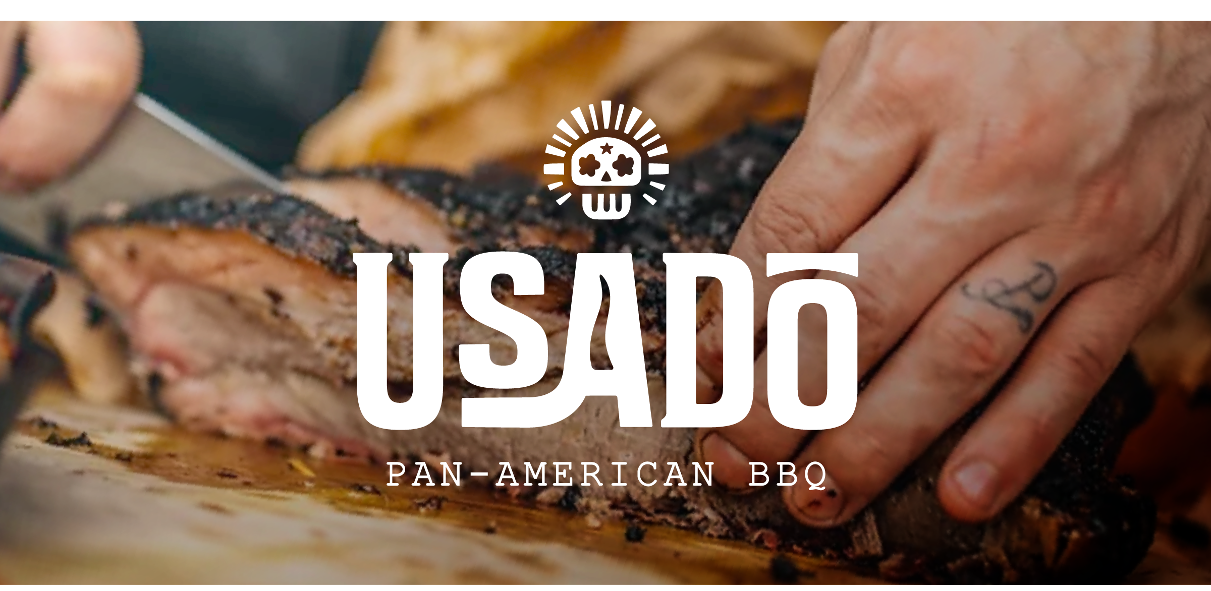
The final mark brings different parts of the Usado story into one compact emblem, combining a stylised skull, Texan star and fork to reflect the meeting of culinary and cultural influences behind the concept.
A wider illustration set draws on fire, ingredients and the food itself, with references including flames, chilli, agave and lime. These give the identity more ways to express itself without asking the logo to carry the whole story.
Red and orange bring the heat and energy of fire cooking, balanced with green and a more grounded stone grey. Organic forms and slightly irregular compositions soften the stronger typography, keeping the identity confident without becoming too rigid.
The Application
Food remains the hero of the identity. High contrast photography captures open flames, smoke and close details of the dishes, making the experience of cooking and eating feel immediate. Candid imagery of the chefs adds another layer, putting the people and craft behind the food into the brand rather than presenting Usado as something anonymous.
The graphic system supports rather than competes with that imagery. Sticker inspired illustrations and looser compositions can add energy where needed, giving social and promotional creative more personality while allowing menus and more functional applications to stay clearer and simpler.
Built to grow
The identity was built so its character could be dialled up or down depending on the application.
The core mark, typography and colour can work cleanly on more functional pieces such as menus and uniforms, while social and event creative can bring in the full mix of photography, illustration and irregular composition.
This creates variety without relying on a single repeated template, keeping the brand recognisable through its ingredients rather than a fixed approach to layout.