
nspa Beauty Rituals - Restage
A bespoke skincare regime in three simple steps. Bringing the spa experience home.
The Project
Beauty Rituals was an established skincare range offering performance focused products at an accessible price.
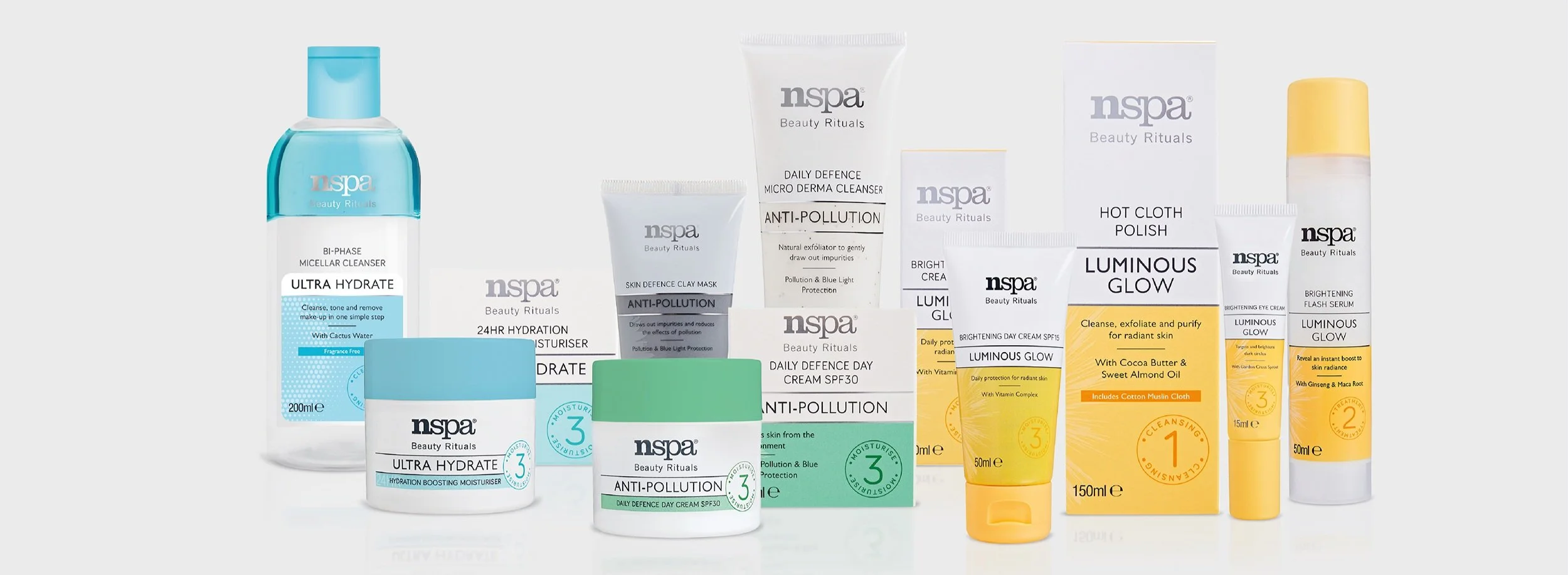
The restage was an opportunity to modernise the identity, strengthen its shelf presence and make a growing range easier to understand. With around 20 products covering different skincare needs and a wide variety of packaging formats, navigation was just as important as creating something visually distinctive.
The new direction brought more colour and personality into the range, while adding a more considered finish without losing the approachable character of the brand.
-
Visual identity · Packaging design & artwork · Illustration · Art direction · Photography direction · Advertising & POS
-
Charlotte Sinoir, Dominic Cheung, Toni Paine, Heather Hamilton
Packaging & identity
Packaging sat at the centre of the restage, with shelf impact and navigation shaping much of the visual system.
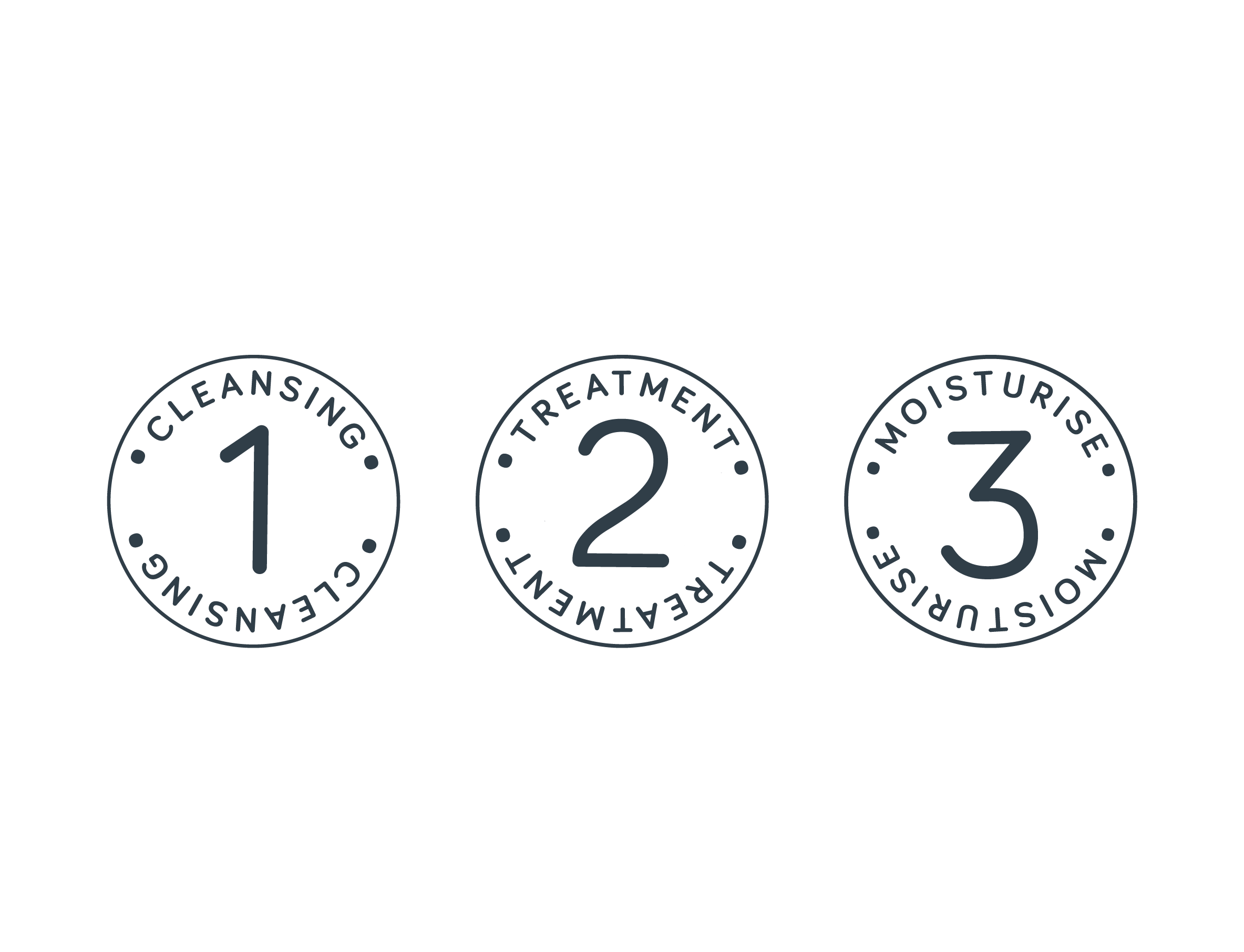
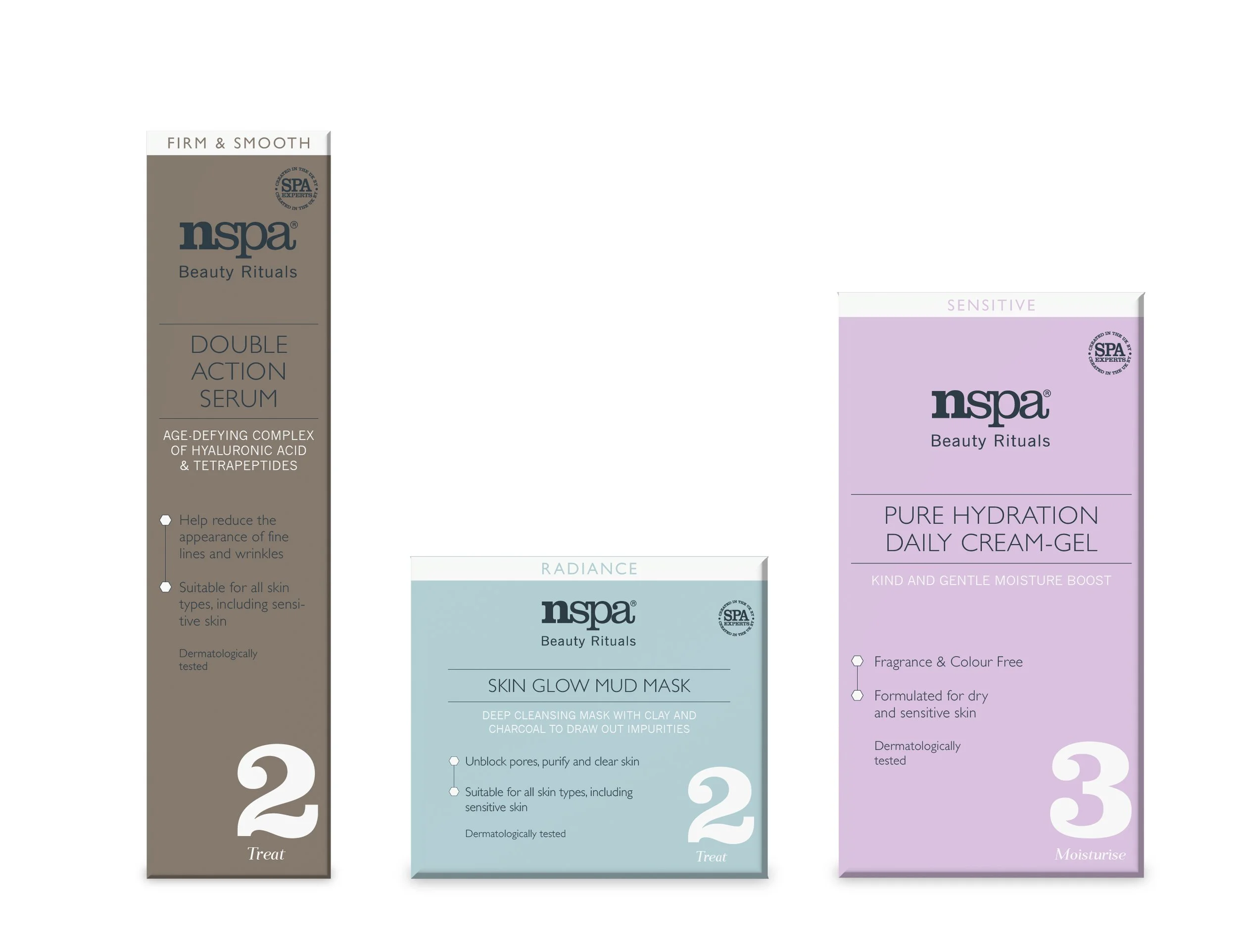
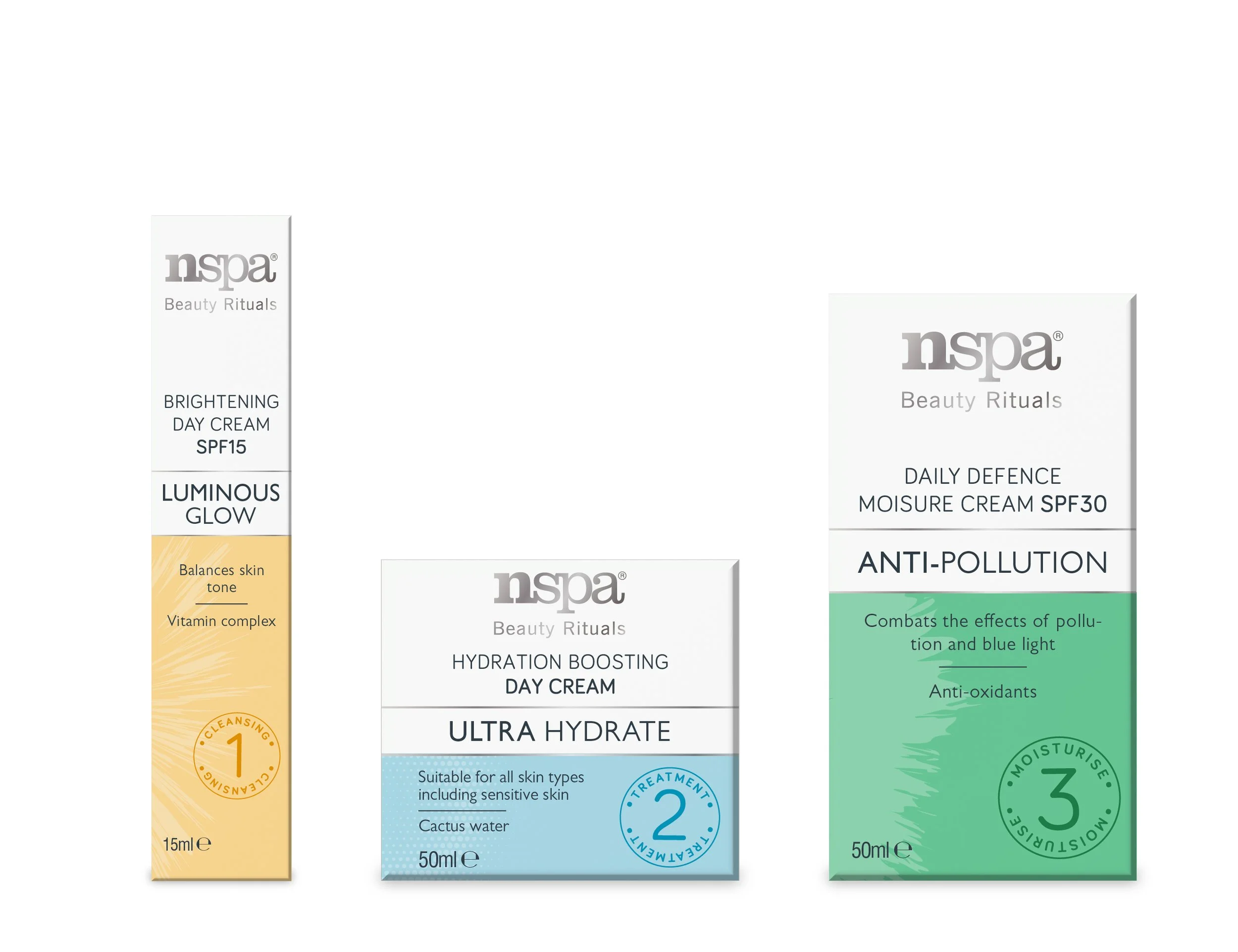
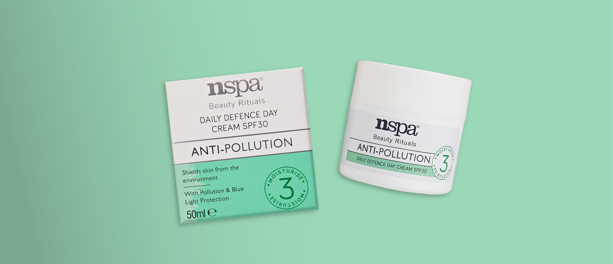
Each product family was given its own colour, drawing from nature and the ingredients or benefit associated with the range. Splitting the packs with stronger blocks of colour made those families easier to distinguish, while silver foil added a more considered finish.
Individual illustrations gave each family another recognisable cue, helping communicate the different need states without relying on product names alone.
Building a flexible system
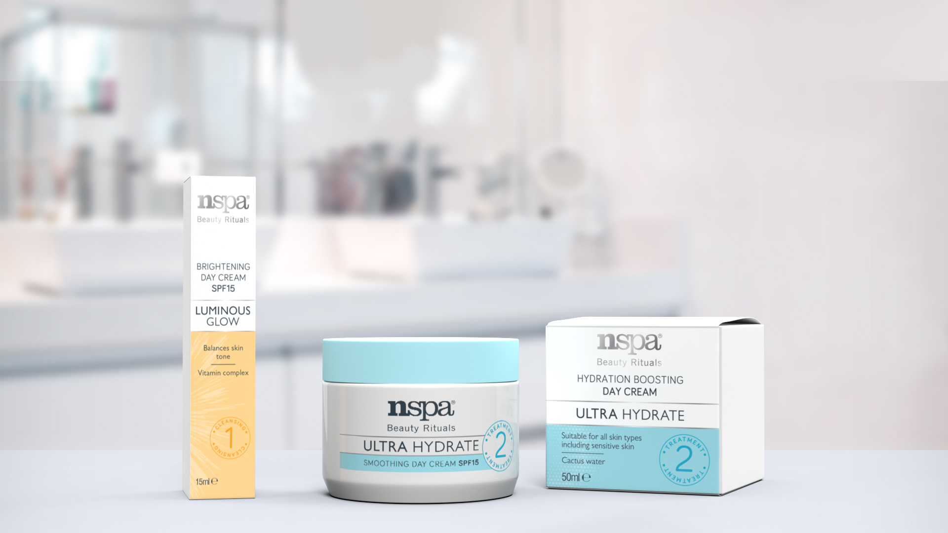
The identity had to work across bottles, tubes, jars and cartons with very different proportions, so it could not rely on one fixed packaging layout.
Extensive visualisation and testing helped establish which parts of the system needed to stay consistent and where the design could adapt. The aim was for each product to work in isolation, but for the full range to feel much stronger when seen together on shelf.
The restage was built around four existing brand values:
Energetic · Accommodating · Trusted · Approachable
Imagery
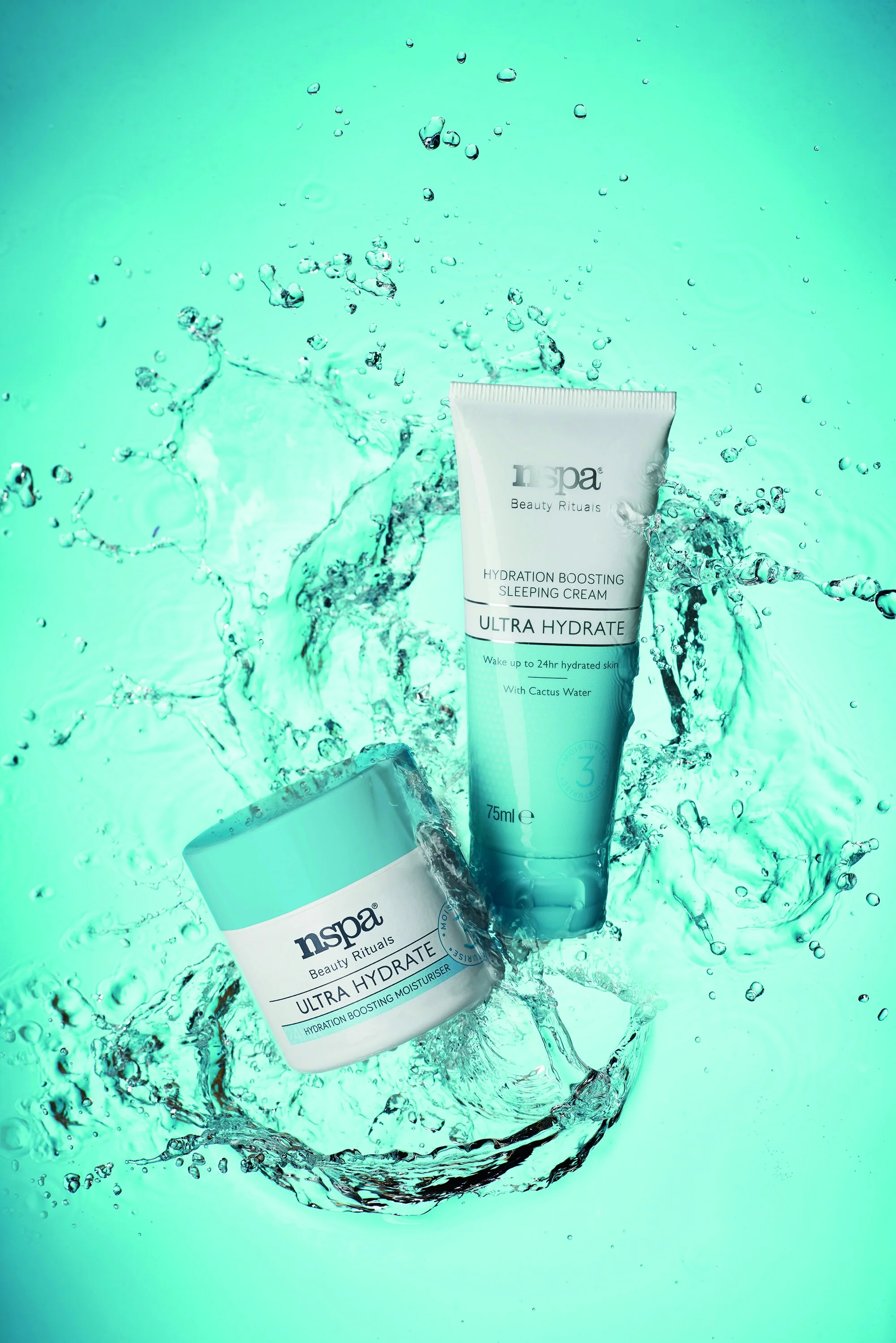
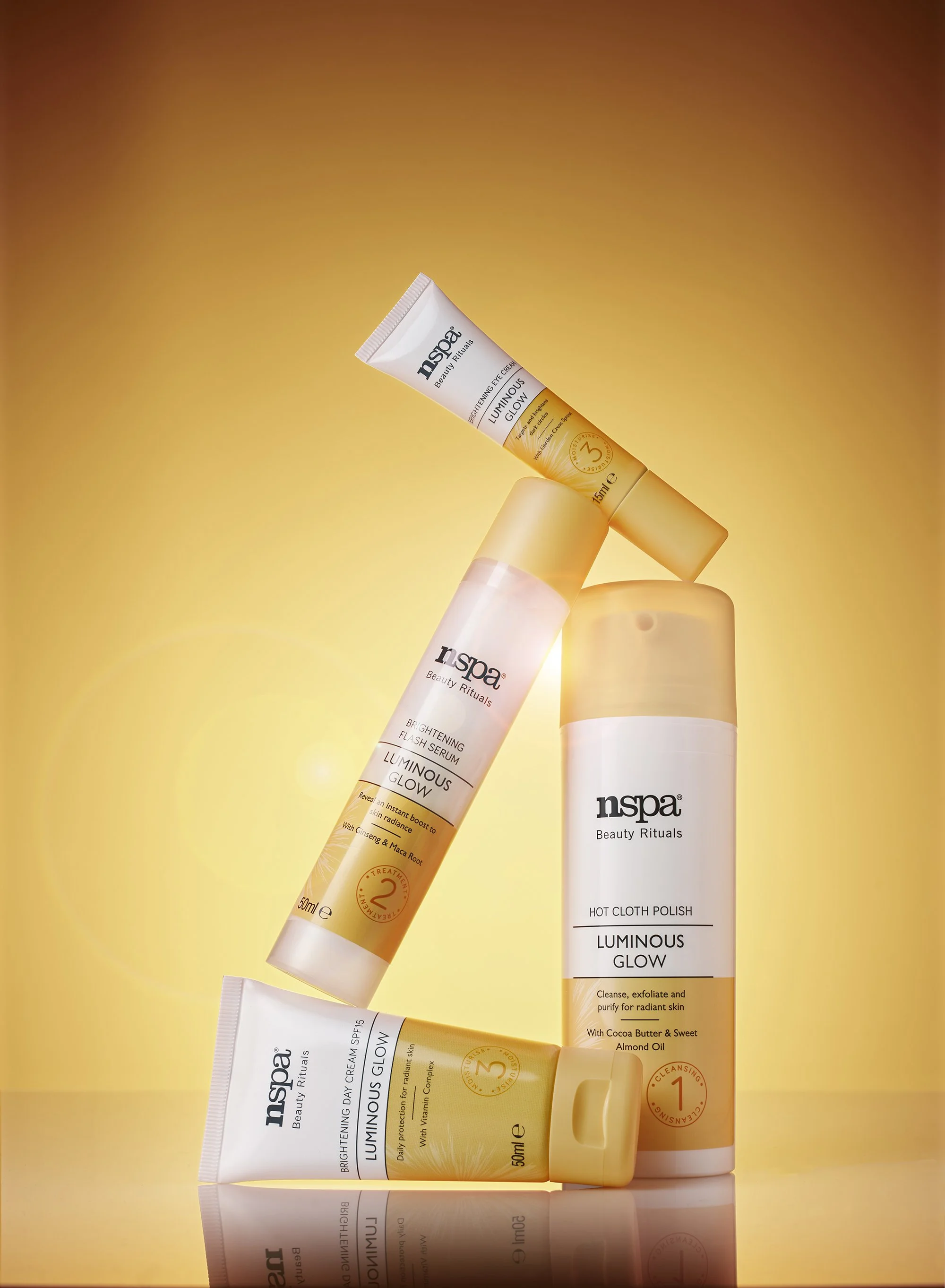
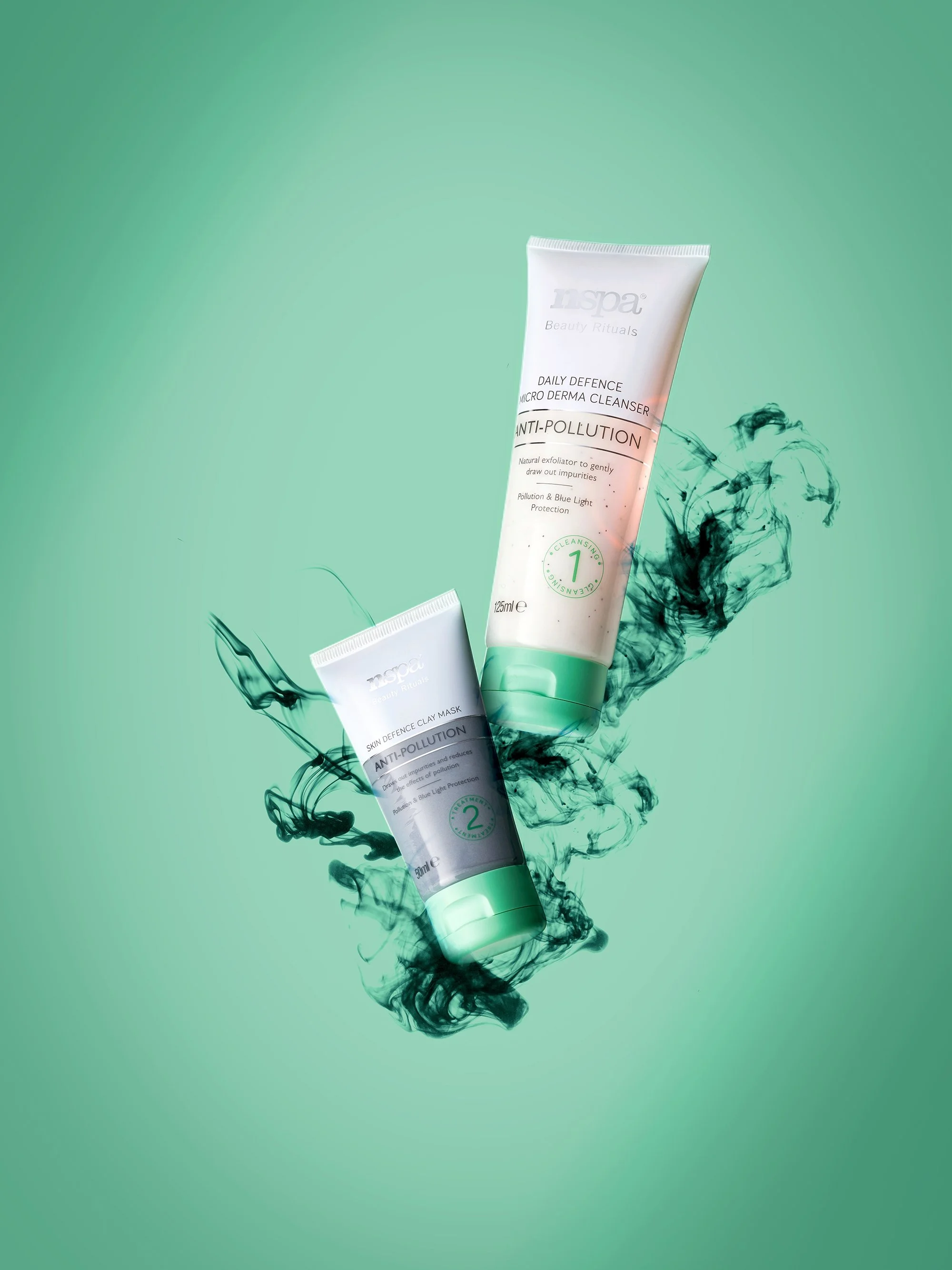
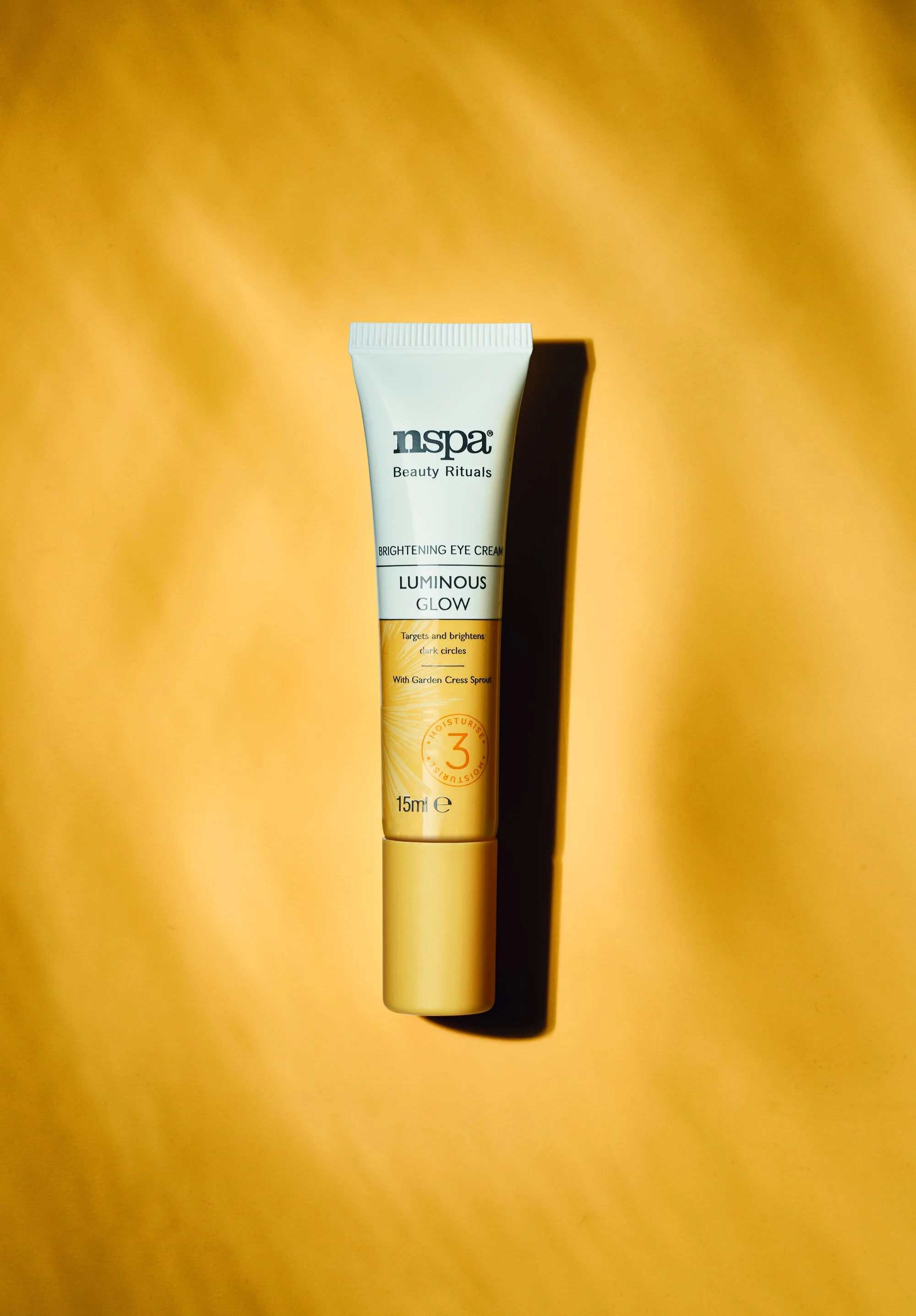
The photography extended the product family system beyond the packaging.
Colour-blocked sets created a clear connection back to each range, while styling introduced more subtle clues to the individual product benefit. Light and reflective details helped suggest Luminous Glow, while water-led styling reinforced Hydrate.
The minimal compositions gave the products a more elevated feel, while the strong use of colour kept the imagery energetic and recognisably Beauty Rituals.
Amazing and inspirational but attainable skin
Model Photography
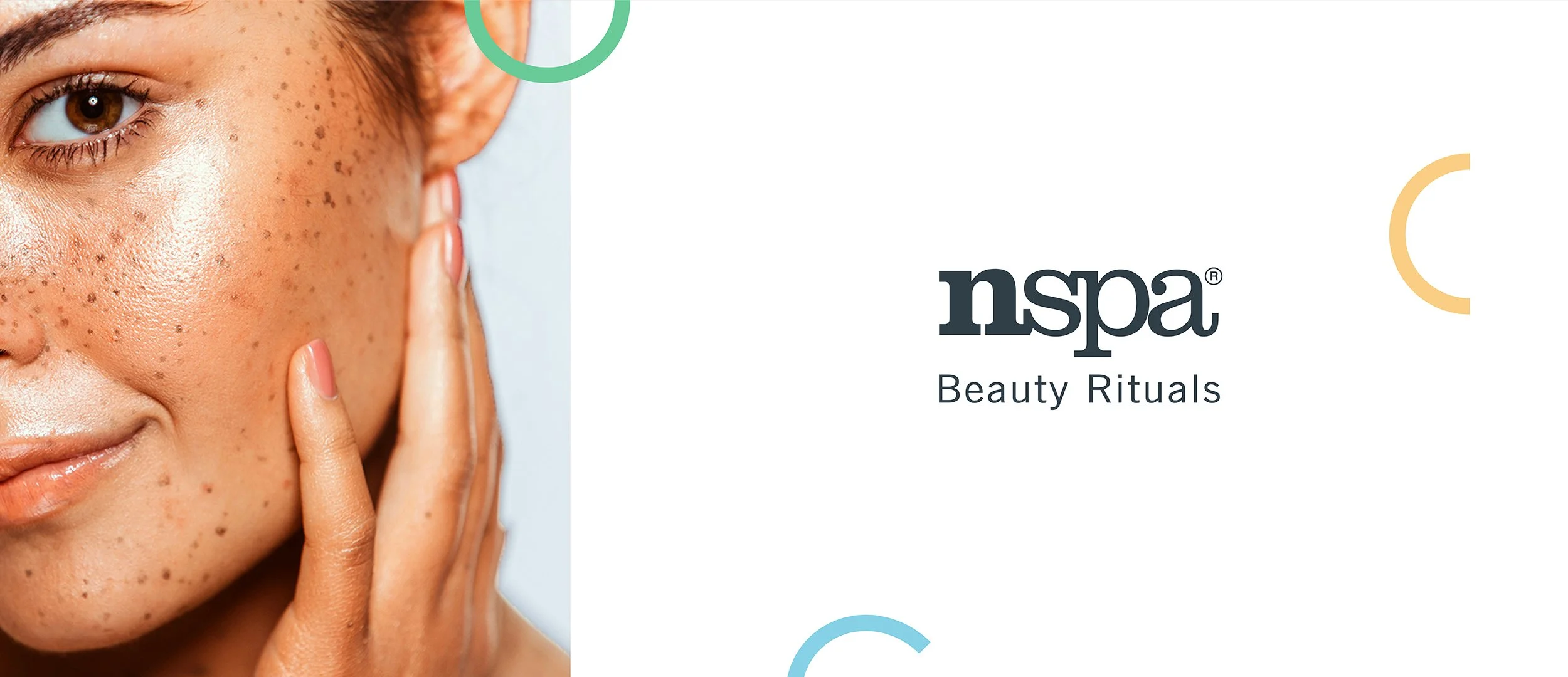
A clear style was set for model photography, focusing closely on complexion and the natural character of the person rather than creating an overly perfected idea of skin.
Dynamic crops draw attention to texture and individual features, with retouching kept deliberately natural. Full or subtle smiles bring some of the energy and approachability of the wider identity into the images.
Advertising
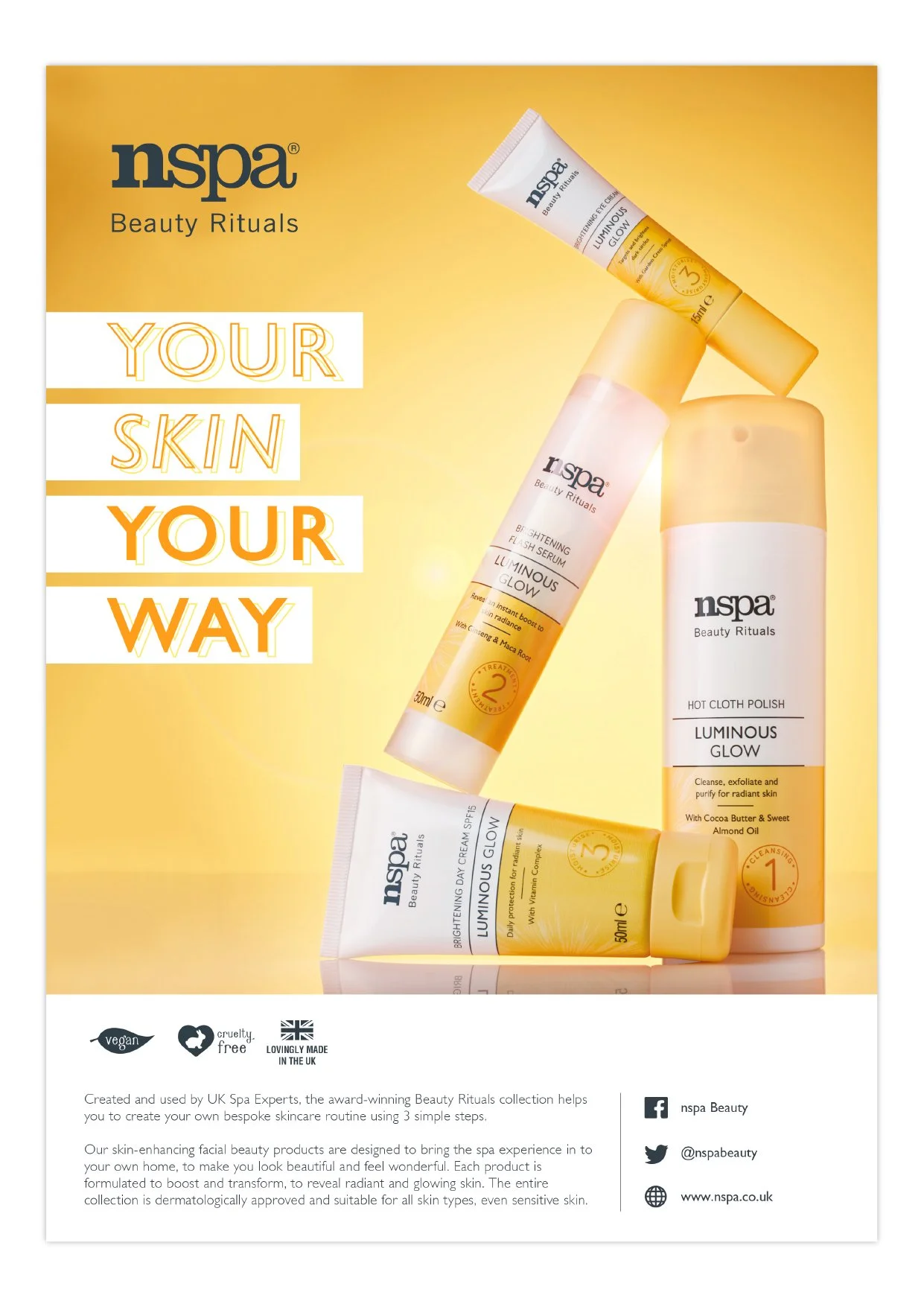
The advertising balanced the more considered feel of the photography with the playful side of the brand.
Copy was kept intentionally light so skin and product imagery could carry most of the impact. Colour and graphic details then added personality without competing with the result being shown.
Point of Sale
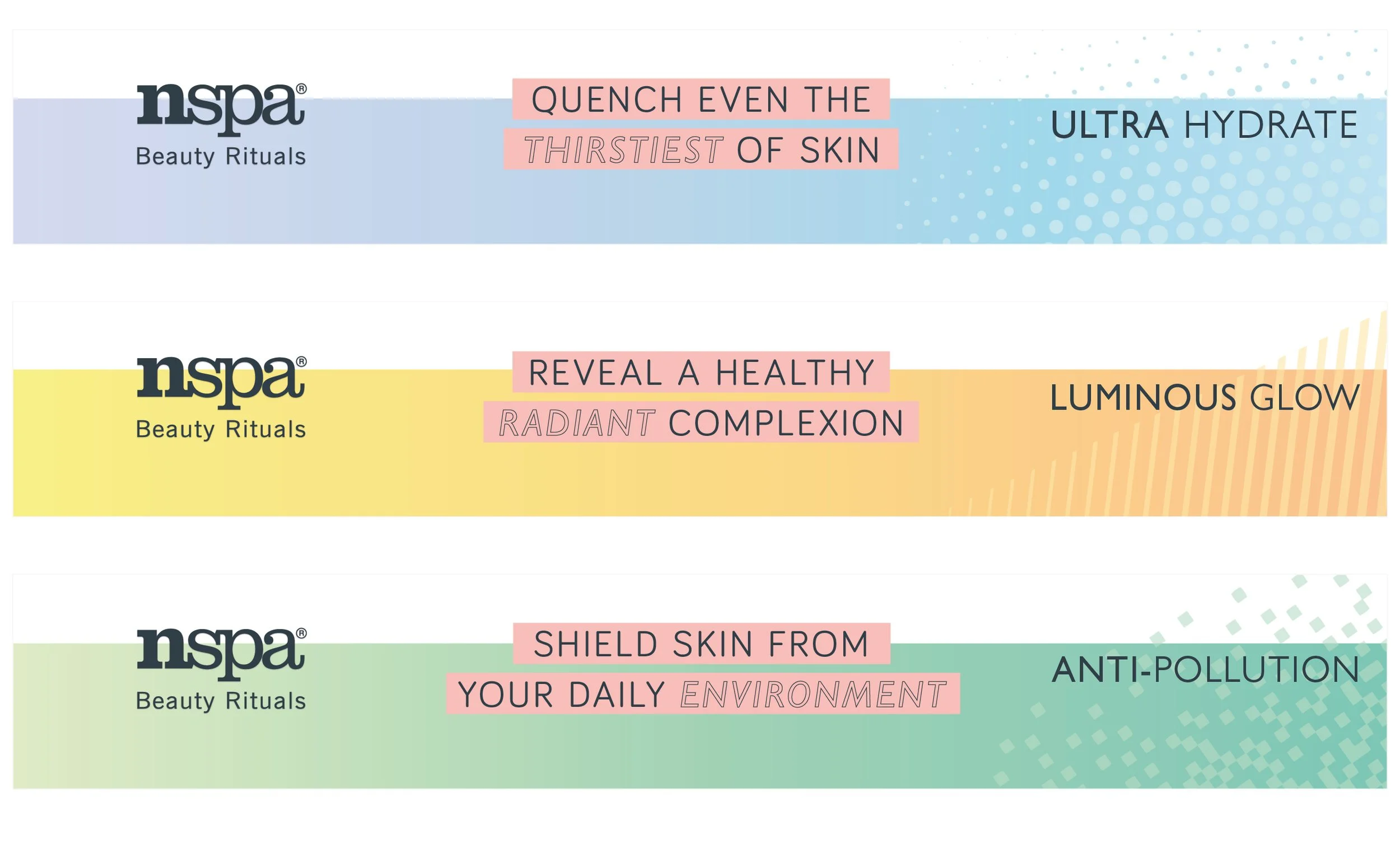
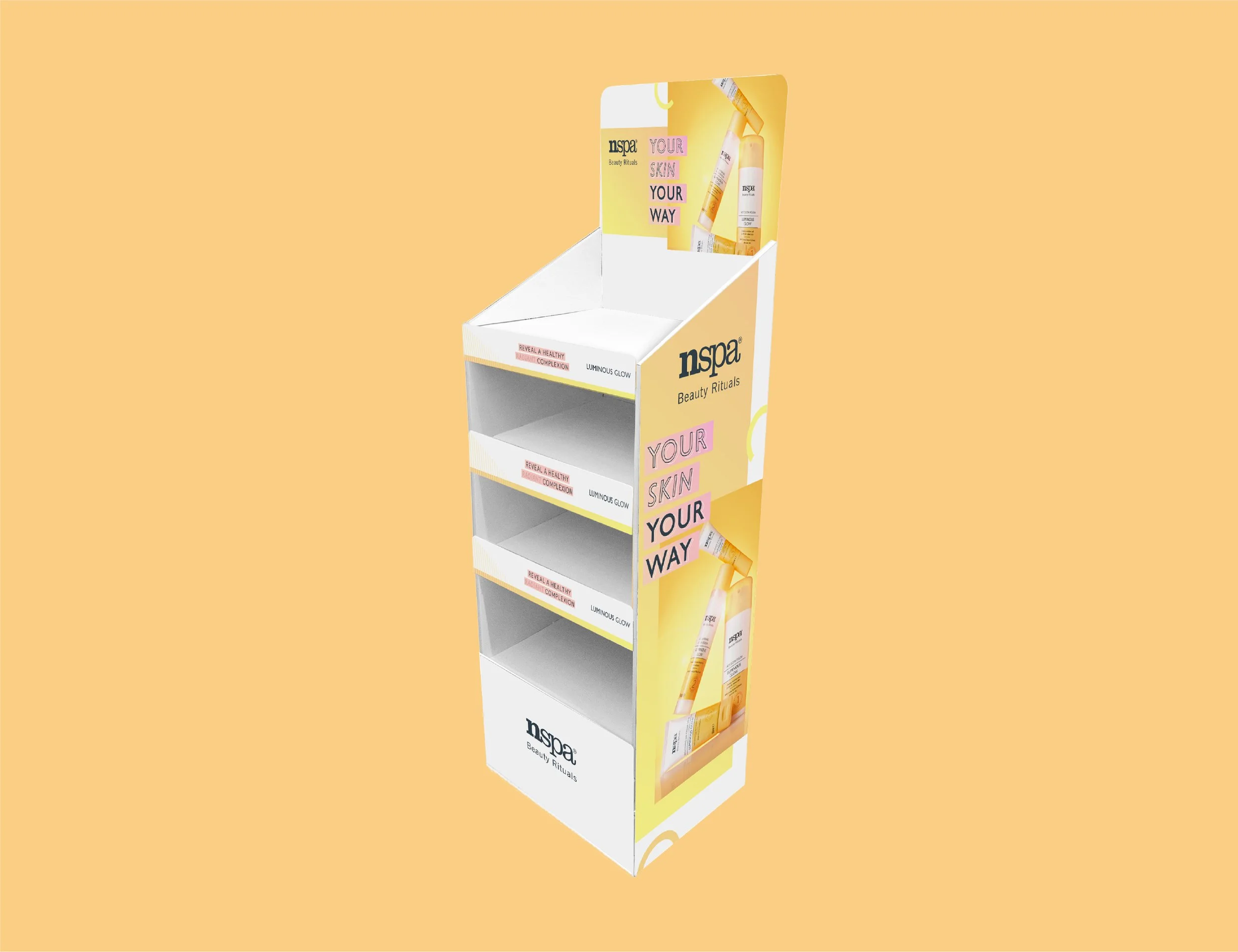
Point of sale needed to do more than repeat the packaging. It was where the brand could explain the range, clarify different skincare needs and help customers feel confident about what they were choosing.
The same colour blocking used on pack became a quick navigation tool, while more space was given to product education and core brand messaging. That combination helped the range feel both easier to shop and more credible as a skincare offer.
Guidelines
The final guidelines brought the packaging, photography, advertising and retail approach into one usable system.
They defined how colour, illustration, typography and imagery could behave differently across each area while still reflecting the core values of the brand.